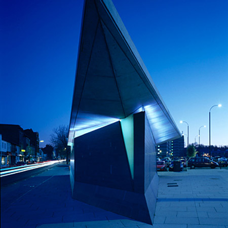
Gravesend public toilets by Plastik Architects
Here's another building with a pointy prow, but this time it's a public toilet. Photographer Edmund Sumner has sent us these pictures of the new facilities in Gravesend in Kent, England, by Plastik Architects.
The local council asked for a "minor landmark" public convenience to act as the centrepiece to its regeneration masterplan.
All photos are © copyright Edmund Sumner
Here's some info from Plastic Architects:
--
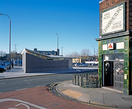
Gravesend, a small town on the River Thames in Kent, is undergoing significant regeneration. The site for the public toilet lies at a key junction along a new public footpath linking the heart of Gravesend to public parkland to the south. The brief was to provide a new toilet facility on the edge of a car park within the Lord Street / Parrock street regeneration area.
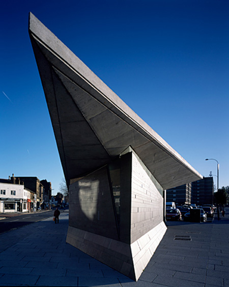
Gravesham Borough Council required the building to be an eye-catching, 'minor-landmark' as a centrepiece to the adopted masterplan for the area. The basic form of the building is derived from the slope of the topography and the geometry of the site.
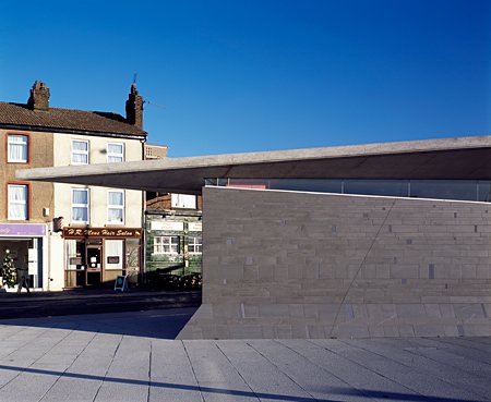
A simple conceptual diagram provides four main load-bearing internal walls, defining the internal spaces, with sanitary items serviced from the eastern wall.
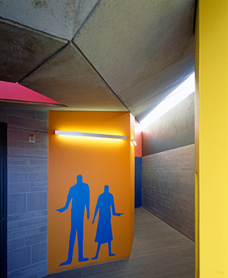
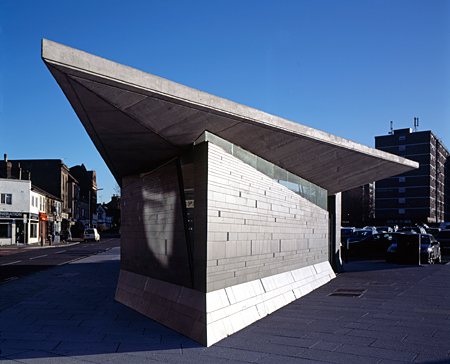
The slope of the roof facing the new tree-lined avenue emphasises the slow incline up to Windmill Hill, reinforcing the view of the hilltop and creating a welcoming and bright entrance at its high point. A more fluid and faceted form was developed for the Parrock Street side in response to the fast moving traffic.
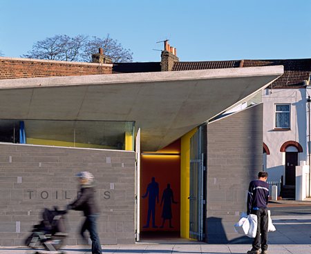
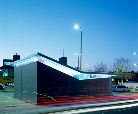
The roof form is a distorted and inverted cantilevered pyramid, consisting of four triangular facets that meet in the lobby space. Roof planes fold upwards to hover above, but never touch the irregular external walls.
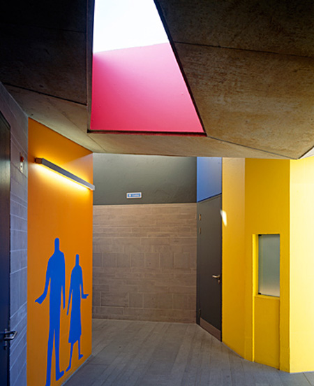
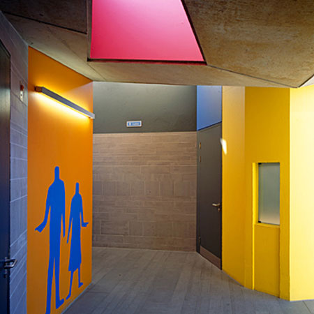
Four faceted structural walls and two distorted columns are positioned to allow the roof seams to lead directly to the primary internal spaces - visually connecting the heart of the building to each corner. A single triangular roof-light was positioned along one seam in the heart of the plan, allowing the entrance space to be awash with natural daylight.
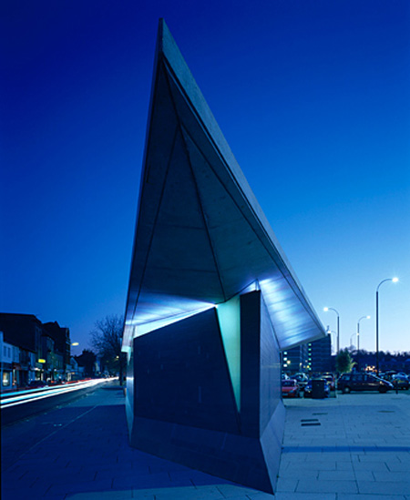
The mass concrete roof is separated from the tile-clad, concrete block walls by a continuous glazed clerestory; achieving a visual tension in the composition between architectural elements and allowing all internal spaces to be naturally lit. Structure is set away from the external wall to emphasise this separation. The design achieves a building that functions both as a landmark structure and as an efficiently planned toilet facility, housed within a sculptural form.
--
Posted by Rose Etherington