Swarovski Ginza store by Tokujin Yoshioka 2
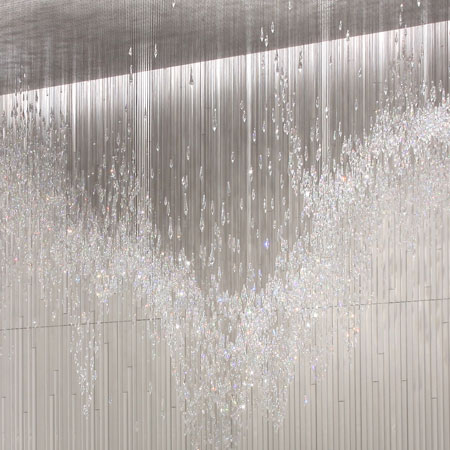
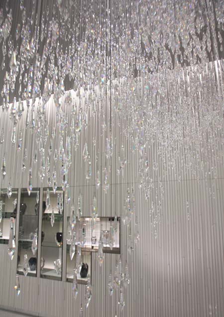
Here are more images of the new Swarovski store in Ginza, Tokyo, designed by Tokujin Yoshioka, including the photos of the store's interior.
See more photos of the "Crystal Forest" store's facade in our earlier story.
Below is a Q&A interview with Yoshioka, provided by his office:
--
SWAROVSKI GINZA
Tokujin Yoshioka Design
Q&A
Please tell us how this project has started.
This is a large project implemented by Swarovski to renew boutiques and concessions in all major fashion capitals around the world.
It was the year 2005 when I first worked with Swarovski for the project called Swarovski Crystal Palace. For this landmark project, in which Swarovski invites designers from around the world to create chandeliers, I designed a futuristic chandelier entitled “STARDUST” which projects images on each crystal component through the use of fiber optic.
This design visualized a scene, which I saw in a dream on one night, that the sky is studded with countless transparent particles of light as if this fantastic sight were floating in the air.
In 2006, Swarovski appointed architects and designers for the design competition for the new store design concept and I was fortunate to be nominated as a designer to create and develop a new Swarovski retail concept.
The new store in Ginza, is completed as the first flagship ever Swarovski showcases in the world. The concept of the new retail architecture, "Crystal Forest," is comprehensively implemented in this store design.
I am very much looking forward to seeing the further development of the new retail architecture, which reflects the concept of "Crystal Forest" worldwide in the upcoming future.
What is the concept of this new retail design?
When I pondered how to express the intimate relationship between crystals and nature, I have looked to the forest as a key element of my inspiration.
I have intended to design a new retail architecture, which makes the visitor wonder, from the moment of stepping in the boutique, whether he/she were in the forest, jeweled with crystals and pieces of jewelry, rather than proposing an ordinary interior design for retail.
Please talk about the façade, the main feature of the store.
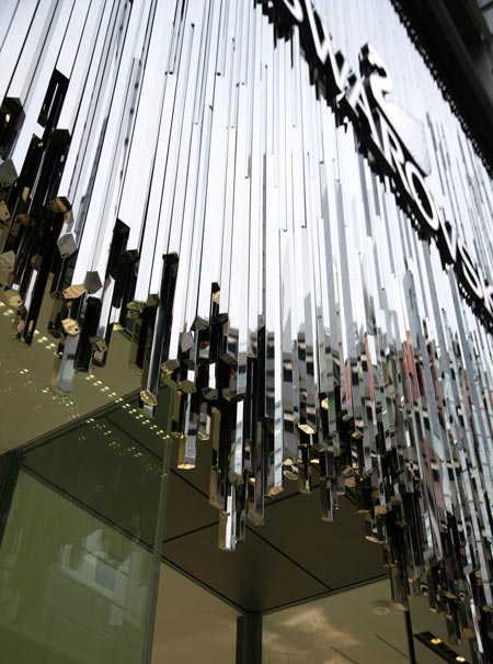
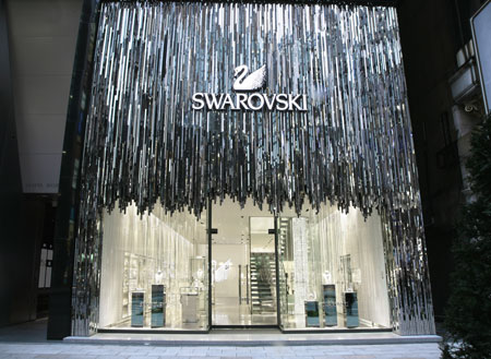
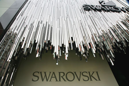
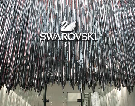
As the key elements of the shop, the facade is covered with nearly 1500 stainless-steel mirror relieves. It reflects the various scenes from different angles and sparkles brightly as if crystals cascade down from the sky.
Its ever-changing day and night expression harmonizes light and fascination and attracts people out in the street.
Please describe how the store looks inside.
Again, I wanted to create a space where the visitor feels wandering around the forest, jeweled with crystals and pieces of jewelry.
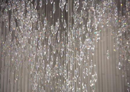
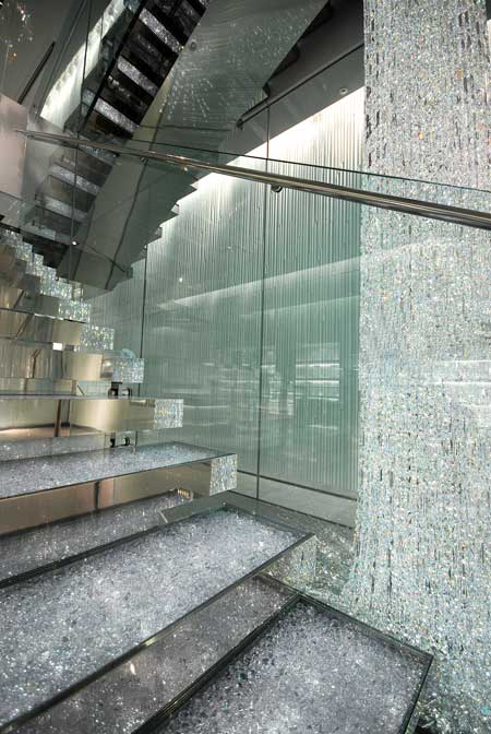
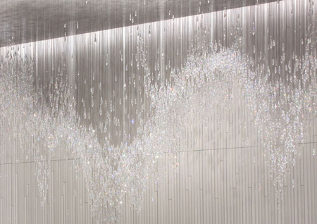
Stepping inside the store through the entrance, where another key element of the design, waterfall-like chandelier, is showcased, the visitor will encounter a crystal staircase. It orchestrates the sparkling of the crystals and radiates brilliance throughout the entire space by creating a fantastic atmosphere.
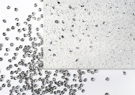
Moreover, dazzling crystals on the floor are embedded in the stone like a fossil. Each staged object increases its transparency and sparkles more in the space when the illumination hits and brings the pieces to live as they are the creatures living in the forest.
On the second floor, a special installation called “Shooting Star” will be presented, in which crystals make a scene just like a fall of shooting stars. In these years, I find beauty in things, which spring from repeated coincidences - a phenomenon like nature.
With using the shimmer of the crystals to resemble stars, "Shooting Star" is an installation, which shows people the beauty of overlapped and reverberated transparent sparkles. The installation will express a poetic and fantastic world where 20,000 crystal stars twinkle down from the sky.
How is it like to be working with crystal?
My initial impression on the crystal was luxury. After learning the history of the Swarovski crystals and spending more time on a dialogue with the material, I was drawn to the beauty, transparency, and poetry of crystals, which harmoniously form the brand philosophy.
What was the challenge you have encountered in the project?
While Swarovki has its long and respectful history, the company challenges anything new and experimental. I have gained a stimulating and interesting experience through the collaboration with them.
The red and blue store has been an icon of the brand up to now. In order to reflect the brand philosophy even stronger in the new retail design, however, I pondered on the idea of covering the entire walls with the white relieves and aimed to achieve the recognition of the brand at a glance even from a far distance.
Until the plan is finalized, we have spent considerable amount of time on the verifications and experiments with materials and system used in the store. The challenge would be to modularize design so that the same system and function will be applied in the succeeding stores in order to realize a consistent concept of “Crystal Forest” around the world. I have tried that the modular system and function will not to ruin the poetry of Swarovski brand.
Your work always links to the image of white. Why so?
I am always fascinated with things that are transparent and white. I am also attracted to the invisible human “senses”. On designing, my intention is not to design a shape of things, but to move people’s emotions and bring out their senses. To me, my ultimate goal is to design the people’s emotion itself.