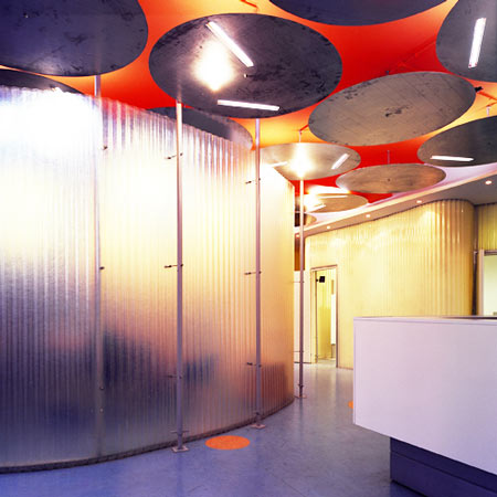
F-zein offices by KLab architects
Greek architecture practice KLab architects have transformed an existing industrial building into an office space for digital media company F-zein.
The interior consists of a sequence of open-plan spaces using simple structures, which can be easily dismantled and rearranged if needed.
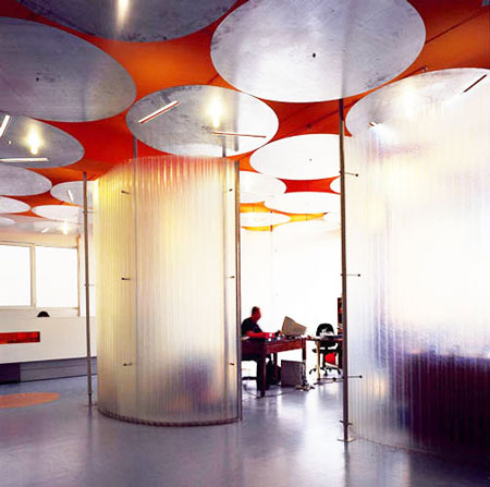
Commonplace or inexpensive materials are used to keep costs to a minimum, such as partitions constructed from standard steel scaffolding poles and joints.
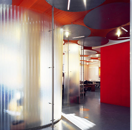
Images by Babis Luizidis.
Here's some more information from KLab architects:
--
Design KLab architecture Konstantinos Labrinopoulos and Miltos Farmakis
The challenge was the transformation of an existing industrial building, which had several construction and functional problems, into an office building for a modern and dynamic company.
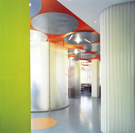
The F-zein company profile is dynamic and fresh; their activity's are diverse and quite original in the business sector of Greece.
The design of the company’s offices had to unveil their business profile, it needed to adjust the existing building to the immediate environmental context and solve all the constructional and functional problems. All of the above had to be achieved within the constraints of a very tight budget. Our main target was to create an interesting, innovative and pleasant working environment.
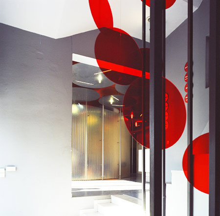
It was expected that the company would rapidly expand over the next few years and for this reason the company’s relationship with the office spaces had to be dynamic. This meant a sense of movement and a sense of instability. We wanted to experiment with low budget materials and our aim was to create something that could be dismantled and carried away in few minutes. This formed the basis of our concept and of the design proposal, which to our surprise was approved.
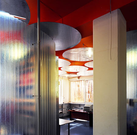
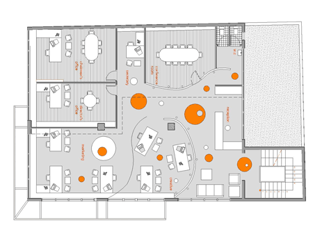
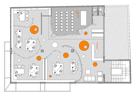
We wanted to create a sense of transparency and duality where everybody is working together and alone at the same time, a sense of a non-permanent and at the same time fixed use of space. We designed unusual curved office spaces without many doors and used a playful colour arrangement of the ceiling and fixed walls to create this.
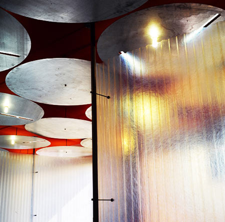
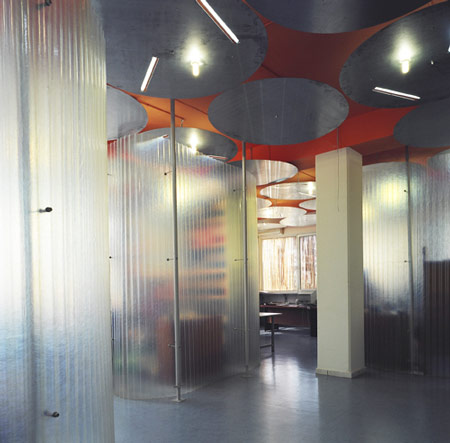
Three categories of spaces were defined and each was to be perceived in a different way. First - the dynamic open plan office area and reception. This area was defined with the curved translucent screens and an ambiguous suspended ceiling formed with grid of galvanized steel disks. Second – the fixed office spaces for managers, which were to be enclosed and private. Third – the storage area, to be designed in a more conventional way.
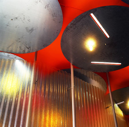
Industrial materials and systems were used to emphasize the mobility. The free-floating space was created with translucent curved partitions made from corrugated polyester rolls that produced spectacular effects with light. Substructure for the screens was formed with standard steel scaffolding poles and joints. The whole construction can be disassembled and assembled back in many different configurations.

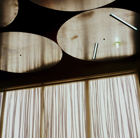
The suspended galvanized steel disks on ceiling (1.5m diameter) are fixed at only one point in their centre. They also doubled as a source of light. Three slots were laser cut within the disc, two to house linear fluorescent lights and one for a low energy consumption fluorescent bulb. This pattern of circular discs on the ceiling created an arbitrary appearance of lights in a very organized grid. The background ceiling slab was painted in bright orange to create a contrast to the galvanized metal. The suspended ceiling functions as an upside down umbrella leaving gaps to testify the presence of the electrical installations on the provocative orange background.
On the staircases we used a technique where the wall colour gets lighter as the stairs ascend, to create the effect of a light coming from above. To create another effect of presence we suspended transparent orange perspex circular discs in the void between stairs, which almost seem to fly in the empty space. With the slightest wind all these discs start to move and create numerous reflections and orange shadows on the stairway walls.
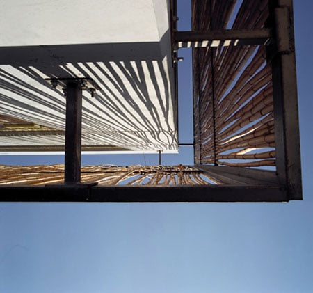
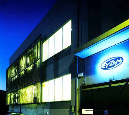
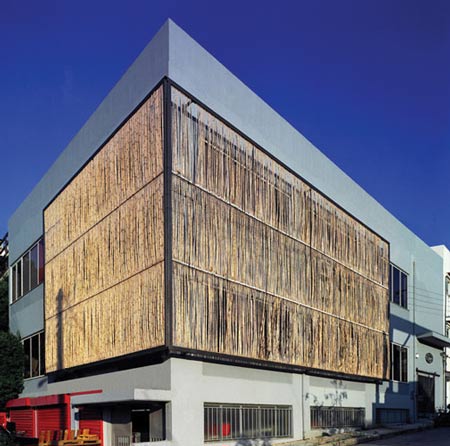
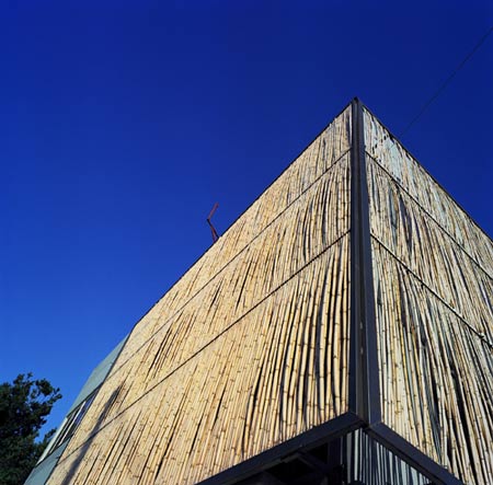
As mentioned above we also wanted to change the exterior of the existing building and at the same time provide solar shading for the offices. Again, we worked with the concept of a low budget application that related to the immediate physical environment. Our proposal was experimental: to use an external vertical sunscreen to filter the light, which was to be composed of canes locally sourced from the stream bordering the site. The canes were to be fixed to the steel sub frame with plastic joints usually used for fixing of electrical cables. The use of canes is very common in Greece, however they are normally used horizontally as additional shading over pergolas.
Once again, to our surprise, the client accepted the proposal and we proceeded with the construction.
KLab architects emphasized a fresh and experimental design with the use of unusual or common materials used in unconventional ways. The details that were produced were inexpensive and easy to construct in order to keep the budget low and the transformation of the spaces easy.
