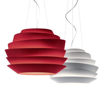
Le Soleil by Vicente García Jiménez
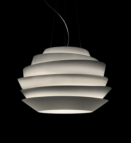
Milan 09: Italian lighting brand Foscarini launched Le Soleil by Spanish designer Vicente García Jiménez at Euroluce in Milan last week.
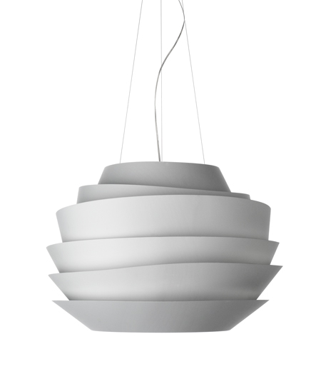
The shade is made of polycarbonate, with strips positioned to reflect light upwards and downwards.
See all our stories from Milan in our special MIlan 2009.
Here's some information from Foscarini about the whole collection launched in Milan :
--
FOSCARINI AT EUROLUCE 2009
At its traditional appointment every two years in Milan, Foscarini welcomes guests to a stand that has almost doubled in size. Using the concept of a crossroads, architects Ico Migliore and Mara Servetto have interpreted the needs of the company by creating ad hoc spaces that describe every project presented. Volumes with asymmetric edges defined by crisscrossing roads become the showcase for the new features of each collection. The large exhibition layout culminates in a central “square” from where you can enjoy a privileged view of all the displays.
In this showcase, the designers’ aim was to create “a kind of urban metaphor of a possible Foscarini city, where the central square, an open space of dialogue on the quality of light, is the fulcrum of a dynamic vision that opens onto free roads of discovery of the new products and collections.”
The distinctive feature of the exhibit lies in its external surfaces, where alternating graphic symbols, transparency and opacity create a continually changing, active landscape. High totem-like panels identify the various collections and signal the entrance to each showcase, while inside the display individual products allow a more in-depth review to better express aesthetic and functional specifics. Thanks also to video projections that run in a loop, the visitor is immersed in an atmosphere of suggestive lighting uses.
At this year’s Euroluce Foscarini once again presents a wide range of innovations. There are seven projects that demonstrate Foscarini’s constant research into materials, forms and their relation to lighting effects, so that each creation is a source of emotions.
The first example of this design approach is Tress, which represents the evolution of an experiment carried out in partnership with Marc Sadler on composite materials. Tress is a weave of threads drowned in resin, which reproduces the texture of reeds, an interweaving of light and material that evokes the warm touch of fabric, creating a highly atmospheric visual and tactile sensory effect.
Fly-Fly (designed by Ludovica+Roberto Palomba) has a strikingly graceful, aerodynamic line reminiscent of a large butterfly in flight. The result of a long research process, the suspension lamp is made of injection moulded transparent polycarbonate which spreads the light 360°.
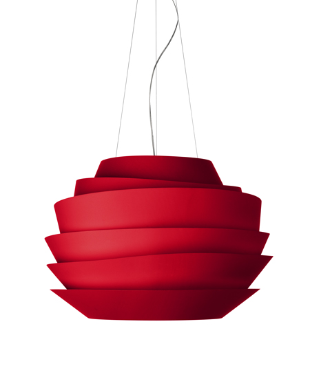
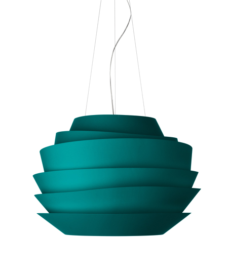
The light is also sculpted by polycarbonate – the full version this time. It shields the light and, at the same time, directs it downwards or upwards, thanks to the asymmetric strips in Le Soleil, a hanging lamp with an important volume designed Vincente Garcia Jimenez.
Another wall light, whose strength lies in its simple asymmetric lines and ability to enhance the lighting effect to the utmost, is called Flap (designed by Marco Zito). It has two overlapping aluminium surfaces of different, but coordinated shapes, with folds that project light in irregular and creative ways. It gives a perception of different planes that induce a three-dimensional effect and is a transversal design that is particularly suitable for creating dynamic wall compositions that break into “trompe-l’oeil”.
The graphic sinuously flowing and sculptural Wave (designed by Studio Baruffi & De Santi), stands out as a true crossover. It is at once a hanging lamp, a wall light and technical fixture. Created in extruded aluminium. Its body, with ellipsoid sections, collects, distributes and projects the light sources upward and through a lateral fissure. It can be flexibility used as a luminous false ceiling, or a decorative wall element and, in multiples achieves its highest level of expression.
Due to the great success of Allegro, Foscarini offers a new related range called Allegretto (designed by Atelier Oï). with reduced dimensions. A reinterpretation of its forms, starting with Allegro’s volumes, allows it to be used in the home and to reinforce its presence in the contract sector.
One timeless classic on the design scene, Lumière designed by Rodolfo Dordoni for Foscarini around twenty years ago, has been updated in an XXL version. Lumière XXL features new dimensions, new geometries and new colour combinations. The lamp stands out due to its strong lines, while retaining all the harmony and language of the original.
Also this year, the complete nature of Foscarini’s product range can be seen in the number of lights offered and their appeal. As these latest products once again demonstrate, Foscarini, places special focus on technological innovation in materials and production methods and continues to express its great versatility through strong, dynamic design creativity and unusual sources of inspiration.