AKbank NV headquarters by dagli + atelier d’architecture
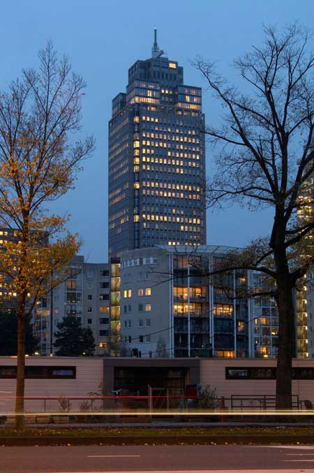
Luxembourg practice dagli + atelier d'architecture have completed the interior of AKbank NV's Netherlands Headquarters in the Rembrandt Tower, Amsterdam.
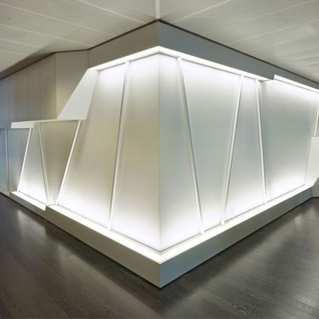
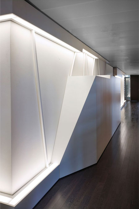
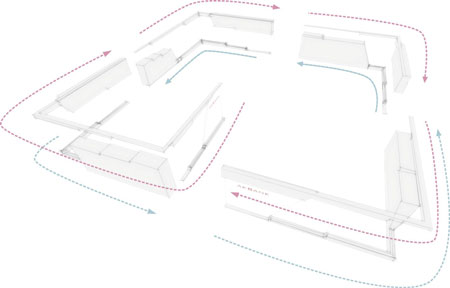
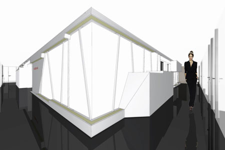
The design focuses on the concrete core of the building, creating a sculptural scheme following the "windmill principle" - upper elements rotate clockwise, lower elements rotate counter-clockwise - leading visitors around the office.
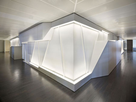
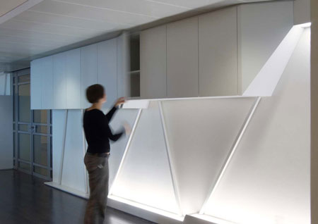
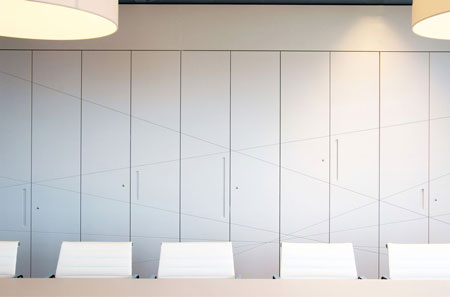
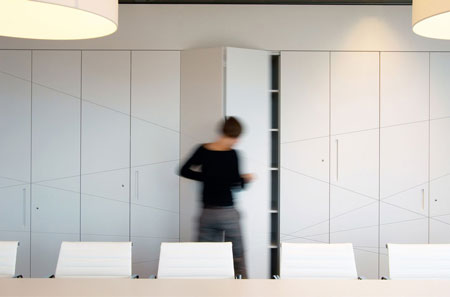
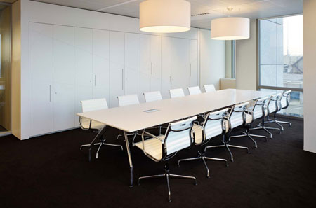
Integrated storage for both visitors and employees act as landmarks around the core.
Here's further information from architect Mathias Eichorn:
--
dagli + atelier d’architecture is a young Luxembourg based contemporary architecture and design firm.
This project is the interior design of the Netherlands Headquarters of AKBANK N.V. in the high-rise Rembrandt Tower in Amsterdam.
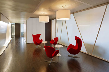
As concept for the design, the architects concentrated on the concrete core of the building and created a sculptural element. The element follows the core wall and generates swollen-out elements arranged based on the windmill-principle. Upper elements rotate clockwise, lower elements counter-clockwise.
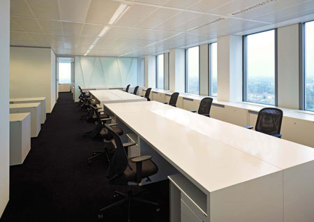
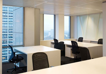
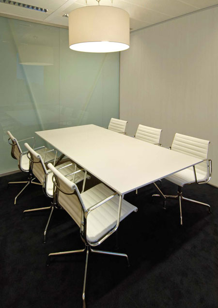
The offices are arranged around the core separated with glass screens to keep the core element as a visual reference.
During the design process, it is most important to us to research the identity of our client, to analyze it and to merge it together with the architecture into a unity.
The building, the utilization and the identity (the image) of the client become one, the architecture with its shapes and colors transports must create a sovereign - professional image (representation) to the exterior. Thereby the value of the realty as well as the corporate Identity of the client gets boosted.
Designing the floor, we used the core with its original function, the vertical access, creating a self-contained sculpture that represents a visual benchmark and leaves the function for the users visible.
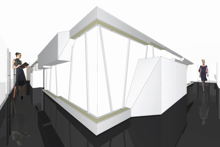
The materiality of the core object is generated with the use of horizontal stripes or bands that are bordering the object.
This bordering is amplified with slightly inclined square sticks. This combination of shapes and forms with its depth and different layers of material finally creates a fully self-contained object, the core object.
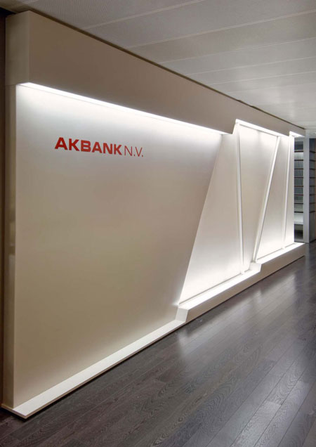
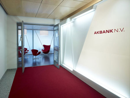
The sculpture starts inside the core with a self-illuminated logo-panel, dragging visitors to the lobby of the agency. From there it follows the complete 360° around the core wall and finally ends with another smaller logo-panel in the lobby.
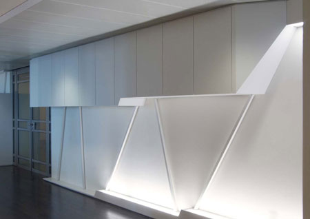
The illuminated bands of the sculpture grow and swell at some places, following a wind mill like formation. The lower elements rotate clockwise, the upper elements counter-clockwise. The elements integrate cabinets in order to amplify the core sculpture’s guiding function throughout utility.
Therefore the biggest elements just next to the main and side entry integrate wardrobes for visitors and employees. Smaller elements all around the core provide room for archives and office supply.
Through the use of these functions, i.e. taking off the coat as the first gesture entering the floor, the core object becomes subconsciously an orientation guide and benchmark.
At dagli+, we believe that a consequent design gives the firm with its employees the opportunity to identify itself through the design, which finally leads to a valorization of the realty.
A consequent design means for us to create and develop an architectural concept for the building and the design objects. It is crucial to make this concept readable for the public.
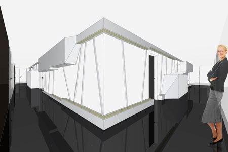
That’s why we realized the AKBANK agency using the unitary color and shape concept, that generates with its neutral colors and shapes a modern-calm, sovereign organized impression.
The fusion of the corporate identity, the design, furniture and employees creates a convincing new identity of the AKBANK for the public.
Project Info:Completion: Nov 2008 (March 2009)
Floor area/size: 1000 m2
Cost: € 650000,-
Architect: dagli + atélier d'architecture, Luxembourg.
Project architect: Mathias Eichhorn.
Client: Akbank N.V.
Location: Amstelplein 1, 1096 HA Amsterdam, Netherlands
Function: office