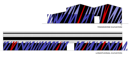
X Block by Planet 3 Studios Architecture
Indian architects Planet 3 Studios Architecture have refurbished a warehouse to create new facilities at Vidyalankar Institute of Technology in Mumbai.
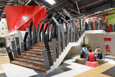
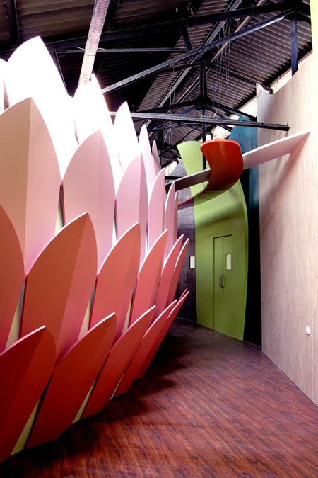
The existing structure was given a new skin and interior, which features a lotus flower-shaped learning centre.
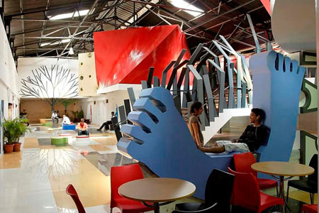
"The design borrows heavily from the language and forms of nature," says Kalhan Mattoo of Planet 3 Studios Architecture.
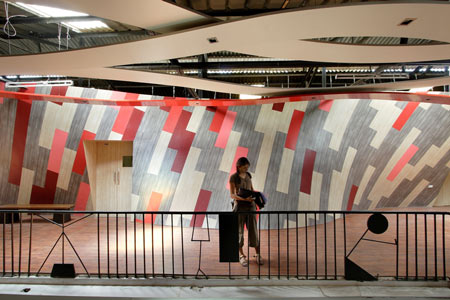
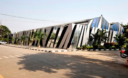
The building's skin is intended to evoke "the sway of tall grass stalks up-close in strong wind" and shelters a patio connected to the canteen.
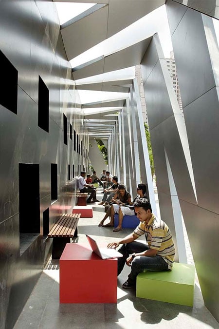
The building includes laboratories, a learning centre and canteen.
Photographs are by Mrigank Sharma, India Sutra.
Here's some more information from Planet 3 Studios Architecture:
--
X Block, Vidyalankar Campus:
Taking forward the progressive education agenda of the institute, this significant new addition to a larger engineering college campus is an adaptive-reuse through interiors of a pre-existing industrial structure that has been retrofitted into a very unusual learning facility. Enthused by the success of their earlier designed building, the educators and the students unanimously elected to have us design this additional 35,000 sq ft space.
The program dictated multiple learning spaces and labs that would develop into an independent bio-technology and life-sciences centre. Located across an internal campus street, this structure directly faces the larger institute but defers in scale and significance. A post occupancy study of the earlier building provided insights into what was appreciated and accepted by the end users.
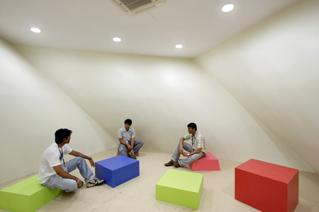
We decided to push the envelope further with more design interventions that challenged accepted notions of educational facility design. In a sense, this building is an intellectual and physical extension of the earlier facility. As before, the focus remained on the needs, wants and aspirations of the students and educators who were to inhabit and accept it as their own.
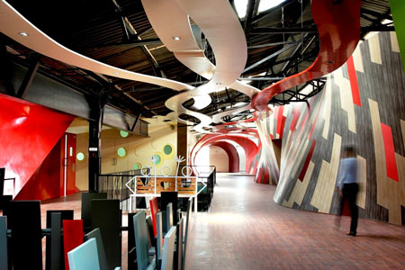
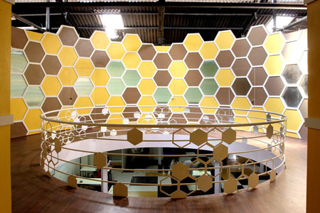
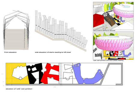
Gutted of its core, the bare shell received a mezzanine floor supported on an independent steel structure. Partitions and elements of lightweight interior materials bend, twist and turn to become large student work displays, graffiti strips, light sources, whimsical lotus petal cladding over a learning centre, colourful organic patterned laminate skins, ventilators as signage letters, a couple of Peepul trees with a hammock to hang in between, large leaf like partitions, cellular screens and more.
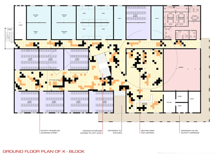 x
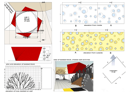
xThe design borrows heavily from the language and forms of nature and the graphic quality of most constructs reiterates its intended use. A staircase with a railing evoking frayed, dried wheat stalk rendered in wood and steel, a meeting room with a twist, game board near the entrance and strategically punctured roof with skylights illuminating the interior corridors, outsized letters that write café and define separation between canteen and passageway, all reiterate the unique nature of this facility.
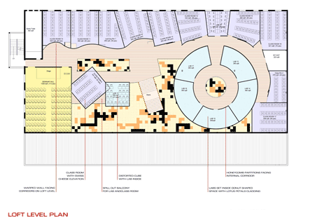
While some elements are directly resonant of intended use like leaf and cellular partitions, others, like the lotus centre allude more obliquely to latent Indian symbolism…seat of learning and lotus is one such AHA! association that we expect the end users to discover on their own. We added a building skin that evokes the sway of tall grass stalks up-close in strong wind. This skin wraps over an external patio that serves as a partially shaded public space. The intention was to ease the transition between inside and outside and continue the interior public space energy to the building exterior. With street furniture, service from canteen and WI-FI facility, we expect it to be another space that students will accept as their own. At night, the colored glass punctures opening from the canteen and reflective skin surface will add a bit of drama and turn this into a really exciting college to learn and hang out in.
We hope that this project will go on to establish the fact that building typologies have to evolve to keep pace with changing needs and design can truly contribute towards communicating and establishing progressive ideas. There is after all no better proof of intention that the built form.
Location:
Wadala, Mumbai, India
Planning (Facade):
Dec ’07 to Feb’08
Planning (Interiors):
Sept ’08 to Nov’08
Construction (Facade):
May’08 to Oct’08
Construction (Interiors):
Dec’08 to Feb’09
Area:
35500 square feet.
Cost of construction:
USD 1 million
Delivery:
Design Consultancy.
Architects:
Planet 3 Studios Architecture Pvt. Ltd., www.planet3studios.com
Design Team:
Kalhan Mattoo, Santha Gour Mattoo, Rashmi Pachgade, Aditi Gautam, Biswarup Roy, Kanwal Kapoor
Photographer:
Mrigank Sharma, India Sutra
