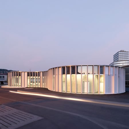
Mensa Triangle by SOMAA
Architects SOMAA of Stuttgart have collaborated with Guido Dongus to complete a canteen between two schools in Leonberg, Germany.
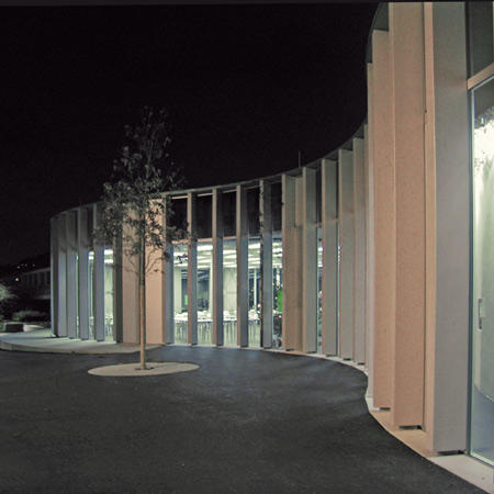
Called Mensa Leonberg, the new structure connects three existing buildings on the site.
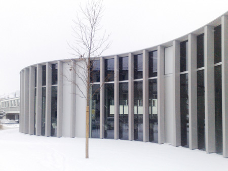
The undulating facade features narrow alternating vertical strips of columns and full-height windows.
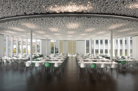
Asphalt flooring surrounding the building continues to the interior.
Here's some more information from SOMAA:
Mensa Leonberg
SOMAA. and collaborator Guido Dongus, would like to announce the completion of the new Mensa in Leonberg, Germany.
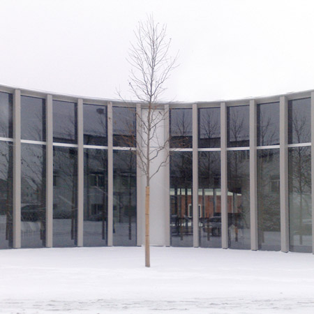
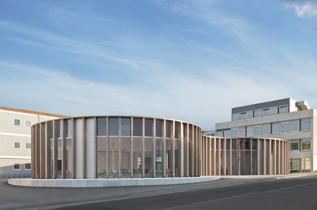
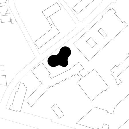
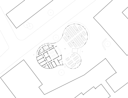
The new Mensa Leonberg is a shared cafeteria between two neighboring schools in downtown Leonberg. The building is situated between the street and three existing buildings and consists of three circular volumes fusing together to become one undulating form. This configuration separates itself from the existing, arbitrary urban plan and defines the space in between the existing structures. This creates a cohesive link between the two schools while also designating itself as a central meeting place.
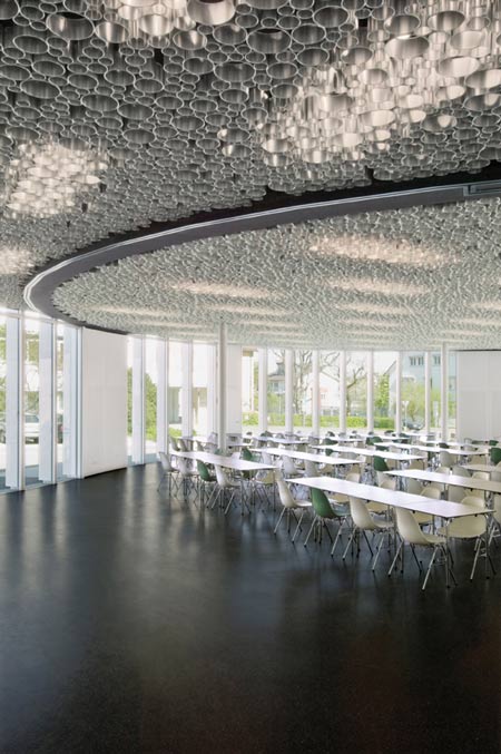
The building creates several interior and exterior zones that are used to fulfill the various social needs of the two schools. These interior and exterior zones converge and blur the division between outside and inside. This is evident when one looks at the materials used for the flooring. The dark asphalt surrounding the building continues into the interior through the entry and, thus, combines the external and internal circulation spaces.
The internal circulation contains the main entrance, the dining counter and queue, and allows for continuous movement between the three core functional spaces. Within these core spaces are two areas for dining and meeting, and a third space for food preparation and other necessary services. By joining the core spaces in this way, the total area of the building is minimized, but allows for a flexible use of space and a generous area for circulation.
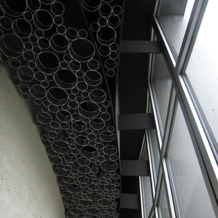
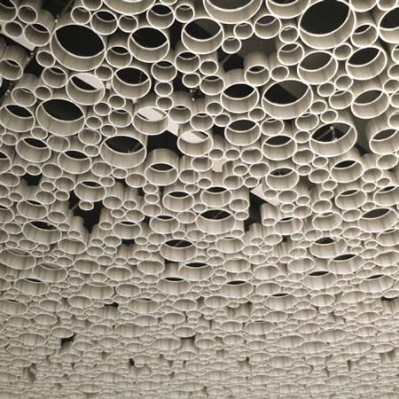
The special zones created by the internal functions are also reflected in the interior materials. On the ceiling, black bands mimic the circular forms created by the building shape. Within these black bands, small, cylindrical, aluminum tubes of differing circumferences were used to create a drop ceiling that disguises the artificial lighting above.
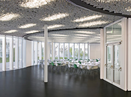
Moveable partitions also follow the circular forms within and allow the two dining areas to be closed. This further clarifies the function of each zone and its relation to the overall building shape.
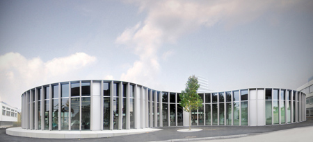
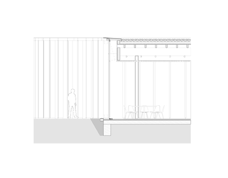
On the exterior, the façade consists of a system of open and closed floor to ceiling panels paired with exterior wooden supports. Here the rhythm of the vertical columns reinforces the undulating form of the building and the open glass façade creates a visual connection to the outdoors.
Click for larger image
The shape and orientation of the building was designed to maximize solar gain and for this reason the southern and eastern sides of the building consist of the main dining areas and have an almost entirely open façade.
Click for larger image
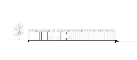
The generous amount of natural light that is created by the open façade allows for the relatively small use of artificial lighting and contributes to making the space feel open.
Click for larger image
Natural ventilation was also incorporated into the façade and is used in combination with a mechanic ventilation system. By optimizing the relation between façade area to ground surface, loss of temperature is also minimized.

Click for larger image
On the western end of the building, the façade is closed surrounding the service core, and skylights are used to provide natural light for work spaces. By using a regular façade in this way, the elements needed for construction could be simplified and a large amount of the construction could be industrially prefabricated
Click for larger image
The simplicity of the building form is then tectonically expressed with in the construction and overall design. By uniting these elements, the building gains clarity and functionality that was beneficial in linking the two schools.
See also:
.
 |
 |
 |
| Yellow Submarine canteen by Tulp Design |
Key projects by SANAA |
More architecture stories |