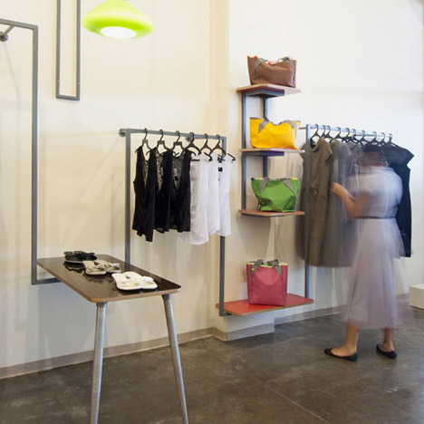
Ahoti by Studio Lama
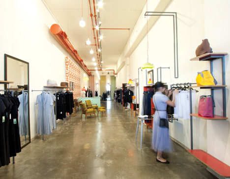
A continuous grey metal bar winds across the wall of this boutique by Israeli designers Studio Lama.
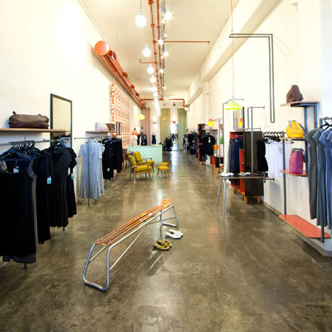
Called Ahoti and located near to Modi'in-Maccabim-Re'ut, Israel, the shop sells clothes and accessories by local designers.
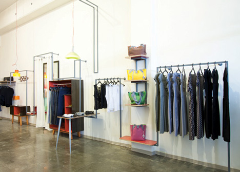
The front part of the space displays new collections on rails and furniture linked by the grey rail, while the rear of the store is more densely filled with older collections.
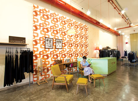
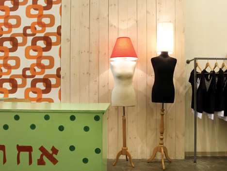
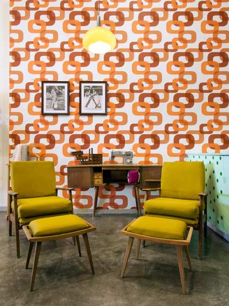
A green cash desk with white polka dots divides the two main areas, accompanied by a block of retro wallpaper framing a seating area.
Here's some more text from studio Lama:
The Israeli "Studio-Lama" has finished its latest project – the fashion shop "Ahoti", located in a small village next to the city of Modi'in."Ahoti", literally meaning "My sister" in Hebrew, is a shop which trades in local designers clothes and accessories.
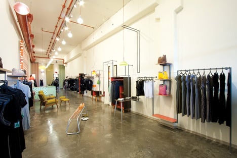
The store's space has long and narrow proportions with a smoothed down concrete floor. These give it a distinct kind of warehouse character, an atmosphere the designers, Eitan Gigi and Ofer Dahan, wanted to preserve as part of the shopping experience. Primarily because of the store's location out in the province and not in an urban district the proportions and sizes of the space were kept intact.
The store is divided into two areas. The new collections zone, which takes up most of the shop's space and holds a small quantity of merchandise, has a clean appearance and posses a large physical space to contribute to a pleasant shopping experience. The second zone is situated deep within the store and deals with former collections and surplus. Here the designers created a visual excess and an overabundance of goods go give an inexpensive feel as well as differentiate and contrast the two areas within a single open space.
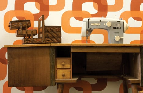
The store, as can be seen, was designed in vintage style, expressed through the choice of furniture, coated in glossy wooden texture Formica, wallpaper characteristic of the period, changing room drapes etc. The store's color palette is base upon subtle hues for the large scale surfaces combined with bold color touches such as the ceiling components colored red, 70's styled lighting fixtures, the color of the shelves and other elements in the interior.
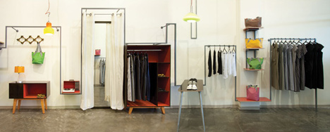
The merchandise too plays the same game – most of it is monochromatic but some goods, mainly accessories, are vivid in color. Together with the colors of the store itself – a whole scheme arises, a gentle and diverse grand picture, yet a pinch cheeky and interesting. The store's entire display is based upon a rectangular metal profile painted dark grey, such as the main metal element in the panoramic picture. This metallic lining is supported by the store's walls, ascends and descends at different rhythms. All the while it incorporates within it clothes displays, accessories shelves and a 70's styled table – with two aluminum legs – showcasing shoes. It follows to include a whole complex comprised of a closet, mirror partly concealed by cream colored drapes, a bookcase with a clothes hanger and a box of drawers. All these elements together merge to portray a cozy environment story more then to exhibit a typical clothes store display of merchandise on regular shelves.
The last area is the sales zone, located deep with in the store and dividing between the two zones - the new and former collections. It is composed of a pastel green counter decorated with green spots, elements taken from the store's logo. Behind the counter is a back wall covered mostly with wallpaper leaving a smaller portion coated with white matte pinewood. This backdrop emphasizes a pair of lighting fixtures based on a clothes display torso with a wooden foundation.
See also:
.
 |
 |
 |
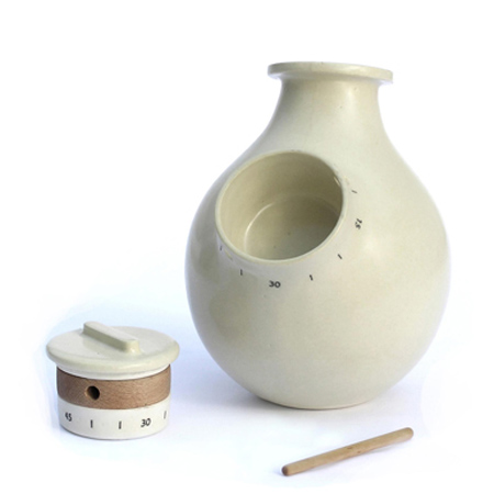
| Vase and kitchen timer by Studio Lama |
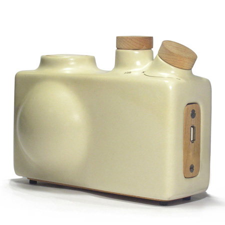
Ceramic radio by Studio Lama |
More interiors stories |