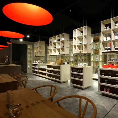
smith&hsu Teahouse by Carsten Jörgensen
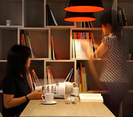
Jars of tea and second-hand books are separated in stacked wooden cubes at a Taipei teahouse.
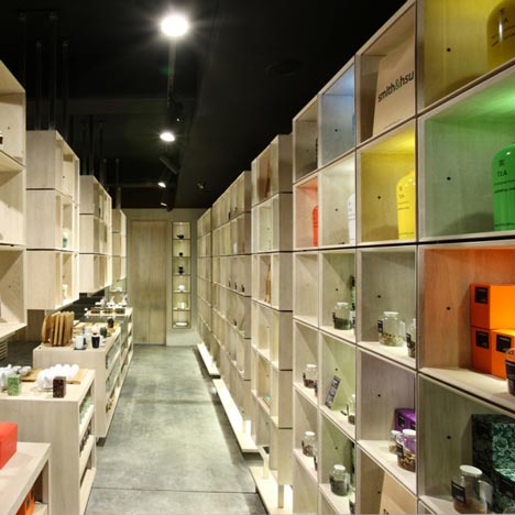
Designed by Swiss-Danish designer Carsten Jörgensen for Taiwanese tea brand smith&hsu, the two-storey teahouse has product displays and wooden furniture on the ground floor, while a dining room occupies the floor above.
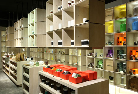
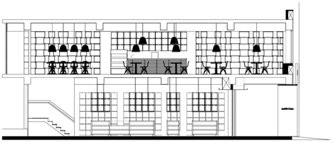
The wooden display boxes downstairs are arranged into grids along one wall, with some suspended from the ceiling.
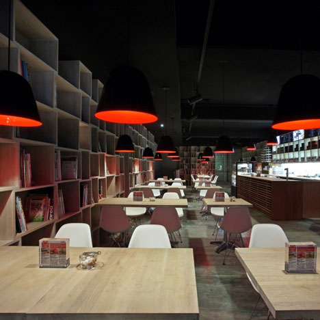
Upstairs, the cubes line every wall and are diagonally staggered with gaps in between.
See some more interesting teahouses on Dezeen, including one made of cardboard by Shigeru Ban, by following this link.
The following text is from smith&hsu:
smith&hsu Tea House, Where Tea and Design Meet.
smith&hsu is a contemporary tea brand based in Taiwan. Its premium loose teas, collected from around the world, are a testament to its deep passion for both Chinese and British tea culture. Beside its carefully assorted tea collection, smith&hsu offers a wide range of beautifully designed tea tools and homemade gourmet food.
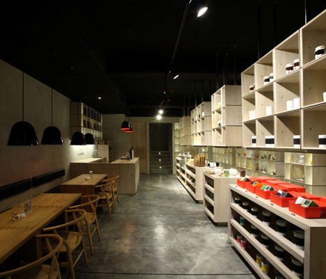
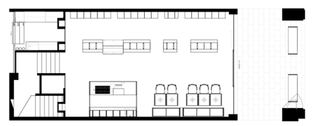
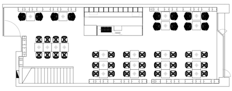
smith&hsu's teahouse on Nan Jing East Road in Taipei is the 5th and latest addition to the brand. Envisioned by Swiss / Danish designer Carsten Jörgensen, the new teahouse has two floors seating 48 guests in the upper dining area and 10 guests in the spacious lower tea shop. It carries minimalistic tea tools exclusively created for smith&hsu and its outstanding teas.
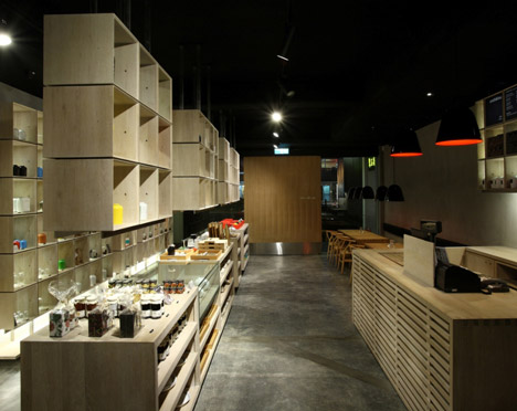
The wood and concrete interior feels authentic. The materials chosen for the store reflect the subtlety of a great tea and trigger the guests' aesthetic sensibility. In keeping with modernistic principles of visual clarity and simplicity, Carsten Jörgensen has created a wonderful framework for experiencing quality teas. The teahouse's ascetic yet warm charm has a calming effect even after one of those long and stressful days.
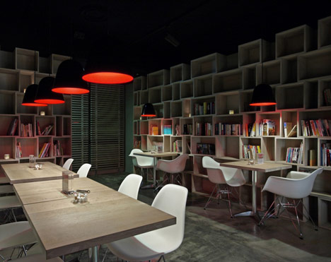
As an extension of the design for the previous smith&hsu teahouses, the key elements of the new store are "soil" and "wood". The store's concrete surfaces display a subtle spectrum of grayish, bluish, yellowish and brownish colors.
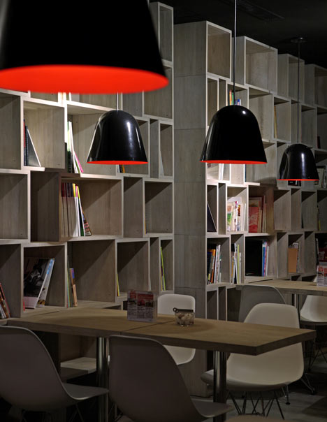
Concrete walls and floors add an earthy feel, whereas the wood gives the store a sense of organic warmth. All the materials smith&hsu has used for the teahouse feel refreshingly raw and uncluttered.
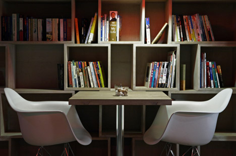
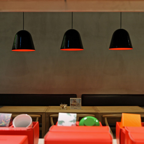
The cubic wooden tables, counters and shelves are simple and unpretentious. On the first floor, Y Chairs by Hans J. Wegner and on the second floor, Eames Plastic Side Chairs by Charles & Ray Eames complement each other and the cubic furniture well. Both are epitomes of the "designer chair" and both are exceptionally beautiful.

The sensuousness expressed in the Eames chair, its elegance and comfort, seems to have made it a perfect match for smith&hsu. Moreover, the inclusion of these two iconic chairs is a sure sign of the brand's desire to bring only the best to its customers.
Bookshelves made of piles of wooden cubes run around the walls of the entire second floor, creating an open library for smith&hsu's guests. The books come from the customers themselves and from a few generous donors. The tea and the books, the concrete and the wood somehow all make sense together in this great looking new teahouse.
smith&hsu has managed to combine asceticism with homeliness and the result is best described as something akin to wisdom.
Designer: Carsten Jörgensen
Area: 172 sqm
Completed Time: May, 2011