BoxBag by Casey Ng
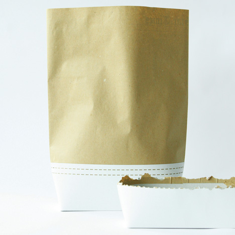
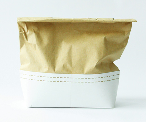
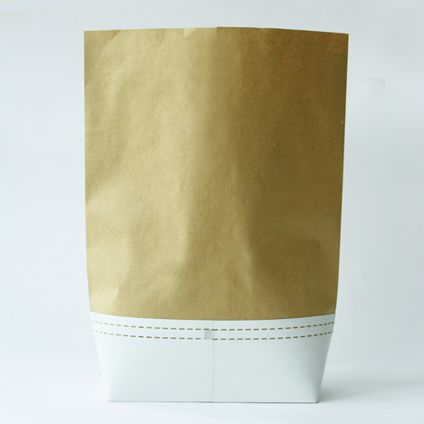
This take-away packaging by Casey Ng combines a paper bag top with a rigid carton for the base.

A perforated tear-off strip indicates where the parcel should be ripped open and shared.

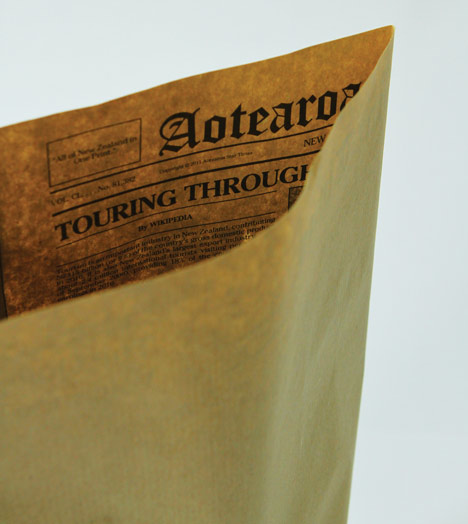
Casey Ng designed the packaging for fish and chips served up in New Zealand, and the inside is printed with newspaper-style graphics about local scenery.

See more stories about packaging on Dezeen here.

Here are some more details from the designer:
Project: Food Culture (Packaging)
New Zealand has attracted more and more people from around the world, either for a short visit or to live. New Zealand is renowned not only for its beautiful landscapes and its sandy beaches but also for the out door lifestyle. In this project, I wanted to design a product that best captured those New Zealand assets to the international market.
Fish and Chips have been part of New Zealand culture for many years and is known as a dish icon of the nation. Whatever the origin, New Zealanders chomp their way through about seven million servings of chips a week, or about 120,000 tonnes a year. Fish and chips shops are established on every street and have become part of the New Zealand lifestyle.
My study project Boxbag, is to explore and introduce the tradition of Fish and Chips and inform the consumers the best of New Zealand. The tradition of this dish lies in the process of unraveling the newspaper packaging into a open dish to share between friends and family and eating in an outdoor location.
As traditional as fish and chips, the food presentation hasn’t really changed much over time. Traditionally, the Fish and Chips packaging is a two-step wrapping process of plain white newsprint and then newspaper. The packaging is cheap, easy to be wrapped and unwrapped, with minimal preparation but provides sufficient insulation and soak up the excess grease. The BoxBag is a combination design between a paper bag and a carton incorporating all of the traditional fish and chips packaging factors and evolving for the modern day consumer. The process of this design uses one sheet of plain newsprint to wrap the Fish and Chips and is then placed into this BoxBag, providing insulation and freshness. The packaging is purposely designed taller than a typical paper bag, encouraging the consumer to rip the bag open. Once the packaging is ripped, it will reveal the custom designed newspaper on the inside. Each article on the newspaper introduces the best of New Zealand landscapes, providing anecdote and information to the consumer whilst eating.
The BoxBag is also designed with consumers who like eating on the go in mind. The tab located at the back, linking to a decorative perforation, circulates around the BoxBag. This aesthetic and functional perforated line allows the consumer to rip around the whole packaging and turning it into an open carton. This method not only provides convenience to the consumer but also encourages the ripping tradition of Fish and Chips.
The form uses a combination of two materials of paper and cardboard not only to provide an interesting contrast between materials but provides better insulation and support for these dual consuming purposes. The packaging is flat packed prior to being used, minimizing space for the restaurant, and a generic size design allowing restaurants to fold multiple times, up to the size necessary to seal the amount of food within the packaging.
Moreover, the packaging is made to be disposed easily, like the traditional packaging of Fish and Chips. So once the consumer has finished with the Fish and Chips, the consumer can simply dispose the BoxBag. Not only does fish and chips provide a Kiwi experience to the tourist industry, now it will also tell a story about Aotearoa.