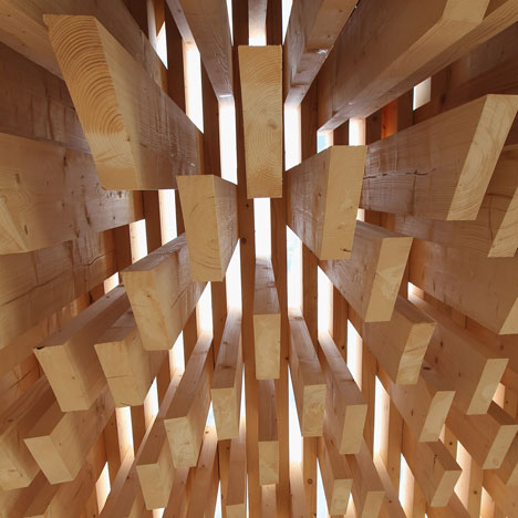
Genesis by David Adjaye at Design Miami/
Visitors to this year’s Design Miami/ fair could climb into the hollow belly of a wooden pavilion by architect David Adjaye.
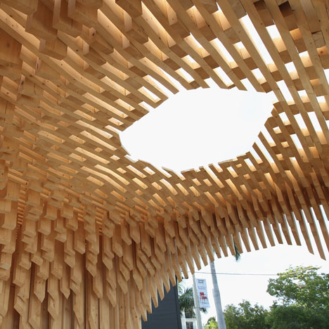
Adjaye was commissioned to create the installation after being named Designer of the Year by the festival back in September.
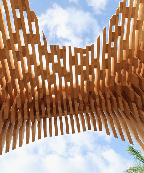
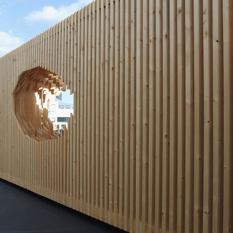
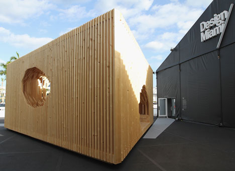
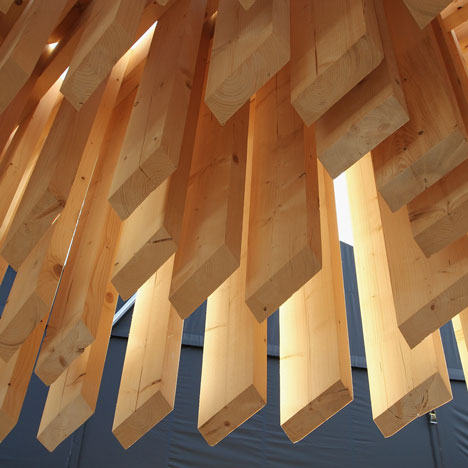
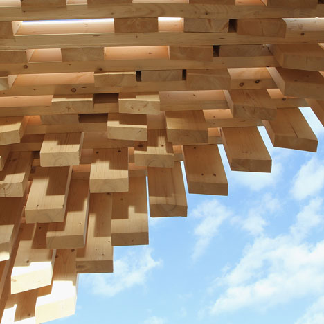
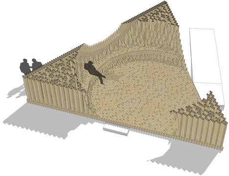
The temporary triangular structure was located at the fair’s entrance and comprised a framework of timber blocks slotted together.
The central hollow punctured the pavilion on every side to create oval openings framing views of the surroundings and sky.
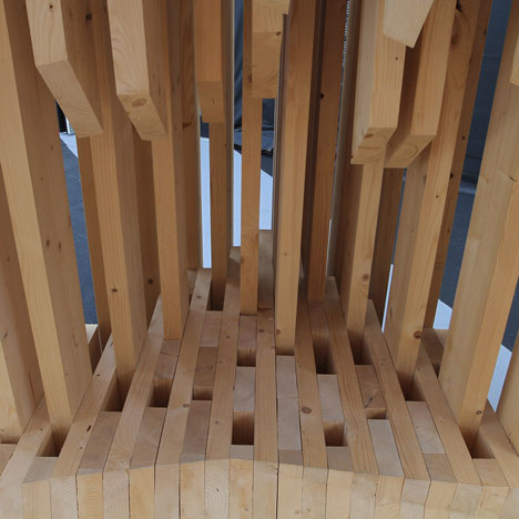
A secondary timber framework also slotted inside the structure to form a bench.
Previous pavilions have been completed by designers including Zaha Hadid, Marc Newson, Maarten Baas and Konstantin Grcic, whose network of hammocks you can see in our story from last year's festival.
Photography is by Alexander Tamargo.
Here's some more text from Adjaye Associates:
Genesis Pavilion
Design Miami/ Commission, 2011
Designed to provide visitors with an immersive experience, Genesis is a complete environment, which integrates enclosure, aperture, views, respite, meditation and community.
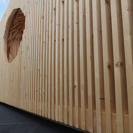
Like a giant piece of architectural furniture, the Design Miami/commission has enabled Adjaye to combine structure, seating, window and doors into a single gesture for the first time.
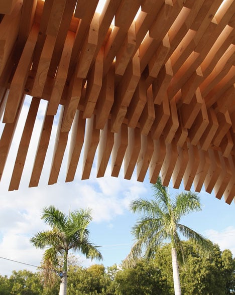
The pavilion is a triangular prism measuring 10m x 10m x 10m x 3.6m, located at the entrance to the fair. It leads visitors to the courtyard space upon arrival, ushering people inside.
It is also the point of departure, and is a final gathering space as visitors leave the fair, with its curved window offering strategic views of the galleries.
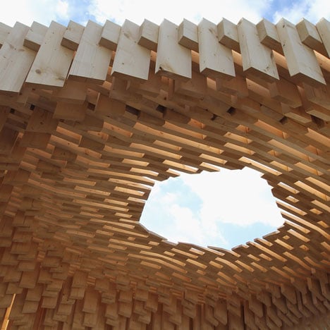
Comprising a series of timber frames that form the roof, flooring and walls, these elements work together and through compression, provide the overall structure.
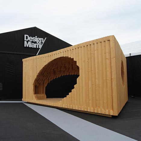
The internal space is formed by carving out an oversized ovoid shape from the centre.
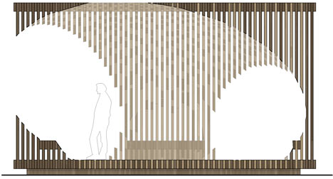
This distorted shape is set at an angle and abuts the perimeter to form the exit, entrance and window.
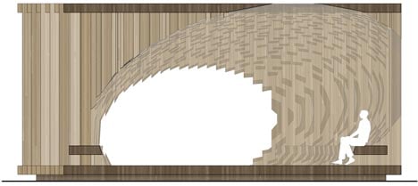
The seating is established by a secondary subtraction from the interior – which repeats the distorted ovoid, creating a platform along the cut-away timber frames.
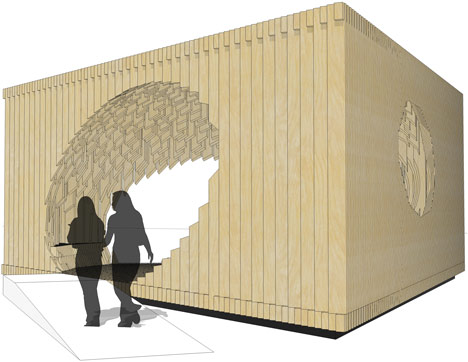
While compressed and joined together with additional filler pieces, the timber frames are not completely fused.
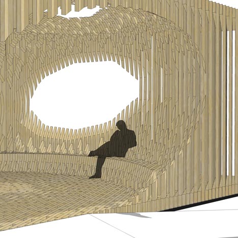
This allows light to filter inside from the exterior and roof, providing a dynamic filigree of light and shadow.
Light is further brought inside via an opening in the roof, which acts as a dramatic light well.