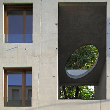
8 dwellings, 4 artist studios and 1 retail area by Charles-Henri Tachon
This concrete social-housing block in Paris has artists' studios on the ground floor and an oval-shaped opening in the roof.
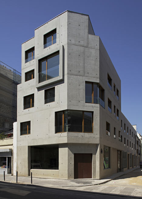
The building, which contains eight apartments, four artists' studios and a corner shop, was completed by French architect Charles-Henri Tachon in 2010.
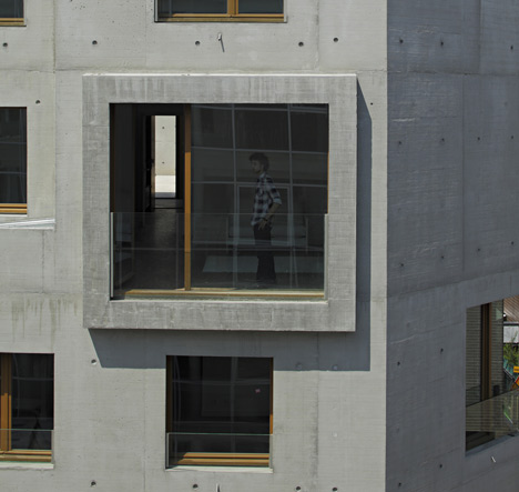
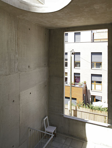
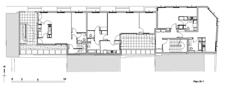
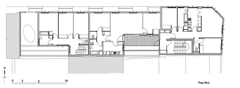
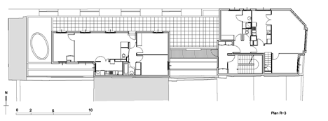
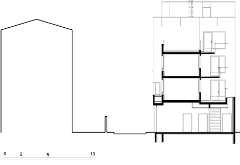
The oval-shaped void is located above the private entrance staircase of one apartment but is visible on the building’s facade.
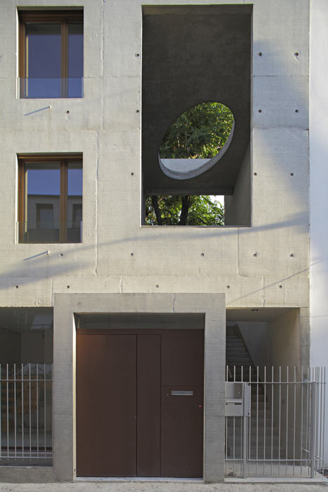
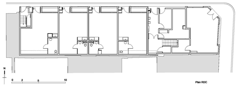
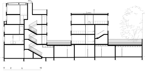
Residents of the remaining seven apartments enter via a second staircase, which is situated between the north-facing studios and the shop.
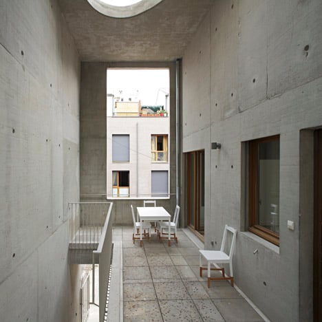
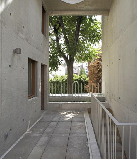
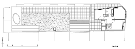
Some of the apartments have balconies, while two have access to private terraces on the roof.
Other projects we've recently featured from France include a Corten-clad library and a water-sports centre with a roof of undulating waves - see them all here.
Photography is by Kristen Pelou.
Here's a little more text from Charles-Henri Tachon:
8 dwellings, 4 artist studios and 1 retail area. Rue du Nord. Paris XVIIIème
This building constructed entirely in concrete, is based on three fundamental objectives. Constructed entirely in concrete, this building lies on reinforced foundations and is grounded on three fundamental objectives.
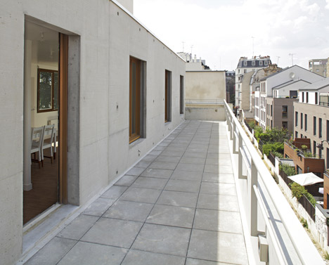
The first objective relates to the designation of Social housing. The word « social » is essential as it indicates the ability of a residential building to create social cohesion and exchange between its residents. Sociability relies on the idea of recognition. At one hand recognition is, in a topographical point of view, a matter of discovering ones surroundings, including the perception of the surroundings from ones own apartment.
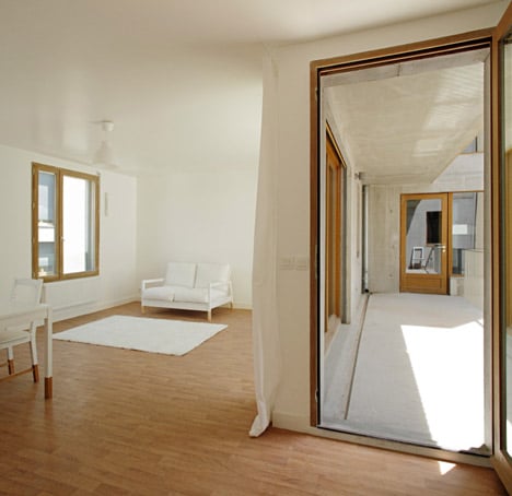
In this building even the smallest apartments have a variety of views to the outside. The diversity of the views provides a better understanding of the surrounding environment.
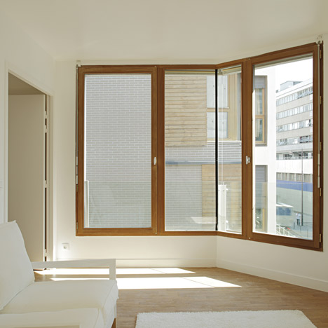
At the other hand, recognition does also include the recognition of others, to be a part of the city and to interact with the city. Every housing unit expresses itself in the façade and is quickly recognised in the neighbourhood as “the one with the large window”, “the one with the terrace” or “the one on the roof”. Each resident becomes hereby an essentiel part of the building itself through his housing unit, and by this also a part of the neighbourhood and the city. This is already a form of social recognition.
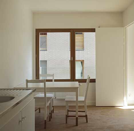
The second objective is the uncompromising work with the plans of the housing units, which were the first priority during the entire work. There can not be any compromises. A pleasant house is not only a spacious house, it’s a house that offers more. More space than it has surfaces, more functions and habitability.
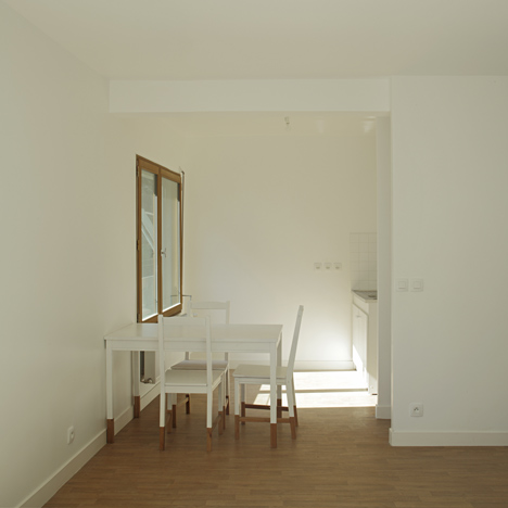
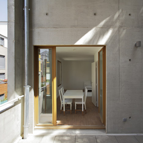
In order to achieve spatial expansion and variety, diagonal views were created to provide transparency and complexity, sequences of continuously spaces, and a wide range of different interiors. Balconies and terraces were designed as directly extensions of the indoor living rooms, and to be spacious enough to become comfortable and useable outdoor living rooms.
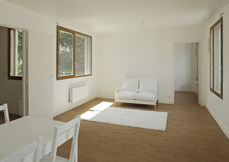
A pleasant house is also, simply a house with natural light in every room, including kitchens and bathrooms. As we found it improper to place the bathrooms on the facade side of the housing units, glass fanlights were used in order to provide indirect natural lighting.
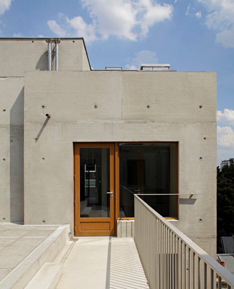
Finally, a pleasant house, is a house that shows that the architect has been concerned about the details : the tiles for the bathrooms, the form of the sinks and to choose just the right faucets - and yet always with an awareness of the context and the financial latitude. The shared spaces are spaces shared between neighbours who provide a common identity. The shared spaces where payed much attention, in the same way as each housing unit. A variety of ways to realise the different details and solutions where used, to show that even with a small budget, it is possible to pay attention to, choose and design each element. In other words, a great attention was payed in all scales of the project.
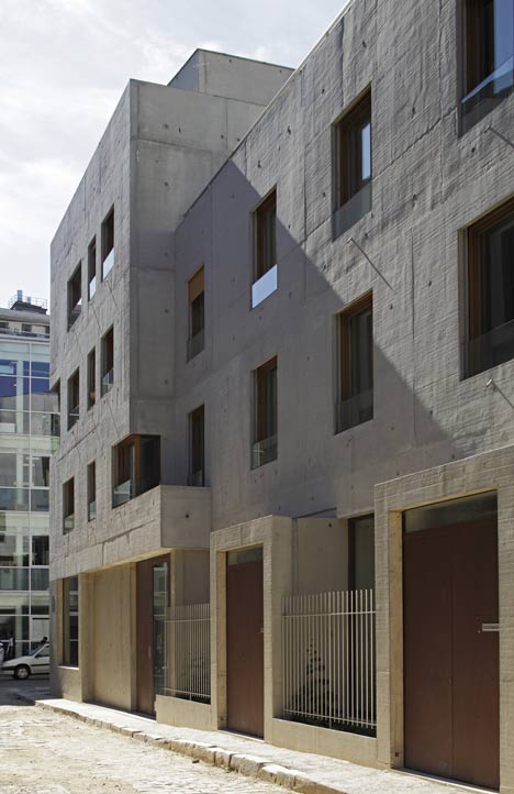
Moreover classical details has been reinterpreted as a part of the project. For example, the traditional Haussmanian staircase carpet has been here turned into a black painted lining on the raw concrete stairs and its white negative lines the underside of the flight of the stairs.
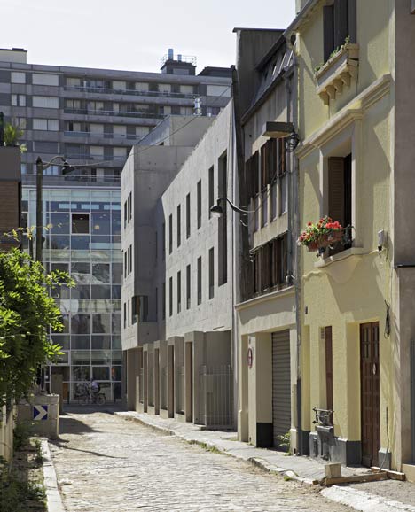
This brings us to the last but not least important objective: the act of architecture is a plastic act. Our work is focused on the relationship between a space and the construction of this space. The methods of construction, the materials, the forces, all these take part of the act of architecture. This is why concrete was chosen, as it works in tension and compression at the same time. Its implementation without visible joints gives the impression of a monolythic mass, and turns the building into a unit from which nothing can be extruded. The building is all about structure. Its design reacts to the context of the street.
Click above for larger image
Set backs of certain parts at the corner of the façade, contribute to make the building rise and appear more dilicate, and it reminds us at the same time of the particular urban situation.
Click above for larger image
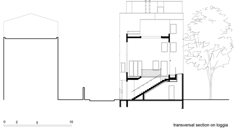
Further down the rue du Nord, the building adapts the sourrounding volumes. While on the ground floor the artists studios front doors are aligned with the property line, the upper floors set back in order to create a longer distance to the building on the other side of the street, as the street is only 4,80 meters wide.
Click above for larger image
To accentuate the sculptural appearance of the building, every detail has been designed to reduce the distance between structure and space. For example, exterior railings were designed as simple glass sheets attached with lateral U-form steel profiles, the windows were conceived in order to include the shutters into the masonry, instead of the traditional steel windowsills, a concave drain has been shaped into the concrete to collect rainwater and evacuate it thanks to a simple stainless steel drainage, and all the ironwork has been embedded directly into the concrete without any platinium fixations.
Click above for larger image
The traditional finish is no longer necessary as it has been conquered by the clear structure and materials.
Click above for larger image
Artist studio/Housing
One is seeking for a constant light and the other wants the warmth from the South. One needs liberating heights, the other searches intimacy and at the same time various and wide views. The artists studios are located on the ground floor, facing North and enjoying a high volume (the city master plan imposes a height of 3,5 meters)
Click above for larger image
On the upper floors on Rue du Nord (2 two bedroom apartments, and 1 four bedroom apartment), secondary views to the South were achieved thanks to double-oriented living rooms opened to terraces.
Click above for larger image
At the corner of the streets (2 two bedroom apartments and 1 five bedroom apartment), the apartments benefit from beeing oriented to both North and East and enjoing a clear view down the rue des Poissoniers.
Click above for larger image
Just like a house, the four bedroom apartment has an individual access and a double height terrace, enabling light from the South to reach rue du Nord through the building...