Stills Flagship Store by Doepel Strijkers
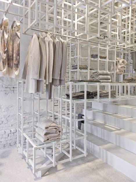
Clothes and accessories are ensconced in an elaborate lattice of wood at an Amsterdam boutique designed by Dutch studio Doepel Strijkers.
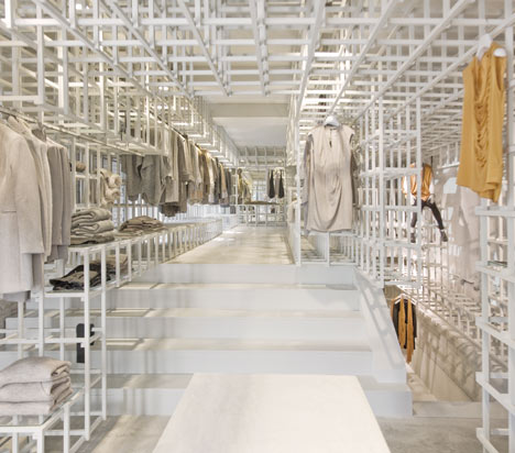
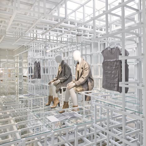
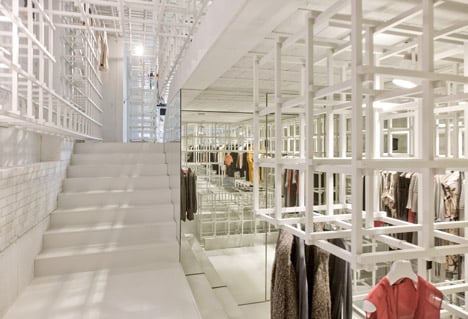
The white-painted grid branches into every corner of the two-storey store, which operates as the flagship for fashion brand Stills.
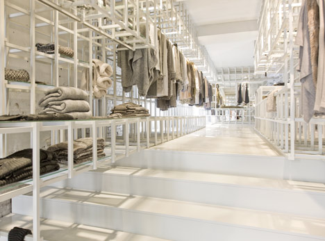
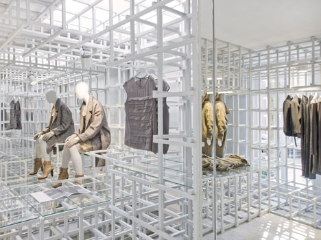
Some garments hang from the framework, while others are folded onto clear glass shelves placed randomly across the surfaces.
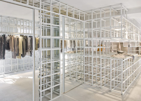
Dressed mannequins appear to be climbing the wooden frame and changing rooms are concealed behind two mirrored doors.
Not long ago we also featured an installation with a similar grid-like interior - see that project here.
Photography is by Wouter Vandenbrink.
Here's some more text from the designers:
Stills flagship store
On the Cornelis Schuijtstraat in Amsterdam a flagship store has been realized for the label Stills. The spatial interventions in the hull, which visually connects the floors, are not emphasized by smoothing them but has been kept visible to show additions and finishing layers over time.
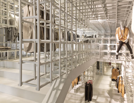
There is a base from which the original shop and its transformations over time remained visible. This pattern of textures in the existing building is complemented by an object. A spatial translation based on the values of the label.
Stills seeks for sophistication through novel combinations and delicate contrasts, in fits, in styles, in looks, in feels. Their ultimate research in the intrinsic qualities of materials, results in new potentials for working with them, treat and combine them.
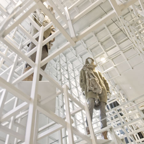
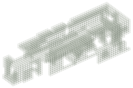
This distinctive Stills quality has been translated in a spatial identity based on a new typology. Natural materials, craftsmanship, refined textures and specific pat¬terns are reflected in a spatial fabric which fills the space as a volume.
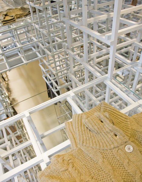
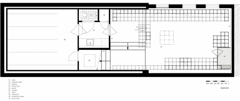
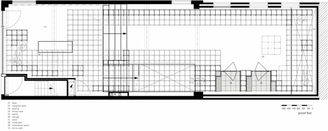
A careful analysis of the movement of humans in space and the percep¬tion of clothing forms the base for the deformation of the spatial grid. The dense grid opens itself. An implementation with a durable spatial identity, maximum experience and minimum resources is the result.
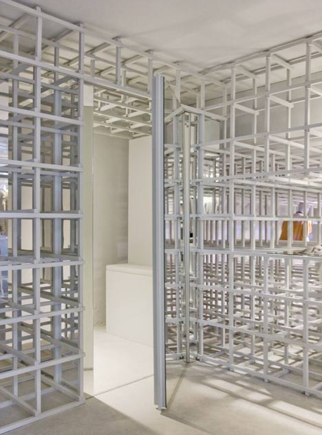
Dressing rooms, lighting and all possible options for presentation are integrated into the volume, so clothing, shoes, bags, books and mannequins form the visual spec¬ification of the continuous structure.
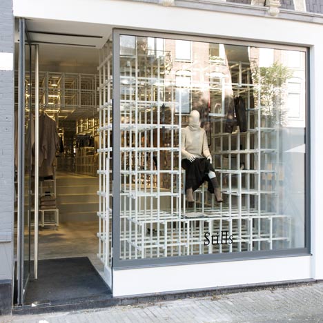
Project: Stills
Location: Amsterdam, The Netherlands
Program: Retail
Assignment: Rebuilding and interior
Status: Completed September 2011
Size: 188 M2
Client: Veldhovengroup Bv, Stills
Design: Duzan Doepel, Eline Strijkers With Chantal Vos
Building Execution
Contractor: Krant Interieurbouw
Interior: Heijmerink Wagemakers
Lighting: Solid Lighting
Mechanical Installation: Aaftink Verwarming Airconditioning