HANS-house by MODO
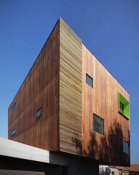
The top of this Australian house by architect Michael Ong of MODO is a timber box that sits at an angle on top of the ground floor walls.
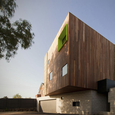
The timber-clad first and second storeys project towards the street in front and across the garden at the back, where they create a canopy over the terrace.
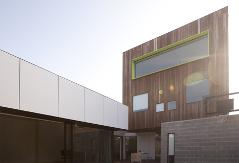
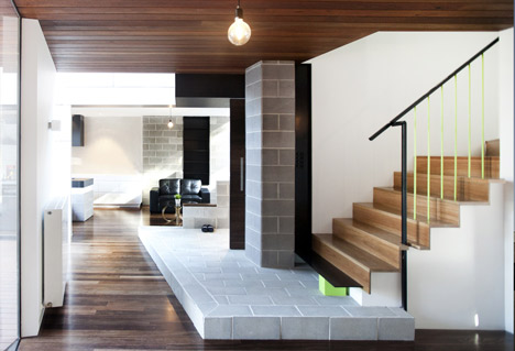
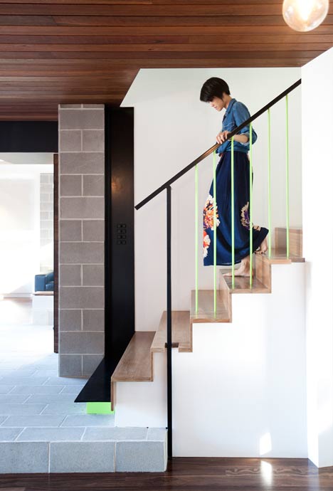
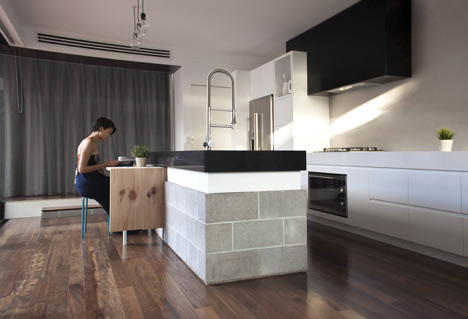
Bare masonry blocks create stark walls both inside and out at ground level, and also provide the structure for worktops in the kitchen.
Located in Victoria, the house provides a home for a couple and their children.
Other popular residences we've featured in Australia include a steel-plated bunker and a house with marble brise-soleils.
See all our stories about Australian houses »
Photography is by Ricky Fung.
Here's some more text from Michael Ong:
The client’s brief was to design a home which played an active role in their everyday life, rather than a static shell. Our aim was to develop a design which engages with the rituals and the growth of this young family; blending the external and internal spaces to create movement and life in the environment.
Located on the elbow of the street, the site is sandwiched between two suburban houses and common practice when it comes to locating a suburban house on a site, is to start at the centre of the plot and enlarge the footprint until the space required is met. Typically remaining on the side of the site is a two narrow strips of unusable landscape and a standard suburban backyard.
The backyard’s intention is to give the occupants a sense of connectivity to the outside, however because of poor orientation and spatial planning, the garden is often under valued, resulting in a passive relationship with the interior.
In HANS-house, instead of standing next to the backyard, the form cradles and pulls the landscape in and to the centre of the house. Giving the landscape a stronger presence in the overall design of this home.
The backyard shares the rear of the site with the living room, the two spaces are divided by a large glass sliding door and a deep timber clad reveal. The depth of the timber reveal formally articulates and stretches out the hidden gap between the internal and external.
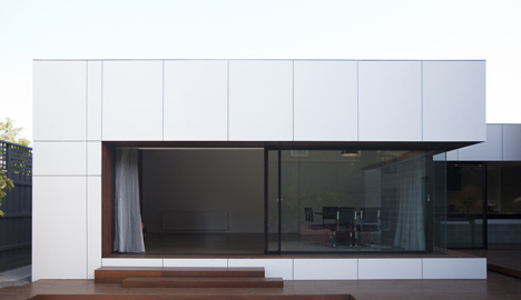
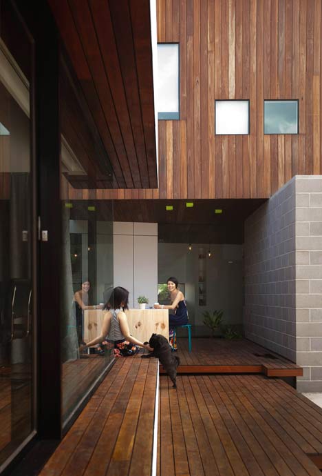
The edge of the reveal also creates a handy seat for large family gatherings. By activating the edge, the spaces are encourage to flow in and out of each other. Orientated north, the reveal also create an eave to allow for passive solar gain. Also a thick heavy curtain can be pulled across to separate the living room and lock in all the captured heat.
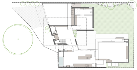
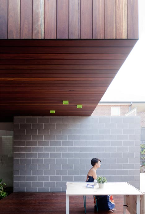
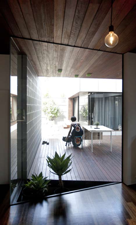
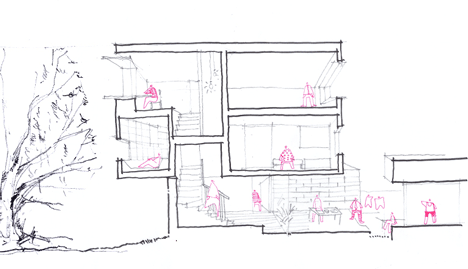
As the backyard moves further to the east it is compressed by the underside of the cantilever box to create a small courtyard. Different to the rear, the courtyard is a more intimate exterior space, the deck is also raised to suggested two distinct zones.
As the courtyard digs into the centre of the house, it surrounds and connects itself with the internal spaces. The cool masonry wall to the north and the cantilever of the upper floors shelters the courtyard from the summer sun, while in winter the courtyard remains dry and tucked underneath the upper floors.
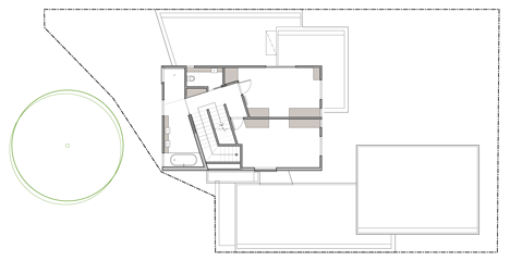
The brick wall to the street front, folds down and slides into the house to formalize the entrance. In the kitchen this concrete brick is adopted again to construct the island bench, moving to the kids retreat area, the timber lined ceiling is the underside of the cantilever box, which is articulate as it flows over the window and out into the courtyard. By using common exterior material internally, the house attempts to invite that exterior in and obscure the transition between interior and exterior. Creating a more dynamic relationship internally and its surroundings.
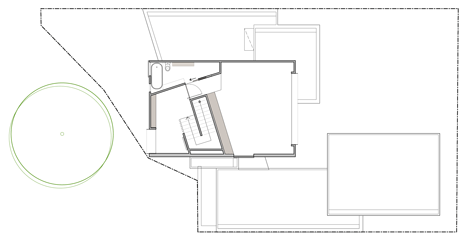
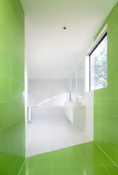
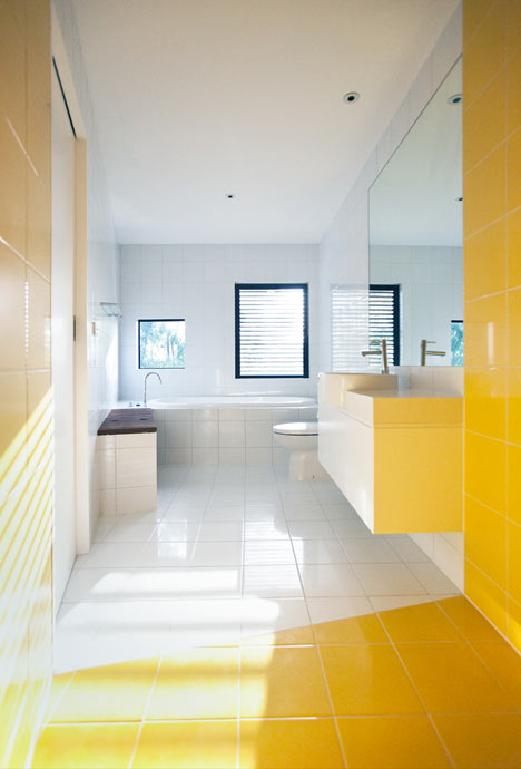
Sitting above the ground floor is the timber box, stretching westwards to the street to greet the large peppercorn tree. The west facing windows is carefully located to capture the views of the tree and at the same time hides behind the foliage to shade itself from the hot setting sun. The opposing façade frames a view of Melbourne’s skyline. Internally the box is carefully divided, with spaces of a slower and relaxed nature (i.e. bathrooms and study) facing the tree, and the more active spaces pointed towards the city.
Architect: M.O.D.O (Michael Ong Design Office)
Location: Aberfeldie, Victoria, Australia
Project team: Michael Ong
Project area: 350 sq meter
Project year: 2012