Design Museum Collection App: computers
In the next movie in our series of interviews we filmed for the Design Museum Collection App for iPad, which is available to download free from the app store here, Design Museum director Deyan Sudjic talks about iconic word processing products in their collection.
He describes the designs of iconic products as the movie follows the move from analogue to digital, starting with the development of the typewriter into laptop computers in the 1980s through to the recent switch from books to e-readers.
You can also listen to Sudjic talking about classic design in previous movies featuring driving, music and chairs.
Download the Design Museum Collection App »
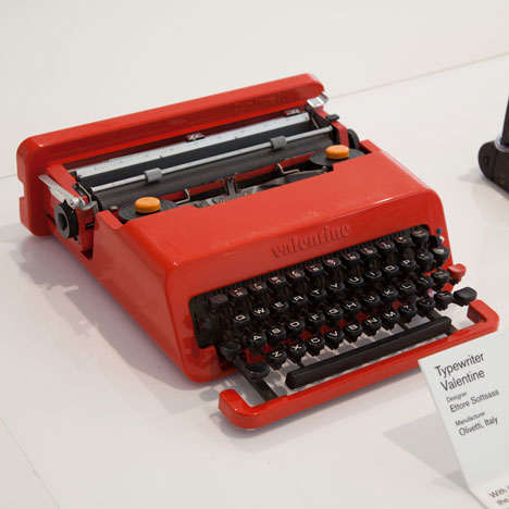
Here are some excerpts from the app:
Valentine (above)
With its plastic casing and strong handle, the 1969 Valentine typewriter was marketed, by Italian manufacturer’s Olivetti, as a lightweight portable typewriter. While it fulfilled its function competently, Sottsass’ playful design and choice of bright colour, inspired by pop-art, expressed the mood of the time and suggested that the typewriter still had a place in the modern world.
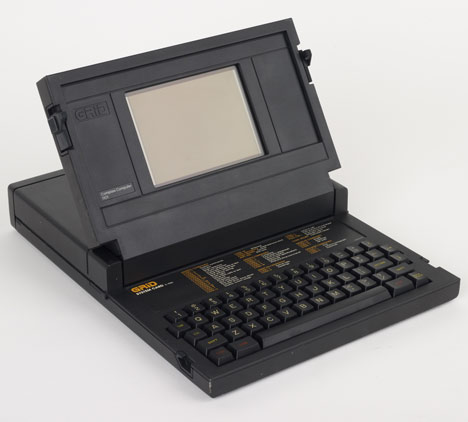
GRiD Compass 1101 (above)
Utilising a clam-shell design, British industrial designer, Bill Moggridge designed what most people consider to be the world’s first laptop. The computer ran its own operating system and included a 320 by 200 pixels screen that, while tiny by today’s standards, was considerable at the time. The high cost of the Compass limited the market and it was mainly used by the United States government.
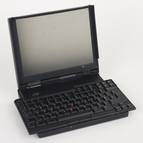
ThinkPad 701 (above)
ThinkPads used innovative trackpoint buttons instead of a rollerball or mouse to control the cursor. While this added a useful new functionality to laptops, many criticised the use of colour suggesting red should be limited to operations relating to emergencies. The other key design feature of this 1995 design is the ‘butterfly’ keyboard that folds out and expands as the lid is opened. The casing and shape were modelled on a Bento box, the Japanese food container with multiple compartments.
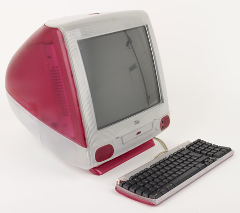
Apple iMac (above)
Founded by two college dropouts in the late 1970s, Apple grew extremely fast in the early years of the computer age and then lost nearly its entire market share to Microsoft, but came back by reinventing the computer. While the all-in-one monitor and computer configuration is an Apple hallmark – dating back to the first Apple
Macintosh in 1984 – it was the launch of the iMac in 1998 that set the benchmark for future computer designs, selling over two million units in its first year.
According to Apple’s Senior Vice President, Industrial Design, Jonathan Ive, ‘The objective was to design a computer for the consumer market that would be simple, easy to use, highly integrated, quiet and small.’ In this typically economical statement, Ive has summarised the winning formula – advanced computer technologies presented in an accessible format.
Ive and his team are more akin to craftspeople than stylists, working through an intense analysis of function and a commitment to using materials truthfully. With the iMac, the idea of translucency emerged from a desire to use plastics in a new, honest way and not as a self-conscious wish to invest the computer with saccharin sweetness. As Ive says, ‘we wanted it to be an unashamadely plastic product. Given our obsession with materials and production processes, we explored different polymers, moulding technologies, colour, texture and levels of opacity. Transluscent materials posed new challenges, we not only needed to design new ways of moulding individual parts but to develop new methods of assembly. We found ourselves caring about the appearance of internal components that had previously had little impact on the product’s appearance.’
The iMac not only transformed computer design but also home offices through its pioneering introduction of colour into the drab world of computing, predominated by greys and beige. When researching new processes, Ive and the Apple team regularly seek advice from outside world of computer design. For the iMac, they consulted a group of confectioners for their strawberry, blueberry, grape, tangerine and lime shades. As Ive noted, ‘Their experience in the science of translucent colour control helped us to understand processes to ensure consistency in high volume.
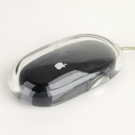
Pro Mouse (above)
Apple’s Senior Vice President, Industrial Design, Jonathan Ive describes the design process for this step-change in computer interaction design which came out in 2000: ‘we learnt from studies that the button on a mouse creates a target specifically defining how it is held and clicked. This limits the number of ways that users can hold a mouse and consequently limits comfortable use with a variety of hand sizes and methods of use.
By building multiple prototypes we developed the idea of making the entire surface the button. Allowing users to position their hands on the mouse naturally afforded different styles of use. Similarly, by rotating the dial around the optical sensor the user can adjust the force required to activate the click switch.
Analysing surface tension in liquid droplets helped us to develop a pure, essential form. A founding idea, however, can be undermined unless the ultimate implementation is based upon the same assumptions. By sharing the concerns and sensitivities of the original idea, we developed a construction to ultra-sonically weld the simple pure surface into the product assembly.’ Jonathan Ive.
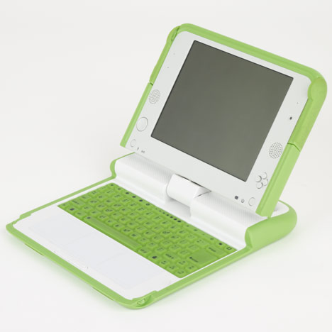
One Laptop Per Child XO-1 (above)
One Laptop Per Child is a non-profit programme created by the Massachusetts Institute of Technology (MIT) in the United States. The 2006 child-size laptop brings learning, information and communication to children where education is needed most: in developing countries. The result is an inexpensive and energy-efficient computer. The machine’s reduction in energy use, by 90 percent, is ideal for a device that could be charged by hand-cranked power in rural villages. The laptop features Wi-Fi antenna ‘rabbit ears,’ an energy-efficient LCD digital writing tablet and integrated video camera. Networking capabilities allow children to connect to each other, their school, their teacher and the internet. Every design aspect of the machine serves a dual purpose to achieve a sense of economy and efficiency.
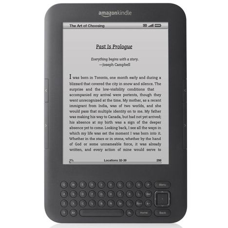
Kindle 3
The Kindle was the first product to suggest that electronic book readers could offer a viable alternative to physical books. Key to the Kindle’s success was the black and white e-ink display that provided a far more realistic representation of print and minimised the screen reflections that plagued other devices. This 2010 version has wireless connectivity that allow users to download content at any time. In 2010, the retailer Amazon announced that in the United States their e-book sales had surpassed sales of paperback books for the first time.