Youth Centre by Cornelius + Vöge
This bright red youth centre in Denmark by architects Cornelius + Vöge is coloured to match the fishing cabins of the surrounding village (+ slideshow).
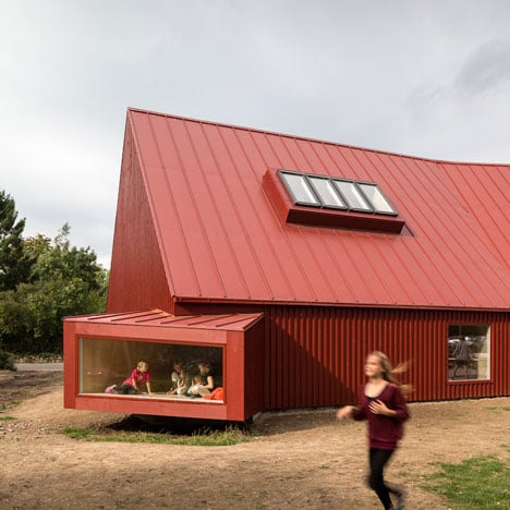
The architects renovated and extended an existing building, cladding the roof and every wall in red-painted panels of steel and timber.
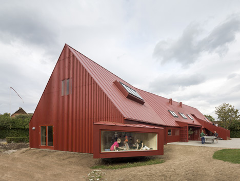
"The colour of the building is an important issue," architect Dan Cornelius told Dezeen. "The traditional old fisherman's cabins are one of the most characteristic elements of the village."
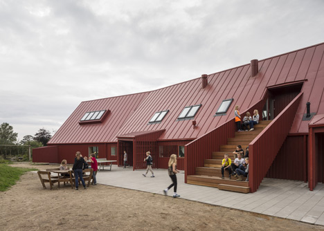
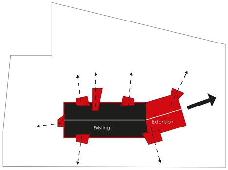
The walls of the two-storey building turn inward at the junction between the original structure and the extension, lining the edge of an outdoor play area.
A external staircase climbs down from the first floor to meet this play area, creating a space that the architects describe as a "small stage".
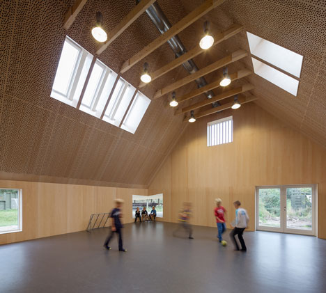
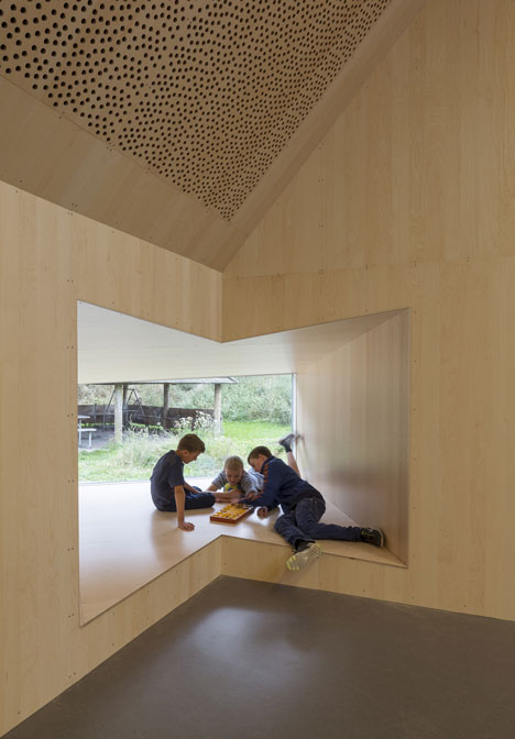
A double-height sports hall occupies one end of the building and features a protruding corner window where children can work or play in small groups.
We've featured a few all-red buildings on Dezeen, including a psychiatric centre in Spain and a chocolate museum in Brazil. See all our stories about red buildings »
Photography is by Adam Mørk.
Here's a project description from the architects:
Youth Centre, Roskilde, DK, 2012
The project is a conversion and extension of an existing building. The main approach is to make a new interpretation of the red barn buildings and fishermen cabins of the old part of the village where the building is located. The extension to the old building starts where the building takes a turn making a more intimate feeling surrounding the outdoor play areas.
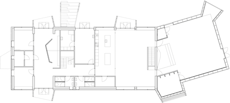
Ground floor plan - click above for larger image
The building is located between an old village and a seventies development, so in order to underline a regional identity to the building it was coloured all red. The red colour follows the tradition of the old fishermen cabins of the village. The roof has the same colour as the facades to make the shape of the building more precise and simple underlining the basic shape of the building.
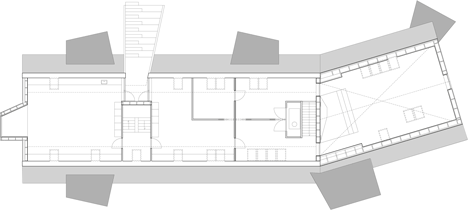
First floor plan - click above for larger image
The building is renovated into a low energy building, covered with new facade materials and reorganized into a more open, playful and modern building. New covered areas, balconies and stairs integrates more intimate corners and living areas both outside and inside.
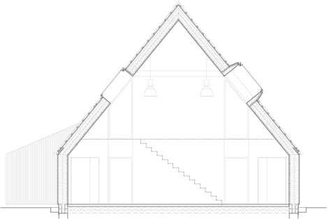
Section one - click for larger image
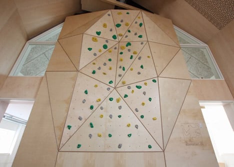
The surrounding green areas are more integrated and daylight optimised. The extension includes a flexible multi purpose hall for concerts, theatre, playing and sports activities including an integrated climbing wall.
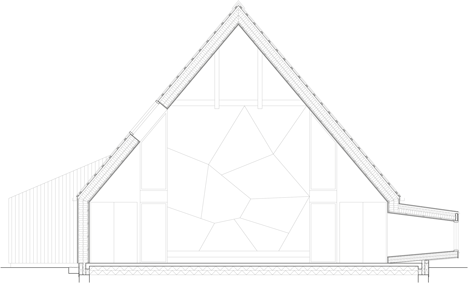
Section two - click above for larger image
Several façade elements breaks the basic shape of the building into a smaller scale: a stair functions as a small stage area, covered entrances and the corner window which cantilevers from the building and creates a more intimate living space for the children to sit in smaller groups - a private space being a part of the interior and exterior at the same time.
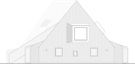
End elevation one - click above for larger image
Type: Transformation, renovation
Team: E. Troelsgaard engineers
Area: 600 m2
Client: Roskilde Municipality
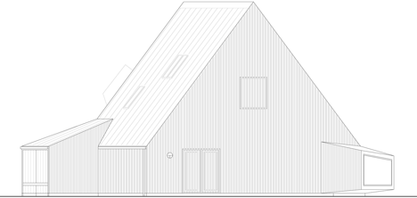
End elevation two - click above for larger image