Ubojnia by Karina Wiciak
Karina Wiciak of Polish design studio Wamhouse imagines paper chairs and chandeliers suspended on meat hooks in this fantasy interior inspired by a slaughterhouse (+ slideshow).
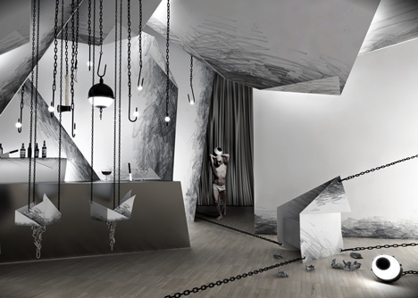
Ubojnia, which means "slaughterhouse" in Polish, is the second part of a collection of interiors, called XII, designed by Wamhouse's Wiciak.
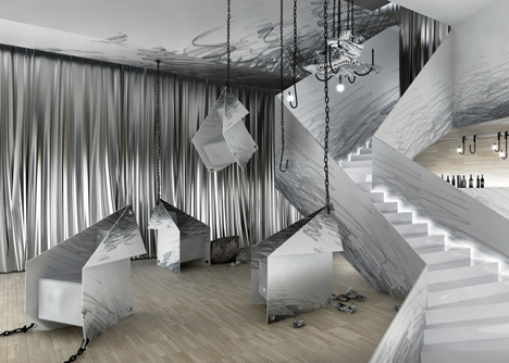
Though all the interiors in the collection are imaginary, it will be possible to commission adaptations of each design and the objects in it.
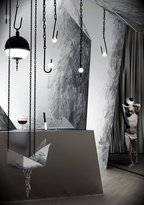
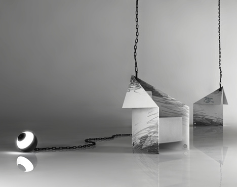
Ubojnia's paper walls and staircase are illustrated with pencil hatching, a motif that continues in the folded paper armchairs, which appear to be held up by meat hooks hanging from the ceiling.
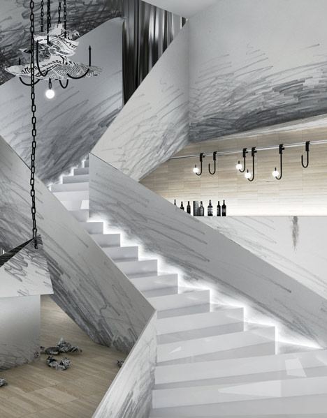
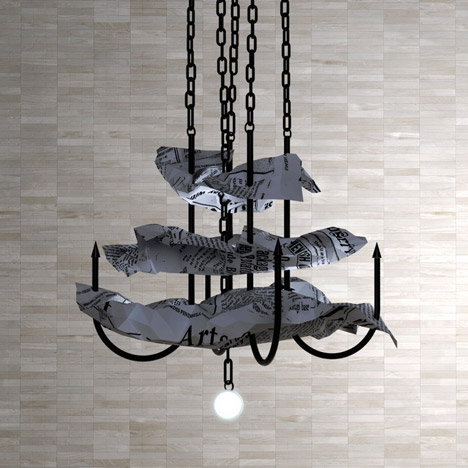
Two bar stools are also suspended from the black hooks, while a chandelier has been created from a cluster of hooks joined by crumpled sheets of newspaper.
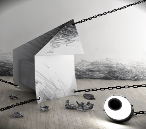
A spherical floor lamp resembles a prisoner's ball and chain, while other bulbs appear to have been skewered onto the ends of hanging hooks.
The interior is a "non-standard place, full of symbols and metaphors, at the borderline between architecture and performance," according to the designer.
We've previously featured a sofa made from crumpled paper and a chair made of waste paper from the pleated fabric industry, as well as paper stage set by architect Frank Gehry for a production of Don Giovanni.
See all our stories about paper »
See all our stories about interiors »
All images are by Karina Wiciak.
Here's some more information from the designer:
Ubojnia is the second of twelve parts of an original collection called ”XII”, entirely designed by Karina Wiciak (designer from Wamhouse).
About the collection XII
The collection XII will consist of 12 thematic interior designs, together with furniture and fittings, which in each part will be interconnected, not only in terms of style, but also by name. Each subsequent design will be created within one month, and the entire collection will take one year to create.
Here, visualisation is to constitute more than a design, which is thrown away after implementation of the interior design, but mainly an image, which has a deeper meaning and can function individually, for instance as a print on a wall, or even a CD cover.
These will not be interiors made to a specific order, but designs based on the author's fantasy and his fascinations of various sorts.
It will be possible to order a specific interior design in the form of adaptation of the selected part of the collection, on the basis of exclusivity.
Ubojnia (slaughterhouse) is not only an interior design, but a combination of design and art. The author’s assumption was not to create trite, fashionable interiors, but non-standard places, full of symbols and metaphors, at the borderline between architecture and performance.
Due to their nature, these are mostly commercial interiors, intended for use and reception by a larger group of people. Yet it was not supposed to be an art gallery in which art is merely watched, but a place which could be put to use to do virtually everything – depending on the purpose and function of the premises.
The author of the collection did not strive to artificially ascribe ideology to random ideas, but rather to make the entire design readable and coherent, and at the same time to design every item specifically for the given interior.
At first glance, Ubojnia shows a motif of hatching, a sketch which not only the main element of decoration, but also visually changes the scale of the room. People who stay in such an interior may get an impression that they are shrunk, or at least that they are in a fabulous and unreal world.
Yet, the very name of the establishment suggest another, hidden message (in Polish “ubojnia" means “slaughterhouse”). Seemingly-paper armchairs called “Szkic” (in Polish “szkic” means ”sketch”) are suspended on meat hooks or tied to chains, which is supposed to symbolise omnipresent restrictions to creativity in art and design.
The very word “ubojnia” may indicate killing of talent and creation, though not necessarily by third parties (as these are not shown in the images), but by the artists and designers themselves. Yet, it is but one of numerous interpretations of symbols which anyone can understand in their own way, or not interpret at all. After all, it is a commercial interior, so any possible, more or less blatant, ideology can be treated with a pinch of salt, and in the case of this specific interior, even with slightly “noir” sense of humour.
The Ubojnia design includes:
» armchair “Szkic” (which in Polish means “Sketch”)
» suspended stool “Szkicownik” (which in Polish means “sketchbook”)
» chandelier “Papierek” (which in Polish means “piece of paper”)
» sphere-shaped, suspended and floor lamp “Kula” (which in Polish means “sphere”)
» smaller suspended lamp and wall lamp “Haczyk” (which in Polish means “hook”)