"Offices designed as fun palaces are fundamentally sinister"
Opinion: in this week's column, Sam Jacob calls for an end to the "tyranny of fun" in office design.
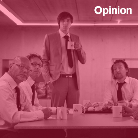
I’m in what appears to be an office, surrounded by people who appear to be doing work. There’s a coffee machine, mugs, lever arch files, Post-it notes, hole punches, staplers, highlighters; in other words, the generic paraphernalia of business. This office, though, is not what it seems. It’s a project by Belgian artist Pieterjan Ginckels (pictured top, centre) titled S.P.A.M Office. Here, under his direction, a team of S.P.A.M. officers print, sort, file and mark up spam emails collated in the S.P.A.M mailbox.
Spam is the lowest form of commerce: unsolicited and unwanted, mass mailed, bot-written language skewed into an ever evolving digital-pidgin to evade filters. In S.P.A.M Office, they are scoured as though messages from another world for phrases and sentiments that suddenly resonate with a rich humanity.
But Ginckels is clear: the real purpose of the project is not the production of stuff or the creation of value, but to set in motion an office stripped of these usual demands of business. Here, without a bottom line, all the artifacts, behaviours and codes of office-ness gain an aesthetic, procedural and social clarity. Here is work - or at least one form of work - laid bare.
Work (as I’m sure needs no explaining to those of you surreptitiously sneaking a look at this site during office hours) is not a natural state. It has evolved into a highly codified, super-stratified state. Yet somehow its alien ideologies are submerged into a sense of inevitability, of this being the only reality imaginable. Business is an internationalised system and offices are the same across the globe. Think of the formula: lobbies, reception desks, suspended ceiling panels, laminated desks, PCs most likely running generic software designed to record a similar set of tasks and information. New York, London, Paris, Munich; coast to coast, LA to Chicago; Dublin, Dundee, Humberside; Primrose Hill, Staten Island, Chalk Farm and Massif Central all merge into a endless landscape of contract carpet tiles.
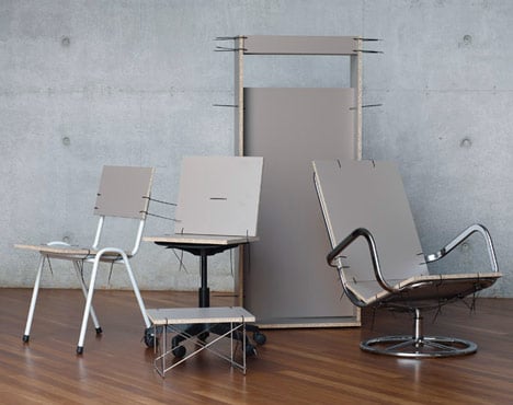
Above: S.P.A.M Furniture, designed by Ginckels
Design plays a huge part in enabling this totally generic vision of human activity. Leaf, for example, through an office supplies catalogue. Here, between the covers, are the tools of office-ness: a taxonomy of objects that inform, instruct and format our behaviours and activities. Overnight shipping promises that all this abstract serenity of boxfresh office-ness is ready to deploy to any location on the surface of the planet.
These are the most generic and ubiquitous of objects. From a design point of view their authorship is unattributed and for all they do to lubricate the smooth functioning of society (no exaggeration: how quickly do you think civilisation would fall without the hole punch or the stapler?) they are mostly uncelebrated.
Of course, there is also a high architecture and design tradition of workplace design. In fact, architecture and design are intrinsically linked to establishing ways of working. Perhaps it’s the typology where the inherent politics of spatial design become most visible, like a junkie’s raised vein. Architecture’s ability to spatialise hierarchies, to organise and then physically manifest power, makes it a central activity in the conceptualisation and reality of contemporary work. Workplace design implicates architecture.
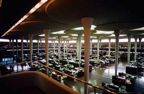
Frank Lloyd Wright's Great Work Room at the Johnson Wax factory (above) is the ground zero of modern bureaucratic space. Here we see the letter-typing clerk-ism necessary for a global cleaning product corporation manifested into sublime architectural form, its open plan made possible by giant mushroom-shaped columns pushing up a ceiling though which light filters down over orderly rows of desks.
We fast-forward in a Mad Men/IBM blur through an age of Miesian office towers whose blank replication expressed and enacted the high corporate era where one square metre replicates another, one floor is the same as another, one corporate man is like another.
We witness the way the Big Bang financial deregulation of the Thatcher era redrew floorplates to deep-plan flat floors, turning offices into vast interior landscapes whose horizons disappear into fluorescent haze. So far, so inevitable: it’s a straight-forward expansion of corporatism into space.
But post Big Bang something strange happens to offices. Instead of looking like offices, they start to appear to be anything but offices.
The Big Bang (27 October 1986) was the moment when we fully entered the post-industrial era, when the very idea of work radically changed. It was the moment when activities like media, advertising and music were dubbed "creative industries", repurposing the term from traditional industrial environments - factories or mines for example - which were simultaneously being closed either out of financial or ideological necessity. In late capitalism’s hall of mirrors, it’s no doubt inevitable that the image of work should invert to that of non-work.
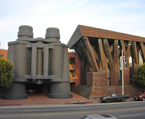
The post-industrial workspace is, I would argue, defined by two distinct visions. First is Frank Gehry’s office for Chiat Day, Los Angeles (above). This project - from its giant binoculars by the sculptor Claes Oldenburg to its cardboard cave - conceives the office as a form of installation art, a landscape of endless difference. It represents the workplace as a non-stop experience that reinvents work not as a task but as pure self-expression.
The other vision of the post-industrial office came from the interior-design-meets-managment-consultancy of architect Frank Duffy & his firm DEGW. Here quantifiable metrics and business psychology met colour schemes and bean bags in a cocktail that appealed directly to business’s unending appetite for theories, strategies, quackery and god knows what else. Just look at the business shelves of a bookstore for more evidence of this. There’s more superstition in business than in the astrology page of a tabloid newspaper, more faith-over-reason than in the queue for a fairground fortune teller, more self-obsessed introspection than on a therapist's couch.
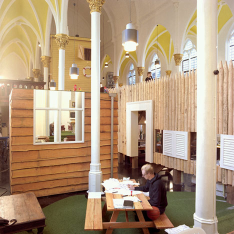
A third model was developed, (with full disclosure, by my own firm, FAT) for Amsterdam-based communications company KesselsKramer in 1998 (above). The design deployed, in the already incredible interior of a church, fragments of other environments: lifeguard towers, Russian wooden forts, garden sheds, patches of football pitch and a picnic table extended to boardroom size. The thinking was twofold. These surreal juxtapositions would act as a landscape within which the culture of the company could be manifested spatially and organisationally. At the same time, its explicit references to a range of other types of place: home, park, sports field and so on, disrupted conventions of workspaces. It was, at the time, a determined antidote to the slick working environments of advertising and communications offices.
All three examples have trickled into the mainstream, spawning the ubiquitous astroturfed, supposed fun palaces that characterise digital, media and communication office design. Plastered with domestic wallpapers that have long since lost their edgy irony, punctured by playground slides linking one floor with another, their forced entertainment has a sinister tone. These are places of perpetual adolescence, whose playground references sentence their employees to a never-ending Peter Pan infantilism.
These spaces of west-coast-uber-alles business ideology might be seen as a denial of the very real power structures inherent in labour relations. And their denial of these dynamics through apparent fun and the sensation of individualism could be seen to operate as a form of oppression. More fundamentally sinister is the idea of work colonising the real spaces of intimacy and freedom: when your office resembles all the places that you go to escape work, maybe there is no escape from work itself.
So perhaps, now the tyranny of fun is all played out, we should take Ginckels’ lead. Maybe it’s only by looking hard into the generic-ness of workplace design that we can find ways of really disrupting ideologies of work for the better. Grab your hole punch and a lever arch file and pin a note to the hessian pin board: declare a moratorium on slides in offices.
S.P.A.M. Office is at ANDOR Gallery London until 9 March 2013.
Sam Jacob is a director of architecture practice FAT, professor of architecture at University of Illinois Chicago and director of Night School at the Architectural Association School of Architecture, as well as editing www.strangeharvest.com.