The History of Typography by Ben Barrett-Forrest
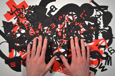
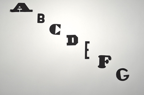
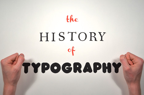
Hundreds of cut-out paper letters tell the history of typefaces in this stop-motion animation by Canadian graphic designer Ben Barrett-Forrest.
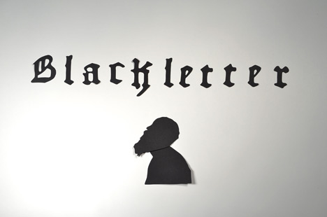
Starting in the fifteenth century with Johannes Gutenberg's Blackletter font, The History of Typography charts the major innovations in font design up to the present day.
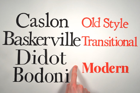
Barrett-Forrest explains the variations between early serif fonts such as Caslon and Baskerville and how they evolved into modern sans serif fonts such as Futura and Helvetica.

Cutting out and animating the letters took Barrett-Forrest around 140 hours over a period of two months, on top of dozens of hours of research and post-production.
"It was fairly tedious cutting out almost 300 paper letters, especially the serif typefaces with their tiny spikes, but it soon became almost meditative," says Barrett-Forrest.

"I feel that I have a much closer connection with each of the typefaces that I addressed, now that I have laboured to create each one."
Originally from Whitehorse in the northern Canadian territory of Yukon, Barrett-Forrest is currently studying multimedia at McMaster University in Hamilton, Ontario. He also runs Forrest Media, a graphic design and media production company.

Other fonts on Dezeen include a typeface of impossible shapes inspired by artist M.C. Escher and graphic designer Neville Brody's reworking of the Royal College of Art's house font – see all fonts.
We recently featured an animation of the best-known buildings of 26 architects, one for each letter of the alphabet – see all animations.