Shimpei Oda reworks humble Japanese house to create light-filled spaces
Japanese architect Shimpei Oda has reworked the dark interior of a humble 1920s house in Kyoto to bring natural light into living spaces and create a small gallery that opens to the street (+ slideshow).
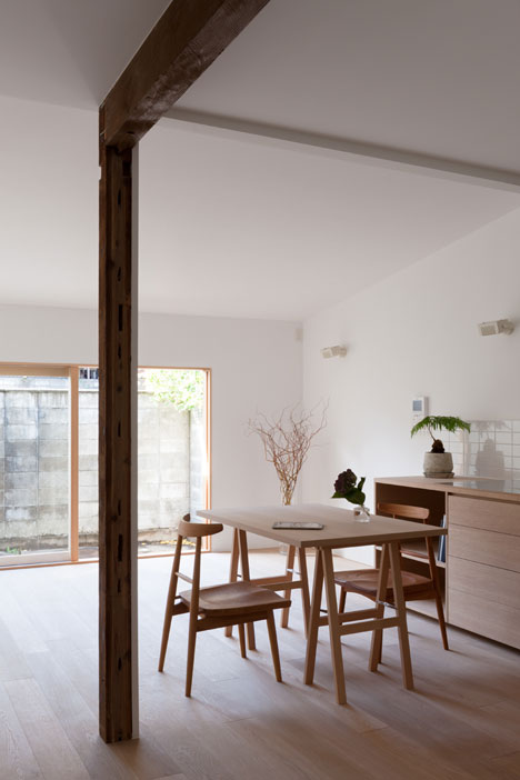
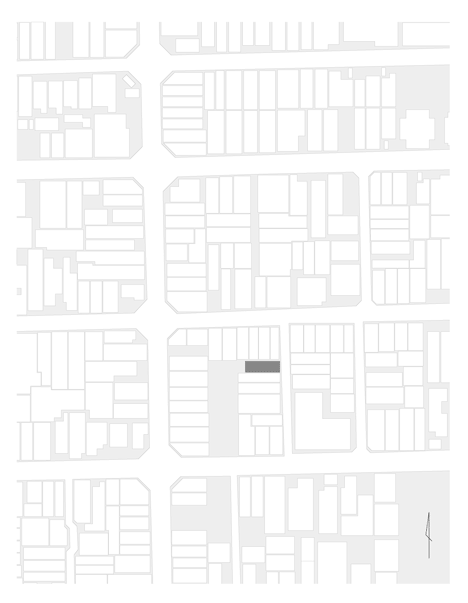
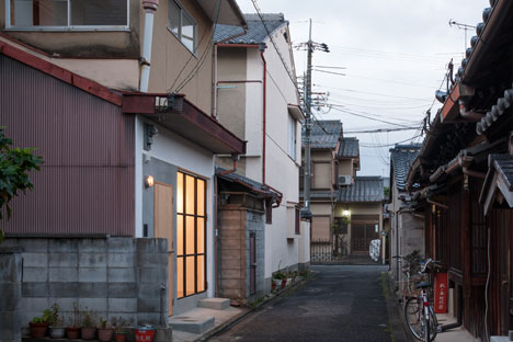
With a width of just 4.1 metres, House in Shichiku is typical of the long and narrow houses built in many of Japan's dense urban districts, nicknamed "eel beds", and the challenge for Shimpei Oda was to work out how to bring daylight inside.
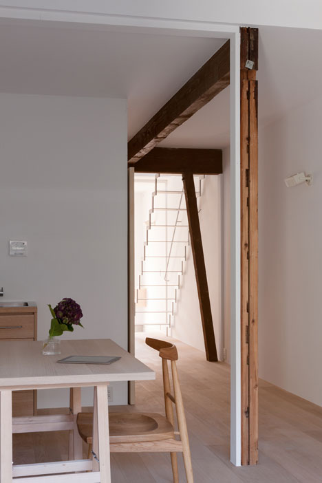
"Because the next building was way too close, the inside of the house was so dark, even in the daytime," said Oda.
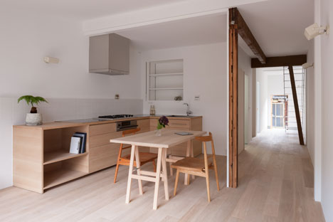
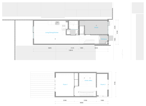
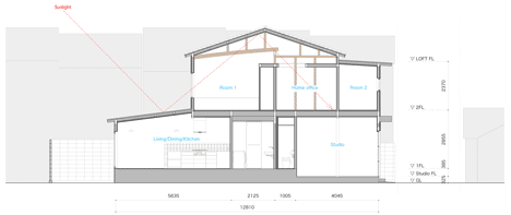
The two storeys of the house were re-planned to ensure each of the main rooms received natural light, whether from a window or through openings in the walls or ceilings.
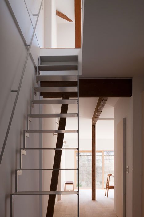
According to Oda, the house had suffered several poor quality renovations in the past, so missing walls and pillars had to be replaced.
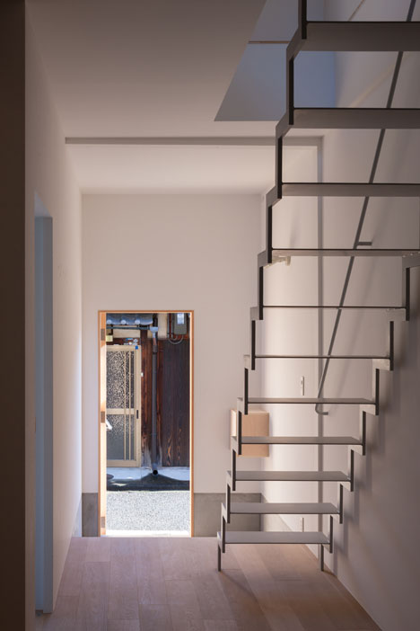
"The existing structure was arbitrarily shifted and newly inserted structures and reinforcements were painted with white colour," he said.
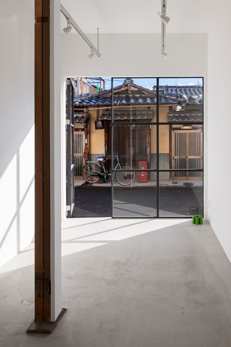
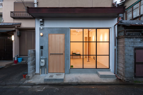
The small gallery is located on the ground floor and is fronted by a square grid of nine windows, some of which fold open to provide a direct access from the street.
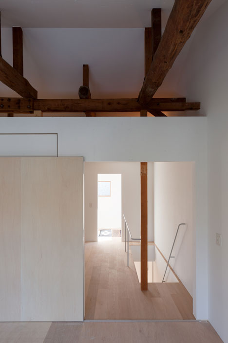
The main entrance sits alongside and leads through to a generous open-plan space that functions as a living room, dining space and kitchen.
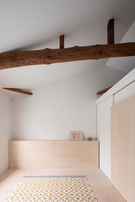
Bathroom and toilet facilities were considered least in need of natural light, so are grouped together in the space between the living room and gallery.
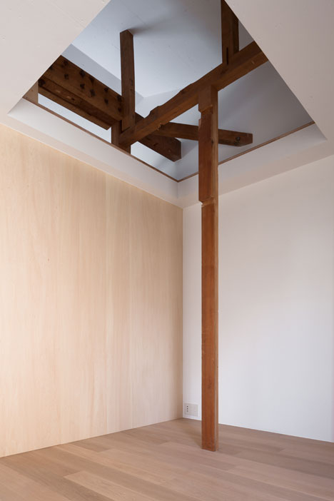
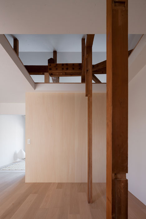
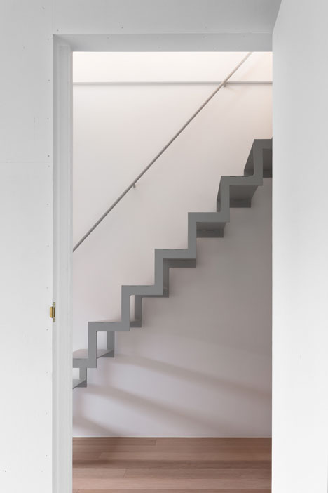
A lightweight steel staircase with a zigzagging profile leads directly up to a home office with bedrooms on either side. Exposed wooden columns and joists support the roof, while large openings help to bring light through each space.
Photography is by Shinkenchiku-sha.
Here's the project description from Shimpei Oda:
House in Shichiku
This was the renovation of a house which was built in the 1920s and the house was surrounded by old rows of houses. The house with a frontage of 4.1 metres and depth of 12.8 metres was like so-called "sleeping places of an eel".
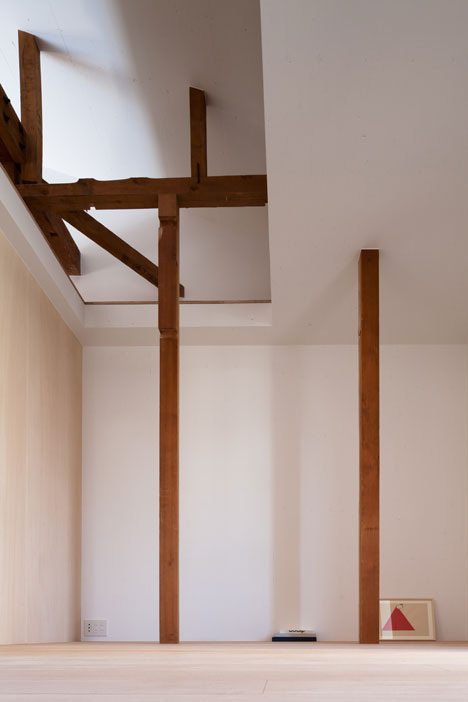
Because the next building was way too close, the inside of the house was so dark even in the daytime. The house had been illogically renovated at several times before so that important pillars and walls were missed.
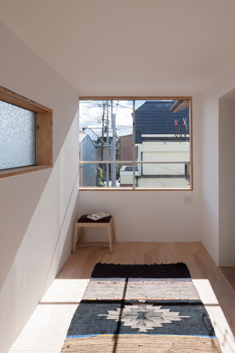
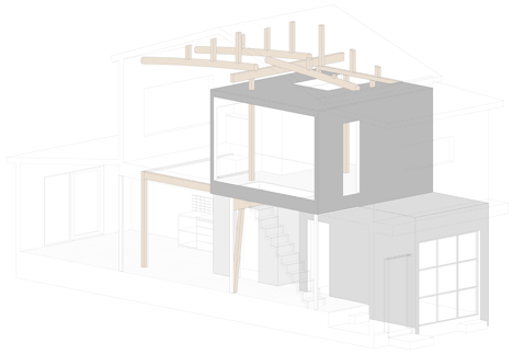
A resident hoped to live with furniture and paintings. A studio, sanitary, and home office were inserted as volumes of the structure. Those intended not only to reinforce the house but also to softly divide spaces to up and down and left and right.
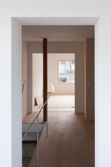
The whole image was glimpsed from openings and slits which were widely opened and the volumes itself were painted with white colour so that the texture could visually stand up to indicate the depth and extent.
The front of the studio opened to alley was changed from a shutter to windows. To change to the well reflective material of lean-to roof, it functioned as a reflector and could get the natural lightning to the inside so it diffused to bright all. Also, it was concerned the transition of brightness by time.
The existing structure was arbitrary shifted and newly inserted structures and reinforcements were painted with white colour. Those were created the context of time but functionally which meant to indicate those things mixed naturally without any conflicts. The softly divided space may be able to use by any discoveries for the living, studio, and home office as extension with the factor of furniture and paintings which may increase in the future.
Project name: House in Shichiku
Location of site: Kyoto, Japan
Site area: 83.50 sqm
Building area: 53.60 sqm
Total floor area: 91.00 sqm
Type of Construction: wood
Program: house
