Gewad apartment block by Atelier Vens Vanbelle features brick walls and a mirrored atrium
Mirrored walls and projecting staircases create optical illusions inside the brick-lined atrium of this apartment complex in Ghent, Belgium, by local office Atelier Vens Vanbelle.
Named Gewad, the building housing four individual apartments was constructed on the site of a former costume shop destroyed by fire, which architect Maarten Vanbelle of Atelier Vens Vanbelle bought and decided to redevelop with partner Dries Vens.
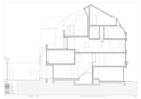
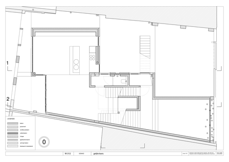
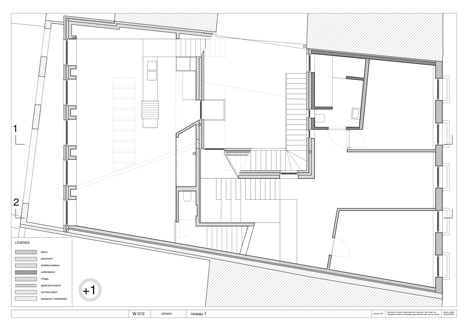
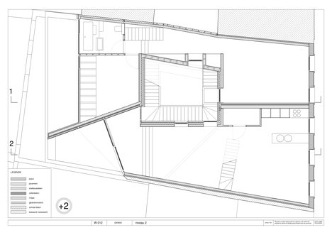
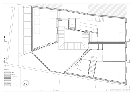
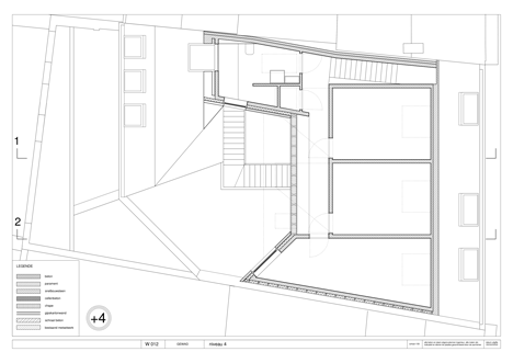
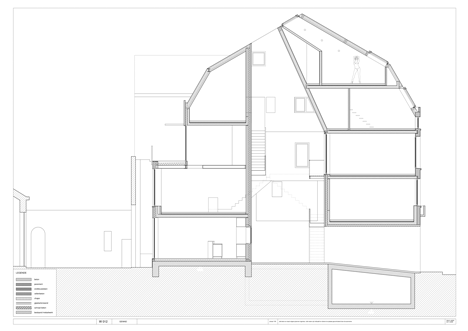
Rather than a standard arrangement of single-storey apartments, the properties slot together in multi-layered shapes that mean each one is spread over at least two floors.
"We did not want to design apartments that would feel like an apartment, with all rooms obediently after the other," said the architects. "It had to be houses, hence all apartments have two or even three floors."
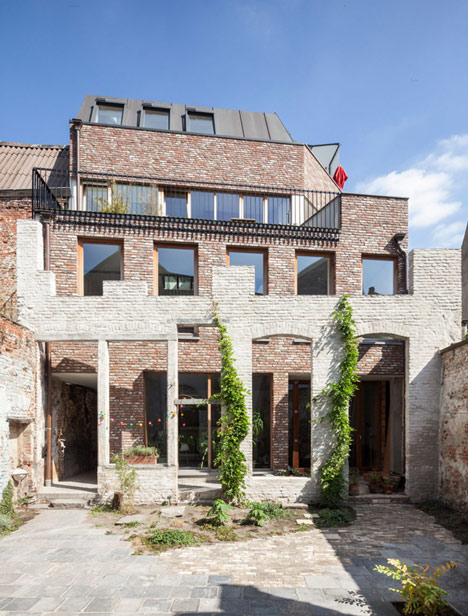
The surviving rear facade was retained along with an existing courtyard which, complemented by the central patio and the street on the other side, allows daylight to reach each apartment at all times of the day.
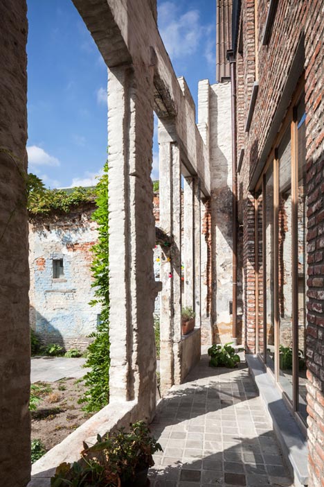
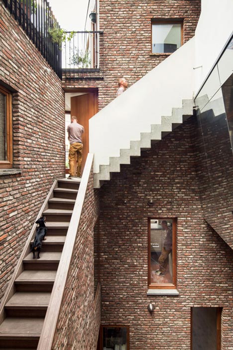
Influenced by the courtyards found at the heart of homes encountered by the architects on a trip to Italy, the patio provides a communal entrance featuring a staircase that ascends to the top floor and incorporates landings, offering access to the apartments on different levels.
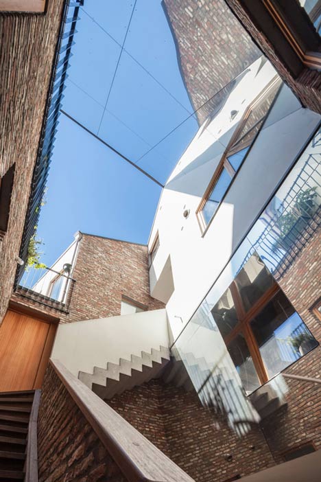
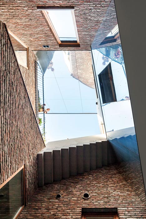
The walls of the atrium are built from brick salvaged from the ruined shop. Stairs are made from different materials, with some hidden behind brick walls and others projecting over the atrium, creating a complex composite effect intended to evoke the illusory drawings of M.C. Escher.
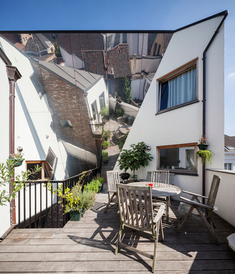
"You see countless courtyards with stairs, balconies and doors in places where you least expect it," said the architects of their experiences in Italy. "That was also the intention: that you step inside and not immediately know how the apartments are oriented."
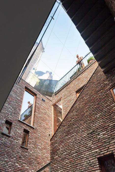
Windows around the atrium allow glimpses into the interiors of the apartments and add to the communal feel, while their careful placement restricts views of the most private rooms.
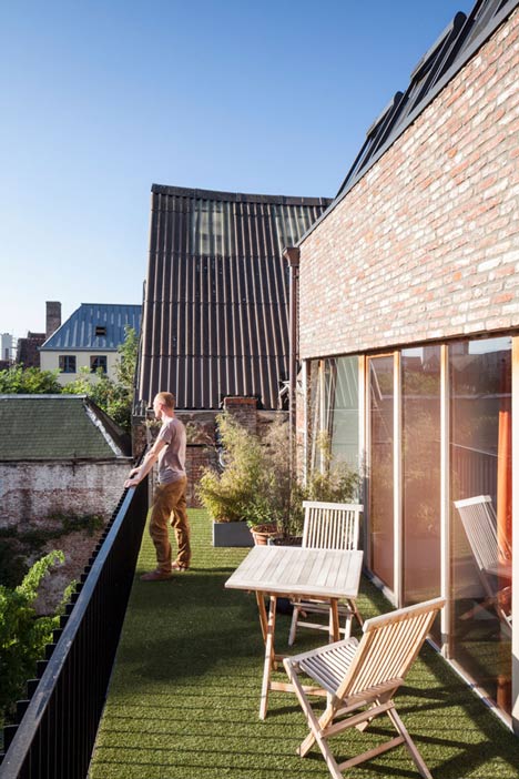
At the top of the atrium is a polished aluminium mirror that reflects sunlight and views of the sky into the spaces below and amplifies views of the surrounding neighbourhood when seen from the roof terrace.
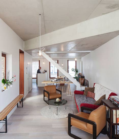
The irregular arrangement of the apartments also creates unique spaces and details, including private balconies, sloping walls and double-height spaces.
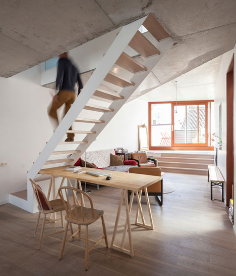
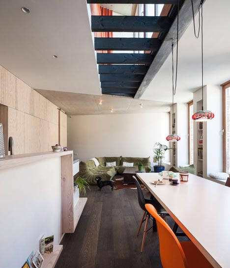
One apartment features a wooden staircase with widened treads that provide storage and casual seating areas, while another has an opening above the living room that exposes dark-stained wooden beams.
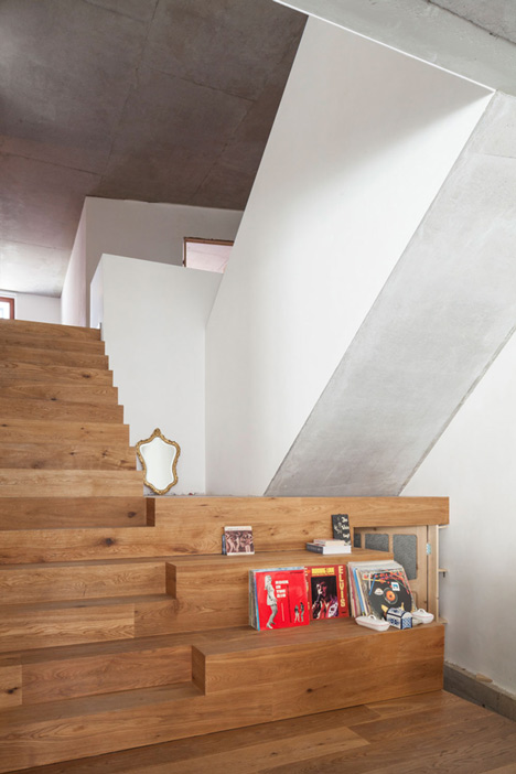
Materials including wood, concrete and second-hand terracotta flooring were chosen to ensure the building ages well with use. The intention is that residents will gradually adapt the public areas to meet their needs.
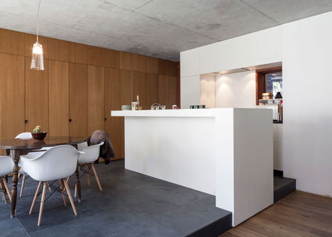
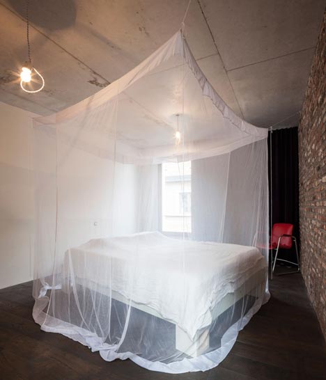
"We have let a lot of materials coexist, without letting it be too crowded," the architects pointed out. "By playing with textures and materials we create atmosphere and define different residential functions."
The architects' studio is contained in a former coach house at the rear of the courtyard, which features planting that will mature over time to create a lush garden.
The street-facing facade is rendered in a whitewash in accordance with the local council's request and features a ground floor wall incorporating the trunks of 23 chestnut trees.
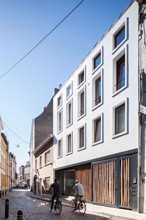
Photography is by Tim Van de Velde.
Here's some more information sent by Atelier Vens Vanbelle:
Four inventive city apartments
Puzzling around central patio
This project brings together four new apartments which run perfectly under, over and trough each other. The building was erected on the spot where once stood a burnt costume shop. Maarten bought the dilapidated house with his brother and parents, and began puzzling together with his business partner Dries. "There was a lot of thinking concerned. We started from zero, only preserving the rear facade. Not only an urban intervention, but thanks to the old rear facade the original dimensions of the courtyard were also retained." "Each apartment overlooks both the street, the central patio, and the courtyard, so that at any time of the day somewhere sunlight can come in."
Italian interior square
Whoever enters the building, stands on a particular courtyard. The architects had shortly before the start of the project on tour in Italy, and there the idea grew. "You will see countless courtyards with stairs, balconies and doors in places where you least expect it. That was also the intention: that you step inside and not immediately know how the apartments are oriented. 'The staircase consists of different materials and we even spotted a piece of' reverse 'staircase. "It reminds of a drawing of graphic artist Escher, which kicks all directions seem to go."
The patio provides a unique circulation throughout the building. The residents come out against each other, or see each other occasionally pass through a window. "Without that privacy is violated. We made sure that no one else is living inside look. "The patio is built with stones recovered from the burned building. Above the patio there's a large mirror made of polished aluminum. It was positioned in a way it reflects down the sunlight during the day and seen from below it reflects the sky.
House Feeling
"We did not want to design apartments that would feel like an apartment, with all rooms obediently after the other." It had to be houses, hence all apartments have two or even three floors. "We have thought very longtime about how we could fit the apartments together." These apartments define eachothers shape and layout. Besides the two floors there are also other elements that reinforce the 'house feeling': each apartment has a separate entrance which can be reached with stairs from the patio, and each apartment has both a street, patio and courtyard side. Each resident enjoys fantastic views of the city of Ghent, a private terrace and nooks and crannies that you would not expect in an apartment. One apartment has a meter high atrium, the other a piece of glass in the bedroom floor, or a hall with a sloping wall. On the street side there is a meeting room for the architects, and at the rear of the courtyard there's a charming former coach house as a studio for the two.
Windows and co
An exception, perhaps, but the architects design everything by making models. "Because we are so focused on light. We make a model, which we orient in the same way as the future home, and by filming the inside we see how the sunlight penetrates the building. "In the apartment building we find numerous examples of well-positioned roof and interior windows. In the upper apartment, where three boys live together, the bathroom is connected to the living room through an inside window, and look out simultaneously by a roof window: "So you see your own house from unexpected angles in a way it remains fascinating. The head of the architecture department of Ghent said that our project is a kind of synthesis of urban living: How can you live together in a small area, but do not suffer the disadvantages concerning light, circulation and privacy?"
Anti trends
The architects wanted to create the feeling that the apartments have spontaneously, coincidentally, almost organically grown. "We do not want architecture for architects. It should not be finger-on that we have thought hard about the design. The intention is that our project is going to look better by getting older, rather than to decline. Hence we have worked with many beautiful old materials: wood, concrete, old floors, etc. The patio has yet to change: vegetation, balconies and washing lines. It should all be a little more 'lived'. 'The façade takes humility on the street. Besides the base, formed by 23 chestnut trees, the façade is a purified version of the classic whitewashed facade. The white plaster was one condition of the city services.
Controlled multitude
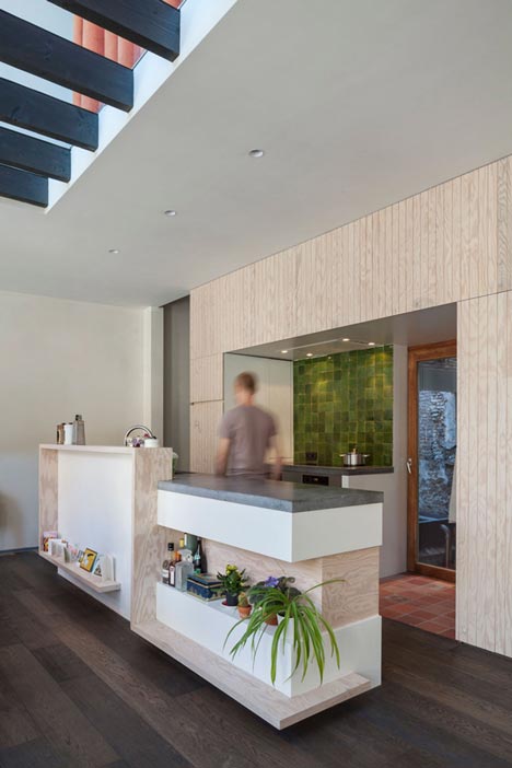
The material is not motivated by ephemeral fads. In the living room of Maarten's apartment we see a wardrobe made from grooved plywood of Polish pine, which has a beautiful drawing. That pine wood contrasts with the dark smoked oak parquet. The ceiling is partly concrete, partly from pasting, partly from wooden beams and there is even an iron beam visible. "So much more fun if you watch your ceiling from your seat." In the kitchen we find even a dash reclaimed terracotta floor, feeling like the oak. "We have let a lot of materials coexist, without letting it be too crowded. Name it controlled quantity (laughter). By playing with textures and materials, we create atmosphere and define different residential functions. Sociability is a bit of a dirty word in modern architecture, but honestly we are quite fond of it."
