Claesson Koivisto Rune launches wallpaper collection influenced by Modernism
Milan 2014: Swedish architecture and design studio Claesson Koivisto Rune has designed a wallpaper collection influenced by the shapes and patterns found in Modern architecture (+ slideshow).
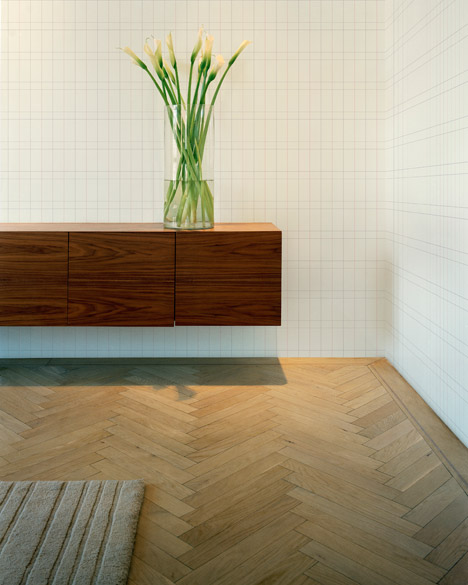
"Architects start with volumes and the way spaces relate to each other," said one of Claesson Koivisto Rune's founders Ola Rune. "When that is done, we add colour. We don't feel wallpaper can be of much help to us. Wallpaper had its heyday during Art Nouveau."

"For a long time architects have been of the opinion that wallpaper represents bad taste and that attitude has been so self-fulfilling that many haven't even considered using it," added co-founder Marten Claesson.

"[But] as architects our job is to challenge the expected," said Rune.
Often described as minimalists and certainly influenced by the Modernist movement, the trio started their research by looking for a Modernist building where wallpaper played a significant part – but couldn't find one.
Modernism followed the late 19th Century's excess of pattern and reacted with clean white spaces – honest materials, a limited colour palette and light were the order of the day. Wallpaper simply wasn't required.
Despite not finding wallpaper in their Modernist heroes' buildings, Claesson Koivisto Rune did find the references they needed to create their collection. Like wallpaper, much of Modernist architecture is based on repeating forms. "The trick is to create patterns that don't feel decorative," said Claesson Koivisto Rune's third founding partner Eero Koivisto. "Once that was clear to us, everything fell into place."
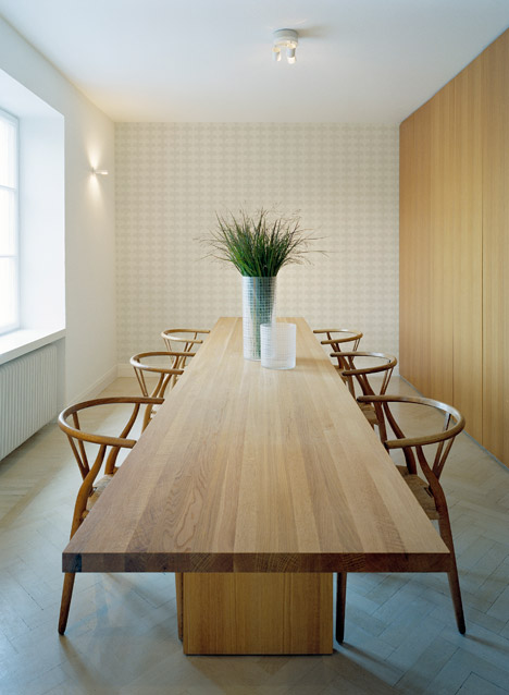
The design titled Facade references the patterns made by the windows in buildings by German Modernist architect Mies van der Rohe – who coined the expression "less is more". Claesson Koivisto Rune followed his advice, reducing the repeating pattern to its bare minimum. "Remove, remove, remove," said Koivisto. "The more we immerse in a project, the more it becomes a question of subtraction."
Bertrand Goldberg's 65-storey Marina City in Chicago, colloquially known as The Corn Cobs, provided the starting point for Corn, which Rune is happy to admit could also be seen as a cobweb.

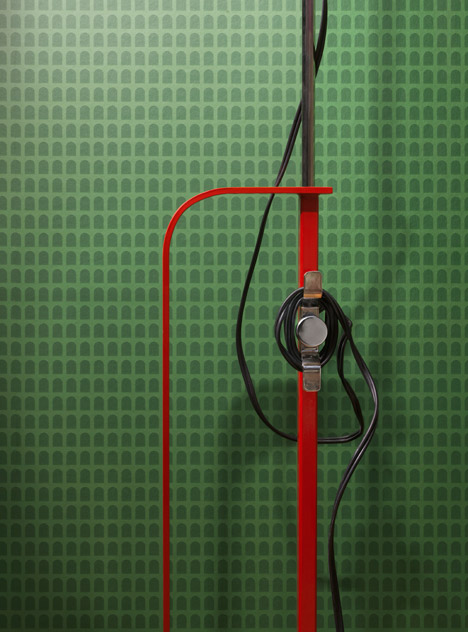
Arcade references the arch, a common feature in architecture since ancient times and a form frequently seen in wallpaper. Claesson Koivisto Rune reduced it to an abstract pattern, the appearance of which changes with distance.
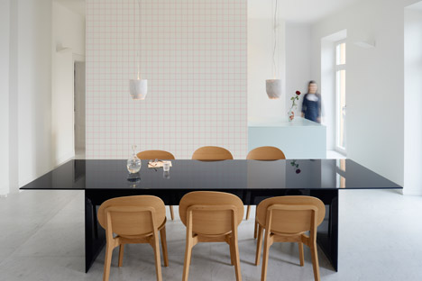
"Box is a classic pattern, but not on wallpaper," said Rune. It's more commonly seen on floor tiles and again, Claesson Koivisto Rune has created a minimal representation using delicate lines.
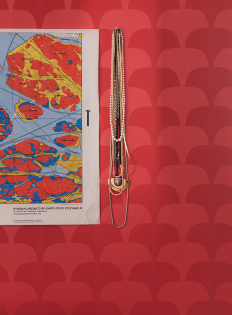
Suit references one of their own projects – dining chairs in Stockholm's Operakällaren restaurant that were upholstered in a striped Paul Smith fabric to make diners dressed in T-shirts feel more smartly dressed.
Blur is the development of an idea the trio first tried in a rug, a square pattern that becomes sharper the further away it's viewed from.
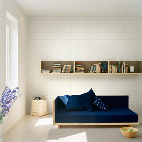
Notebook references old-fashioned maths exercise books. Again the pattern changes with perspective - the lines break up and appear to merge into a solid colour from a distance.
Bloom is a simplified interpretation of the Japanese gingko leaf.
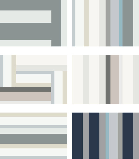
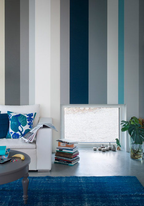
Referencing the colour palette of Modernist architect Le Corbusier's Villa Savoye, Blocks uses the width of wallpaper and its inherent vertical nature, to create six different layouts of dynamically coloured bars.
The collection is the first in a series of wallpaper collaborations between Engblad & Co, a new brand from Scandinavian company Eco Wallpaper, and some of the world's leading designers. "It's been really fun to rediscover wallpaper," said Claesson.