Torafu Architects uses Japanese cedar columns for fifth Aesop shop interior
Japanese design and architecture firm Torafu Architects has collaborated with Australian skincare brand Aesop to design the interior of its Osaka shop, with cedarwood blocks used to create multiple display areas at varying heights (+ slideshow).
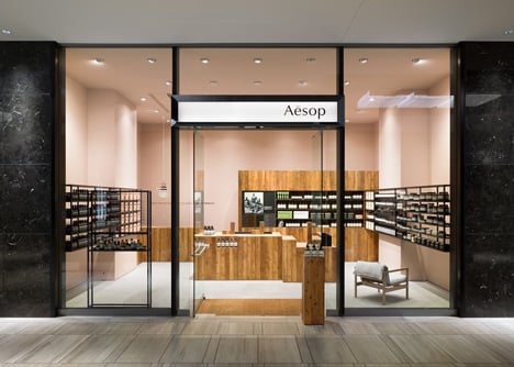
Located in the Grand Front Osaka Mall, the space was a seven square metre box with 3.9 metre high ceilings and a glass facade that faces the promenade, spanning the entire frontage.
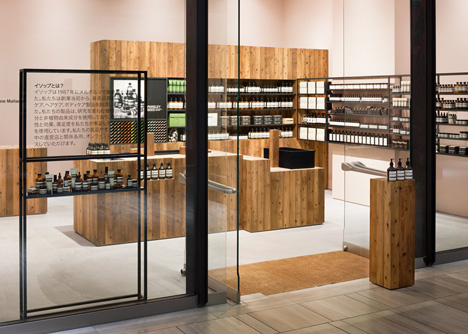
"We wanted to create a natural feeling against the cold glass and stone materials decking the promenade. Looking for local materials, we found the once-baked Japanese cedar wood pillars," said Torafu Architects.
"When we presented the material choices to Aesop, they suggested using the pink colour for the walls."
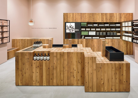
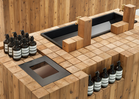
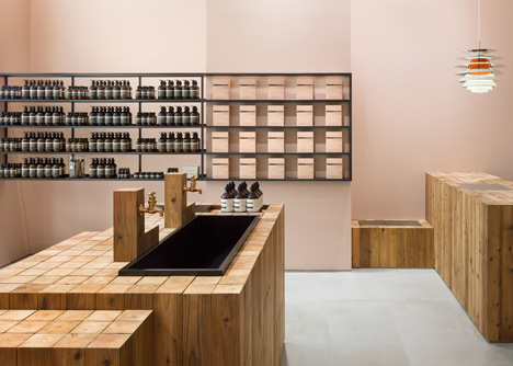
The Aesop shop fittings are made from squared cedar wood logs, positioned vertically and varying in height to house shelving and sinks, and to create counters, plinths and enclaves for product display. They also partition the storage room from the front of the shop.
"At first we were going to use wooden tiles for the floor, and the counters would look like they were extending up from the floor. But it was too much to have small grids everywhere, so we changed the floor to mortar and just the wooden volumes remain."
Blackened steel shelves at a continuous height around the perimeter of the shop provide continuity between the pink walls and the wooden fixtures, their lightness and transparency contrasting with the solidity of the wood.
The blackened steel provides a visual connection with the window frames and is a material that Torafu Architects also used in the Aesop Shibuya interior, one of four other shops the firm has previously designed for the brand.
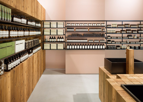
Finally, the vintage pendant lamp over the sales counter and the lounge chair in the corner of the shop are intended to welcome customers into the space.
Photography is by Takumi Ota.
There are more than 25 Aesop stores in Dezeen's archive, by designers including Ilse Crawford, March Studio, Ciguë and Frida Escobedo.
In an interview with Dezeen's editor in chief, Aesop founder Dennis Paphitis said that the brand commissioned a different design for each of its stores as the thought of a "soulless chain" horrified him.
Here's a project description from Torafu Architects:
Aesop Grand Front Osaka
We performed the interior design for a store by Aesop, an Australian skin care brand, located in the Grand Front Osaka mall. With its 3.9m-high ceiling and 7meters square plane, the project area offers a simple space with a glass facade that stretches the whole frontage facing the promenade.
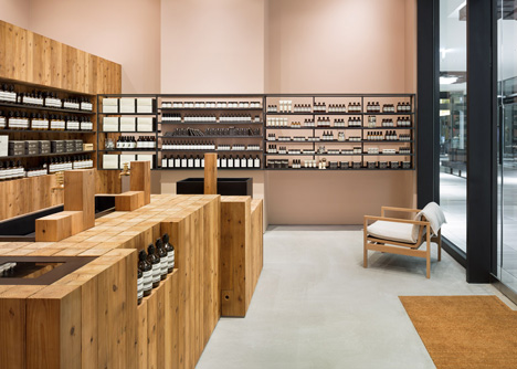
The combination of the soft pink coloured walls and ceiling and the Japanese cedar green found at the centre of the space has a warming effect on the interior of the store contrasting with the otherwise cold stone and glass material decking the promenade. Moreover, the fixtures, such as the consultation counter and point-of-sale (POS) counter, are made from squared Japanese cedar logs of varying length, which also help partition the storage room from the front of the store.
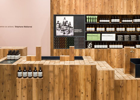
While the rough veneer of the Japanese cedar creates a contrast with the homogenising effect of its surroundings, the top surface of the squared logs of varying length are punctuated by aptly placed sinks, thereby bringing about a soothing sense of rhythm to the store. Furthermore, shelves made of black steel help frame the store by bridging the space between fixtures and columns.
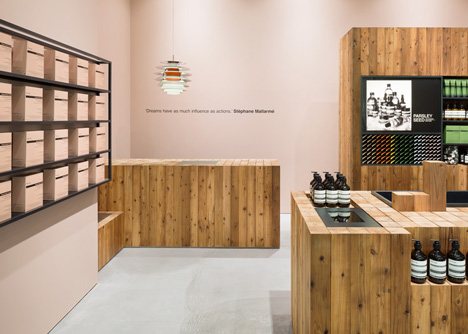
The shelves make Aesop's products stand out by creating a floating impression, while at the same time projecting a subtlety that balances the solidity of the wooden fixtures. Finally, the vintage pendant lamp hanging over the POS counter and the lounge chair sitting in the corner of the store help convey a sense of intimacy and consideration towards the customer.
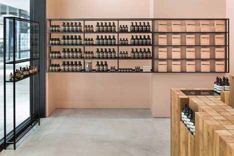
Like a cosy and inviting lounge, we sought to create a store serving simultaneously as a vehicle for Aesop's brand image and a showcase for their products.
Facility design: maxray(lightings)
Production: &S
Credit: Graphics: Aesop
Site area: Grand Front Osaka Mall
Total floor area: 47.48 square metres