House CM is a contemporary terraced house with a uniform timber facade
Belgian architects Bruno Vanbesien and Christophe Meersman have designed a terraced house on the outskirts of Brussels that stands out from its post-war neighbours thanks to its timber skin and minimal form (+ slideshow).
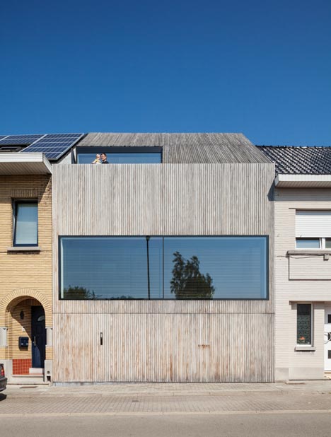
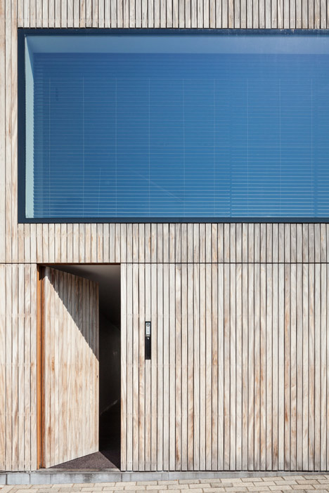
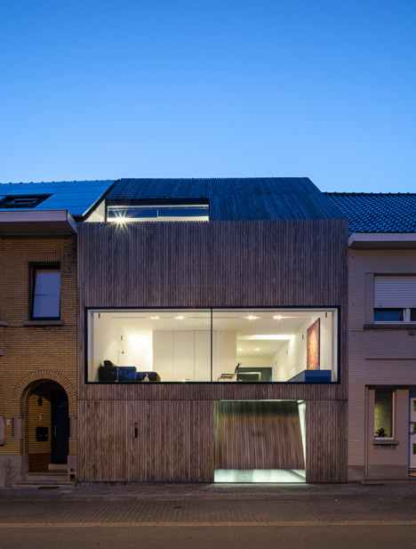
House CM was designed by Bruno Vanbesien in collaboration with owner Christophe Meersman. It mimics the shape of the post-war houses on either side, but usurps convention with timber cladding that covers the facade and extends up over the roof – camouflaging the front door and garage at street level and hiding a balcony from passers by.
"We wanted to create a uniform surface with just one material," Vanbesien told Dezeen. "The colour of the timber integrates well with the row of houses on the street, and unlike materials such as aluminium, it was acceptable by the local council."
The streamlined cladding and a single strip of glazing at the front are also designed to create ambiguity, so it's hard to gauge the size of the house from the street.
"The neighbouring houses clearly show where the floor levels are," explained Vanbesien. "Most have three levels, and we have four levels, but from the outside it looks like there are only two levels."
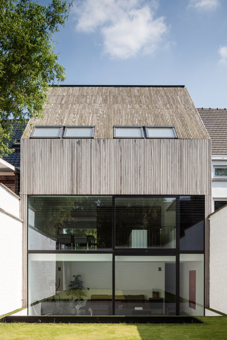
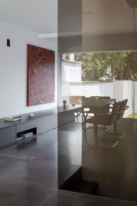
By contrast, the north-facing back of the house is entirely glazed on the ground floor and first floor to maximise daylight inside and create a strong connection with the garden.
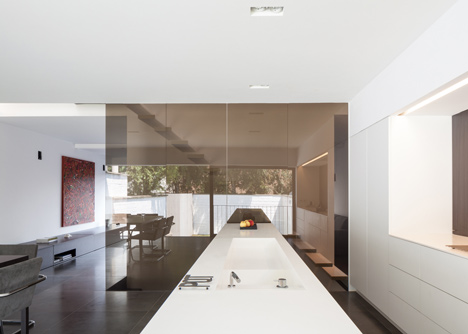
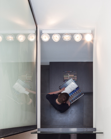
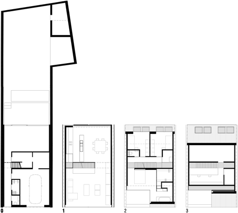
Inside, the four floors are connected by a metal staircase with open treads and glazed landings to increase the flow of light up and down the house.
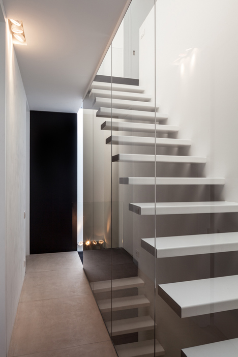
"It was important to create views from the top to the bottom," said Vanbesien. "We wanted it to feel like one house, with all the spaces connected, but without it feeling like one big loft."
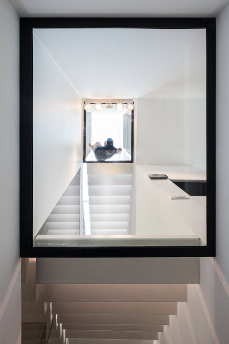
The staircase runs from side to side in the centre of the house, so that it bisects the floors, creating an informal division between the front and back rooms without the need for walls or doors.
The ground floor has a garage at the front and a living room at the back, opening on to the garden, which could be converted into an office in the future.
A second living room occupies the front of the first floor, with a kitchen-diner at the back.
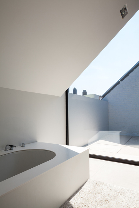
The second floor has two children’s bedrooms at the back, and a master bedroom and en-suite at the front, where the timber facade rises up to conceal a private balcony.
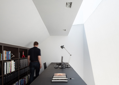
The loft level at the top has a study with a strip of glazing cut into the roof to bring in light.

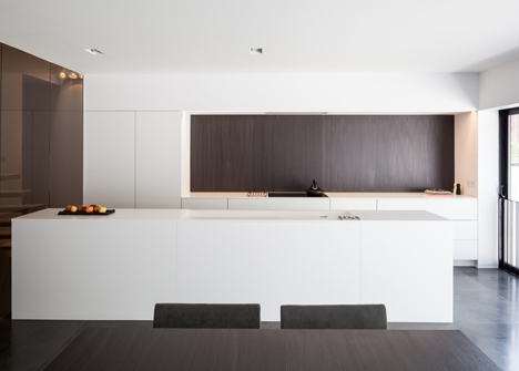
Basalt floor tiles have been used throughout and continue outside to make an additional connection between the indoor and outdoor spaces. Pieces of bespoke furniture were also been built to uniform proportions and with uniform materials to make the interior feel streamlined.
"There is a strong 80x80cm grid in the house, where the lines of the floor tiles, the plasterwork, the doors, and furniture are brought together," said Vanbesien. "There are not many different materials, and all the furniture surfaces and sinks are made with solid materials, so it looks like they are made out of one piece."
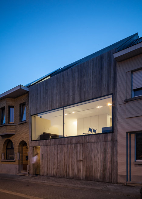
Afromosia – a durable hardwood – has been used for the exterior cladding. "It is a stable wood, which we needed for the roof, and it keeps its nice texture even after the façade has weathered to a grey colour," said Vanbesien.
Photography is by Tim Van de Velde.
Here is some more information from Bruno Vanbesien:
House CM, Belgium
This new house was built on an open lot in between two houses dating from the second half of the twentieth century. It is the result of the successful cooperation between the architect and the owner, an architect-assistant himself.
Although the facade seems to suggest that behind its afromosia panelling only two storeys are hidden, in reality this is a far bigger house. The big window in front, evenly balanced between the ground floor and the first floor, complicates an unambiguous reading of the layout even more. From the start, the design-team opted for a discreet facade, harmoniously linked with the neighbouring houses. This can further be seen in the camouflaging of both the front door and the garage. The placing of the front window proves to be more than an aesthetically pleasing solution. The large window placed on a pedestal brings the rooms on both ground floor and first floor a combination of much welcomed privacy and luxurious reclusion from the street.

The wooden panelling in tropical hardwood decorates the front facade but also covers the roof and the back of the house, thus creating harmony and unity in the use of materials. The same discreetness is not to be found in the back of the house. There the architect has chosen to pursue a maximum of transparency and flexibility and to give free expression to the personality of the owner. The large windows on the ground but also on the first floor can be opened up wide so that the transition between in/out becomes blurred. This playful treatment of inside and outside is best witnessed in the use of the terrace next to the bedroom on the second floor. There, the glass door can slid away to make room for the bed, which can be rolled outside to sleep under the stars. The natural stone floor composed of basalt tiles in the different rooms as well as the terraces outside maximises this effect even more.

Inside one cannot help but notice the metal staircase. Its construction is kept light to bring a maximum of light from the light shaft directly above the staircase to the storeys below. The aluminium frame of the light shaft is hid between plaster so that only the glass remains visible, making it a very decorative element in the house. All interior elements (kitchen, bathroom, lighting, furniture) were designed with the architecture in mind. The strict alignment of the furniture, the inventiveness of the design and the use of selected materials further accentuates the architecture and gives it extra lustre.
Location: Zellik, Belgium
Floor area: 220 square metres
Architects: Bruno Vanbesien and Christophe Meersman