WORKac shuns "office as playground" for Wieden + Kennedy's NY headquarters
You won't find slides, ping-pong tables or other faddish touches at the New York offices of advertising agency Wieden + Kennedy, designed by US architecture studio WORKac (+ slideshow).
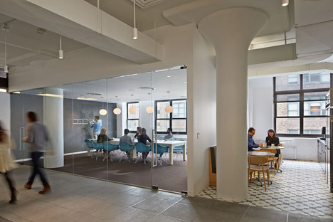
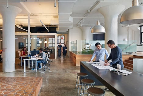
Instead, the 4,600-square-metre space in Lower Manhattan features places for collaborative work and discussion between Wieden + Kennedy employees.
"The design for Wieden + Kennedy New York moves away from the office-as-playground to put work back at the heart of creative work," said WORKac, who have banished the kind of fashionably juvenile equipment found at the offices of Google, Microsoft and Lego.
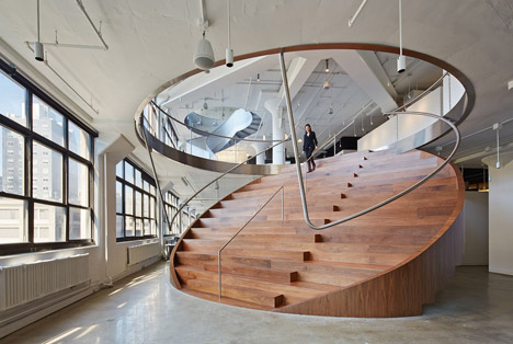
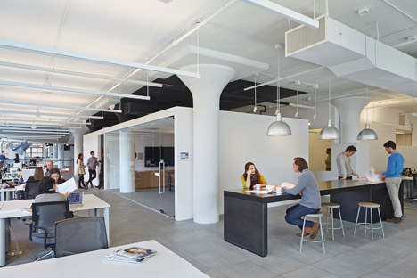
The architects did however opt for a fashionable staircase-cum-seating-zone and included four categories of work areas in various sizes, ranging from 245 open office spaces to ten large communal spaces.
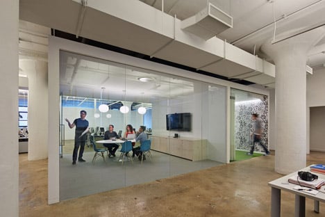
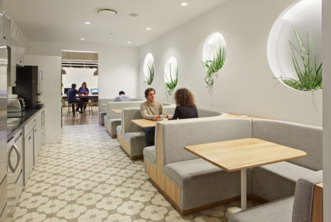
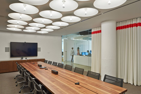
Meetings take place in phone booths and around picnic tables, as well as at more traditional conference rooms.
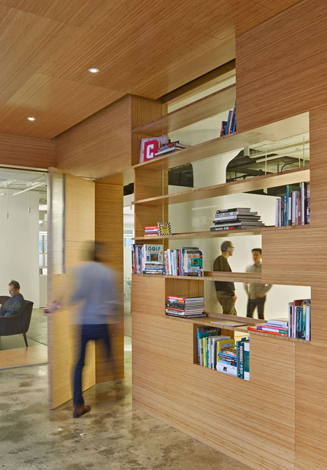
The offices occupy the sixth to eighth floors at 150 Varick Street. Each of these three levels is broken up by glass partitions, intended to create a sense of openness.
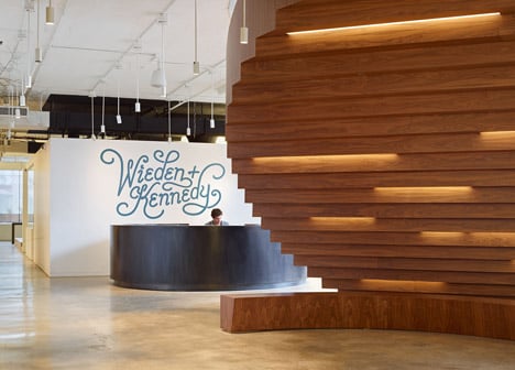
A round black reception desk sits beneath a graphic of the company name at the entrance.
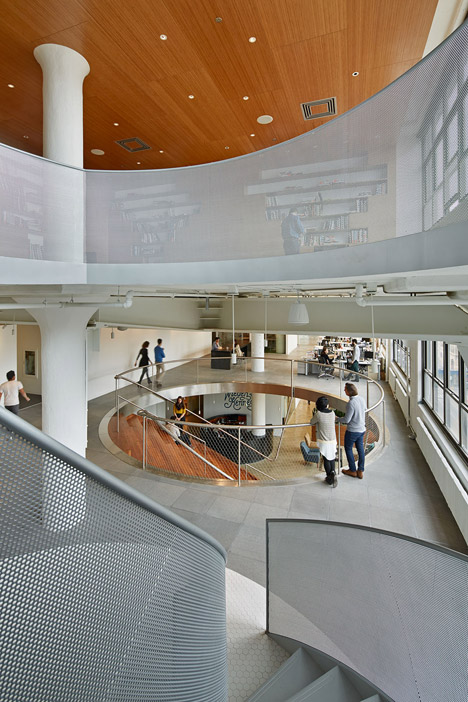
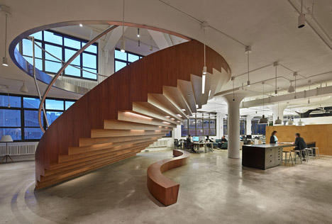
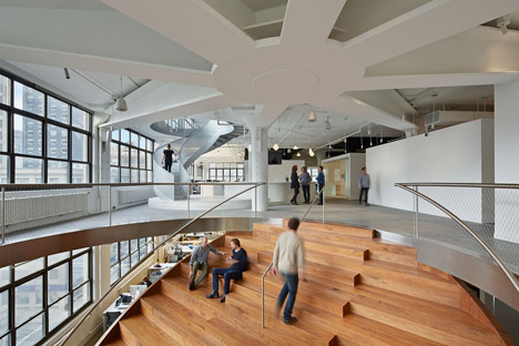
The lower two storeys are connected by a circular wooden staircase that doubles as a seating area, while a spiral staircase with metal mesh banisters allows access to the smaller third floor.
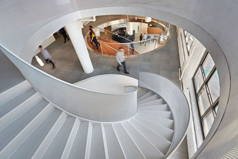
The large holes in the floor plates created by these vertical links help to visually integrate the different levels.
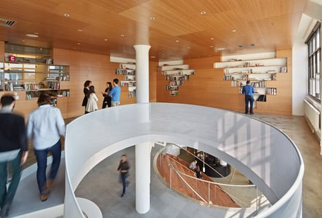
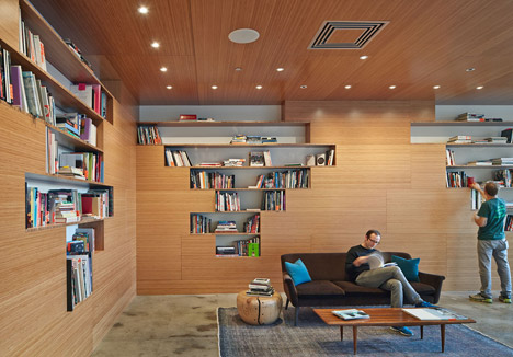
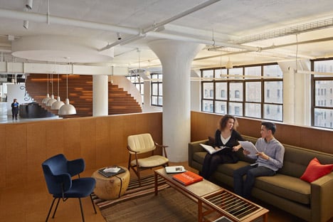
Surfaces in the library on the top storey are lined with bamboo panelling, contrasting with the polished concrete floors that feature throughout most of the interior.
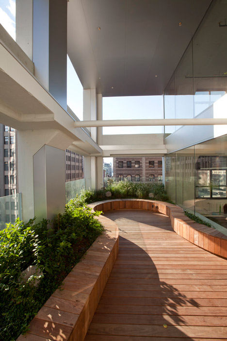
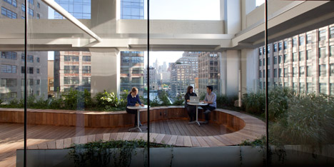
A covered terrace on the lower floor features wooden decking surrounded by planting, providing employees with outdoor space and views of the city.
Other facilities include a multipurpose gym, a kitchen and lounge areas, plus a bar next to the spiral staircase on the middle floor.
Dezeen columnist Sam Jacob recently wrote an Opinion column calling for an end to the "tyranny of fun" in office design.
"These are places of perpetual adolescence, whose playground references sentence their employees to a never-ending Peter Pan infantilism," Jacob wrote.
Photography is by Bruce Damonte, unless otherwise stated.
Here's the information sent to us by WORKac:
Wieden + Kennedy, New York
Renowned advertising agency Wieden+Kennedy has developed a global reputation for innovative work dating back to their early Nike campaigns in the 1980s. The agency’s Portland headquarters designed by Allied Works cemented Wieden+Kennedy’s position as a patron of architecture and continues to influence the design of their offices around the world.
WORKac's design for the agency's 50,000-square-foot New York office embraces urban density as its motto: a minimal compression of individual work spaces that opens up room for a gradient of diverse collective spaces.
The design for Wieden+Kennedy New York moves away from the office-as-playground to put work back at the heart of creative work. After a foray into the history of the workplace, research revealed that while advertising agencies have always been at the forefront of cutting-edge office design, no single workplace trend has replaced those that came before. Rather, the ways that people work have continued to evolve, layer and multiply.
Because work at Wieden+Kennedy is highly collaborative, WORKac designed the widest possible range of discussion spaces to accommodate meetings and gatherings of varying size, privacy levels, and duration. Teams can choose to hold quick reviews standing up at 10-foot-long "Over-The-Counter" blackened steel tables; have informal discussions in lounges with comfortable furniture and natural wood floors, raised to different levels to create a sense of privacy; or gather in the kitchens for working lunches.
More traditional meetings can be held in conference rooms that range in scale from smaller, intimate "Phonebooths," to "Picnic-Table" meeting rooms that accommodate up to 10 people to larger, formal "Wide-n-Long" conference rooms. Glass walls create a sense of lightness and transparency to the space. Clusters of these different meeting spaces are organized around groups of 20-25 people in open offices, featuring polished concrete floors.
A series of larger collective 'moments' are distributed vertically to serve as the connective tissue for the agency. These spaces open up views across the office through circular oculi that create the largest possible openings in the floor slab while minimizing structural impact. Connecting the 6th and 7th Floors, a circular-shaped, walnut-clad "Coin Stair" features bleacher seating that can accommodate office-wide meetings or informal discussions below a spider-shaped structure that transfers load from a removed column. On the 7th Floor, a white-tiled bar provides an opportunity for end-of-day office celebrations. Connecting the 7th and the 8th floors, a perforated metal spiral staircase leads to a generous bamboo-clad, library "den on the 8th floor.
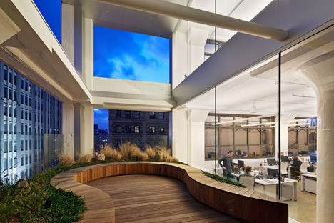
To bring the outside in, a double-height space on the 6th and 7th floors is combined with the removal of the existing windows and a new interior storefront to create an outdoor park surrounded by blueberry bushes and visible from the street. Completely wired for power, music and wi-fi, employees can use the outdoor space to meet, eat lunch or even take a bi-weekly yoga class. On the 7th Floor, inside the office, a large, multi-purpose gym offers additional space for interaction and recreation. The space doubles as a 'black box' to accommodate the whole office for lectures or film screenings.