"Six points of viral architecture"
Opinion: the way we consume architecture online has changed thanks to social media, creating a new genre of imagery – meme-tecture. Alexandra Lange offers her guide to making an architectural meme.
I absorb a great deal of design social media daily. Some of it is fascinating, some of it is depressing, much of it is repetitive.
In any given week, there will be one building (or even one rumour-of-building, like George Lucas's Museum of Narrative Art, now headed for the Chicago lakefront) that appears and reappears, bouncing from Citylab to Dezeen, from Planetizen to FastCo.Design, Architizer to Curbed. As the story turns up, slightly tweaked, in your Twitter stream or Facebook feed, it will usually be accompanied by the same image. Of the five or six provided by the architects, one is the winner. But why?
After a couple of Twitter conversations on the topic, I began to try to identify the common qualities I saw in the repetitions, and why I found many of them so frustrating. There's nothing inherently wrong with architects playing this game, making sure their rendering rises to the top of public consciousness, for example, when a competition is covered. But I wonder if the viral mentality begins to seep into design proper, simplifying and shining, so that each building moves closer to the easily digestible.
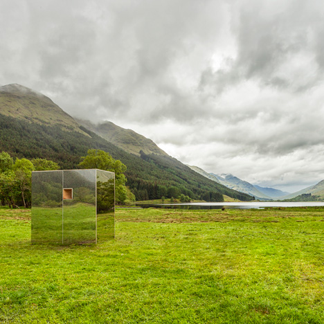
Nothing will ever look as perfect in real life as it does in pixels, as we found out during last year's Flint Flat Lot debacle. The winning entry for the public art project in Flint, Michigan, was rendered as a floating silvered house but ended up looking more like a cardboard box covered in aluminum foil. Mirrored things continue to be popular; a real-life building that isn't there in Scotland proved popular on Dezeen earlier this summer.
Mimi Zeiger (@loudpaper) suggested that viral trends follow advances in rendering technology; if first lens flare, now reflections are passé, could polar lighting be next? Will we be surprised when that new museum in Melbourne doesn't come with a picturesque rime of frost?
The court of public opinion, especially as delivered after careful inspection of the two-inch-squares of social media, isn't considered. It's emotional, excitable, hungry for something new to be wowed by. Like all viral media, it skews toward the positive, the jokey, the familiar in a glistening new package. It likes shouting, and big letters. I like big letters too. But I don't need them on my bus stop.
Without further ado, and with apologies to Le Corbusier: six points of viral architecture. (Why six? I am told it is more viral than five.)
1. Ducks. A bus stop that spells B-U-S is an awful lot like a duck that sells eggs. As Robert Venturi and Denise Scott Brown wrote in 1968, in On Ducks and Decoration, the former is "the sign that is the building," and in much of their contemporaries' architecture, "an expressive aim has distorted the whole beyond the limits of economy and convenience."
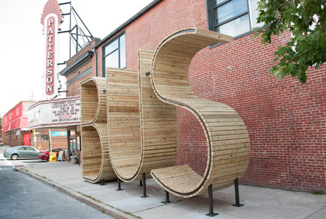
I rolled my eyes at the virality of that bus stop as one site after another picked up the story. Because it was an art project, by Spanish collective Mmmm, expressiveness was all that was required and in interviews the artists point to their own "obvious" solution. I believe when artists begin to play in the world of architecture, particularly via social practice, we need to ask the same questions of their work as we would of that of architects. As propaganda this was a resounding success, but as a long-term and permanent work of infrastructure? It is problematic, I wrote when challenged on Twitter, "because oversized, no info, minimal rain protection. A stunt not a system."
While in the short term it inspires social media sharing, the B-U-S bus stop doesn't necessarily have a larger impact on the Baltimore bus experience, and one wonders about the longevity of both the untreated boards and the lack of homelessness-proofing. Couldn't someone move into upper B? Obviousness is rewarded in the social media realm for the very same reason it was criticised by Venturi and Scott Brown: why go beyond a sign where terseness is a virtue. You don't need the article, you don't even the tweet, to know what this is and pass it on.
2. One. After discussing viral architecture on Twitter with Fred Scharmen (@sevensixfive) and Los Angeles Times architecture critic Christopher Hawthorne (@HawthorneLAT), I began to think of how to define it. My first instinct had been to tweet, "Def something about graphic quality: has to pop in preview image 2 inches wide. BIG plays this game." That's true for the B-U-S bus stop, but it's also true for a variety of projects that aren't quite as obvious.
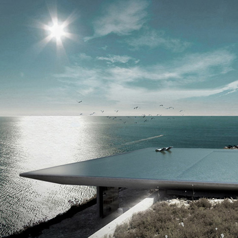
This infinity pool that spans an entire roof, for example, a suggestion from Dezeen social media editor Ross Bryant. Those mirrored cubes. David Adjaye's work often lends itself to a single, powerful image as well, from the early Dirty House to the recent Sugar Hill housing, which looks like stacked graphite boxes from a distance, but reveals a textile-like pattern up close, like a built-in logo.
BIG's entry in New York's Rebuild By Design competition, the BIG U, managed to win both funding and the online war-of-the-renderings by drawing a green line around the tip of Lower Manhattan. The name almost puts it in duck territory, and the image made it clear that something green – aka something environmental – was happening to New York City.
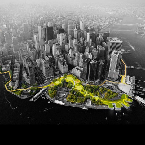
Many of the other projects in this highly complex, post-Hurricane Sandy competition for federal dollars ended up proposing solutions without architecture. A void can't be viral. In general, BIG's work seems designed for sharing: the simple shapes, delivered with a nickname already in place, offer pre-interpretations without a need for Herbert Muschamp to search for an appropriate metaphor. (Of the Guggenheim Bilbao Muschamp wrote, "It's a bird, it's a plane, it's Superman. It's a ship, an artichoke, the miracle of the rose.")
Scharmen suggested viral architecture has much to do with the Big Dumb Object of science fiction criticism. From Wikipedia: the BDO "is any mysterious object (usually of extraterrestrial or unknown origin and immense power) in a story which generates an intense sense of wonder just by being there." The singular objects of architecture, with their noun-names, generate a sense of wonder through their simplicity, their apparent easiness to understand. "We can save Manhattan by building a bigger High Line!" the picture says, even if that's not what the architect means. Do people read on beyond that?
3. One, two, three. After the Big Dumb Object, the Big Dumb GIF. It makes architecture (and moving large inanimate objects) look as easy as one, two, three.
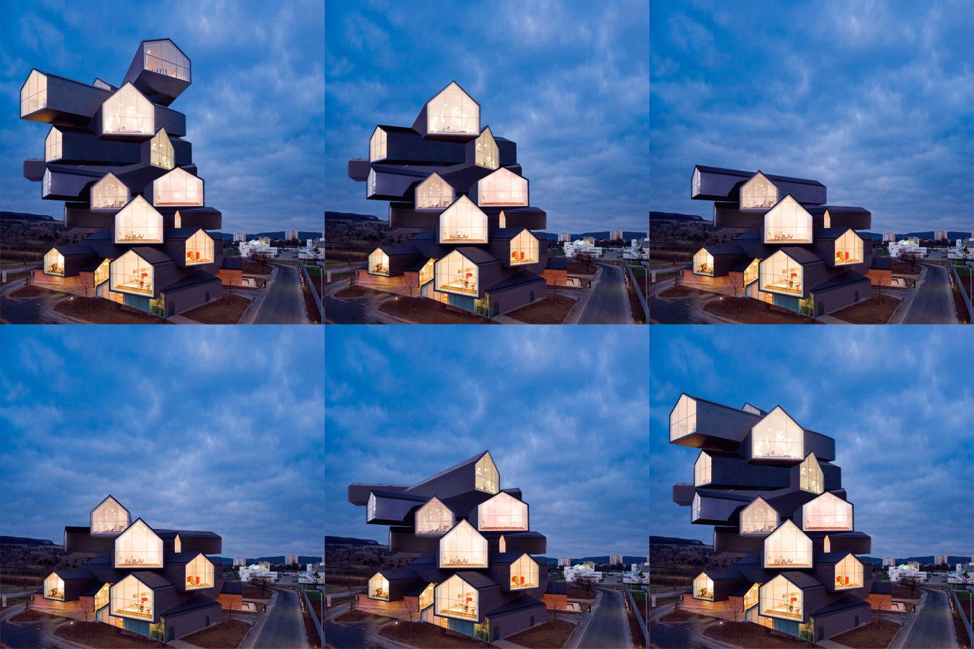
Advanced version: how to build a skyscraper in 15 days. This type of virality translates the weightlessness of so many architecture renderings into assembly terms, making us all feel like Mary Poppins, snapping her fingers at messy, multi-year construction schedules.
4. Instagramminess. Instagram's architecture power users like a few simple things. They like white. They like to square up. They like vanishing points. When Junya Ishigami had an exhibition at the Harvard Graduate School of Design last fall, he sent over specifications for a series of white-on-white models, lunar surfaces in which it was sometimes difficult to distinguish landscape from architecture, roof from ground, tree from column. When he came to the school to give a lecture his slides were, comically, the same: white expanses upon which he had to draw in the few lines to indicate his interventions. The photographs I and others took of those models were surprisingly popular. I think it was because they maintained both mystery and interest at tiny sizes – Instagram thumbnails are an opportunity for discovery, but if an image is too detailed it just looks dark. So: grids, shadows against a wall, baby Thomas Gurskys of the repetitive commercial landscape, and sparkling, unearthly, blown-out-with Amaro filter white.
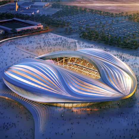
5. Charismatic megafauna. This could also be called the Zaha Hadid category of viral architecture, but she's far from the first designer to combine unusual form with colourful personality, over and over and over again. New media can make its own stars, but it also reinforces existing patterns of fame.
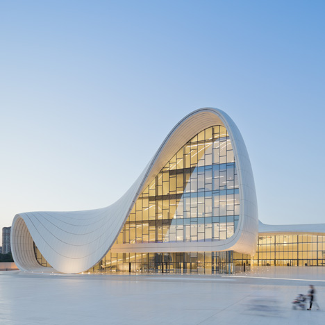
Even as discussions within architectural history and curation move away from an emphasis on the lone creator, and toward a more realistic choral view of the design and construction process, new and old architecture media reinforce the single-player version of the game. Everything from Zaha&Frank&Daniel&Thom T-shirts for kids, to writing about architecture for a mainstream audience, to awards that must be judged on photography alone, evidence a desire for a one-name/one-form equivalency. When you see a white swoop, you know it's a Zaha, and that makes you feel in the know.
Going back in time, Frank Gehry's work could be digested in the same knowing way. One wonders what the internet could have done for Bruce Goff, whose wild projects were tucked away in the middle of the United States, rather than the more media-centric coasts. If some enterprising artist were to re-photograph the work of an under-known mid-century eccentric, and present it as the work of someone new, I'd be very interested to see the result. There's also a coattails version of this strategy, which involves partaking of the characteristics of the charismatics of the past. Every time you see something in bentwood (like these sneakers) or seamless white plastic (like anything Apple), that's reflected virality.
6. Sex. A building that looks like a vagina?
