Garden studio by Serge Schoemaker has a dark, rough exterior and a light-filled interior
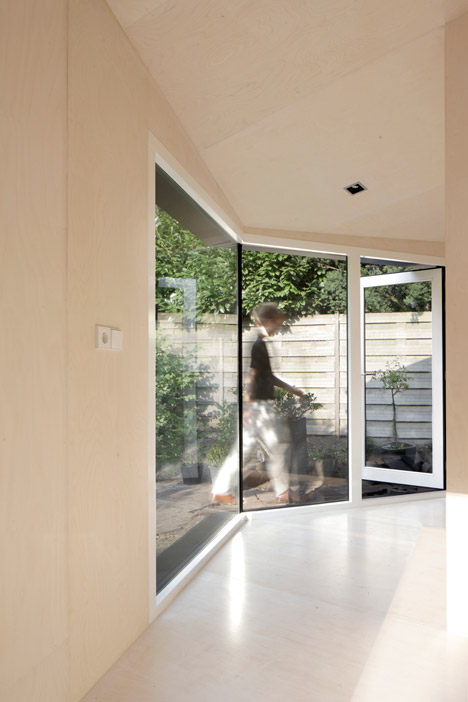
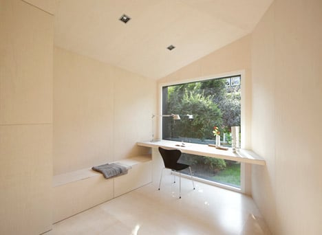
Dutch office Serge Schoemaker Architects meticulously arranged different-sized sections of plywood that "fit together seamlessly like a jigsaw puzzle" across the interior of this angular garden studio.
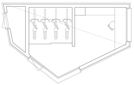
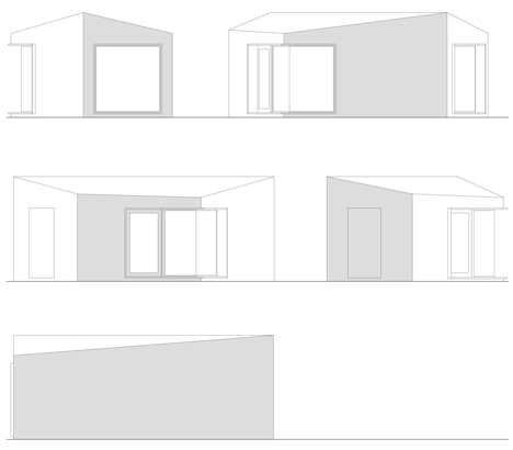
Bussum Garden Studio was designed by Serge Schoemaker Architects as a home office for a Dutch family with two children, which also includes storage for bikes and garden tools and can double as a guest room.
"We did not want to make a regular shed, but more a little house," Schoemaker told Dezeen. "Contrasting with the dark, rough, textured exterior, the transparent white-lacquered birch plywood interior appears seamless and light."
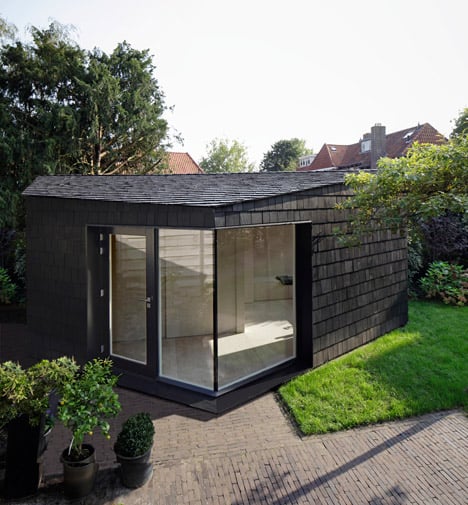
To emphasise the studio's angular form, and to reference the craftsmanship of surrounding 1930s houses in the town of Bussum, the exterior walls and roof were clad in approximately 2,000 red-cedar shingles that were sanded and painted by hand.
"We wanted a homogenous cladding to emphasise the modern, sculptural character of the design, but did not want an industrial look," said Schoemaker, who previously worked with Peter Zumthor and was project architect for the Kolumba Art Museum before setting up his own practice.
"That is why we chose shingles of different sizes, which are sanded and painted by hand. The little irregularities communicate that it is made with care."
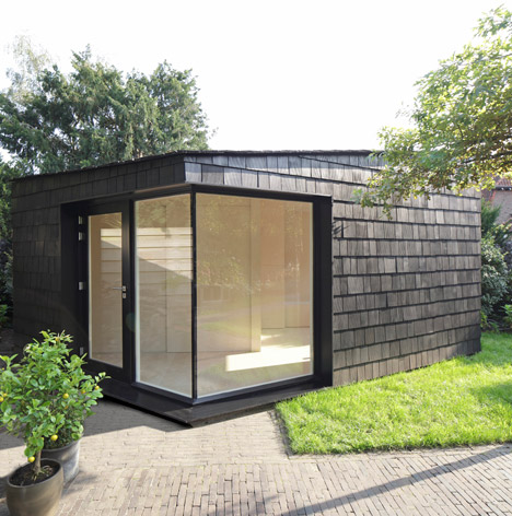
A corner of full-height glazing at the entrance provides a crisp contrast with the irregular textured facade.
"Careful attention was required for the construction of this window, as the glass panes meet at a non-perpendicular angle without a window frame," explained Schoemaker.
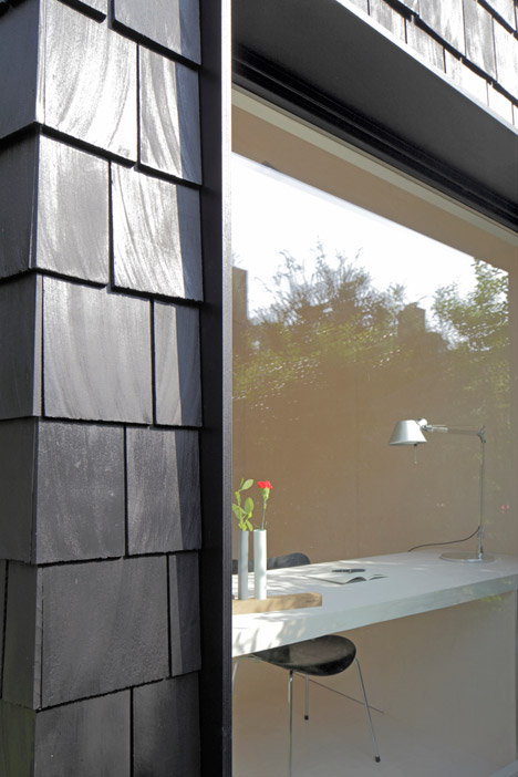
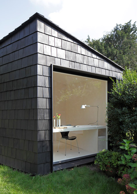
At the back, which faces west, another full-height window measuring approximately two square metres was added to provide the desk with a garden view.
"When you sit at the desk behind this big window, you have the feeling you are sitting in the garden, between the flowers, plants and trees," said Schoemaker.
Deep recesses with black plywood surrounds in front of the windows emphasise the thickness of the studio's walls.
"The thick walls show that this is not a shed, but a house, and emphasise the sense of comfort inside the well-insulated structure," said Schoemaker.
"When you make a little object like this and you don't want it to look simple, every detail is important," he added. "The craftsmanship shows the object is small, but created with care."
Photography is by Raoul Kramer.
Project credits
Team: Serge Schoemaker. Beatrice Nespega

