Ola Architecture Studio's housing block in Melbourne designed as an "ode to brick"
Built near the heart of Melbourne's historic brick-making district, this block of apartments and shops has walls of black bricks that are arranged to create perforated patterns and provide privacy for residents (+ slideshow).
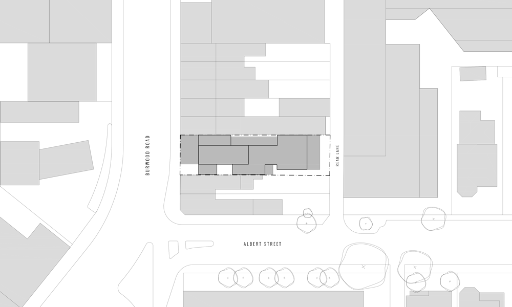
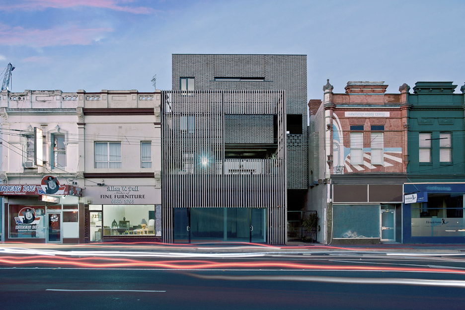
Called Ari Apartments, the four-storey building was designed by Australian firm Ola Architecture Studio to occupy a deep site that spans two plots. One side was previously filled by a Victorian structure nestled in a strip of old shopfronts on Burwood Road.
The main building material is black brick, chosen to reflect the neighbourhood's industrial brick-making past.
"The building is located in Hawthorn East in Melbourne, just east of Auburn Village in the heart of the historical brick-making area, and only a stone's throw away from the original brickworks site itself," explained the architects.
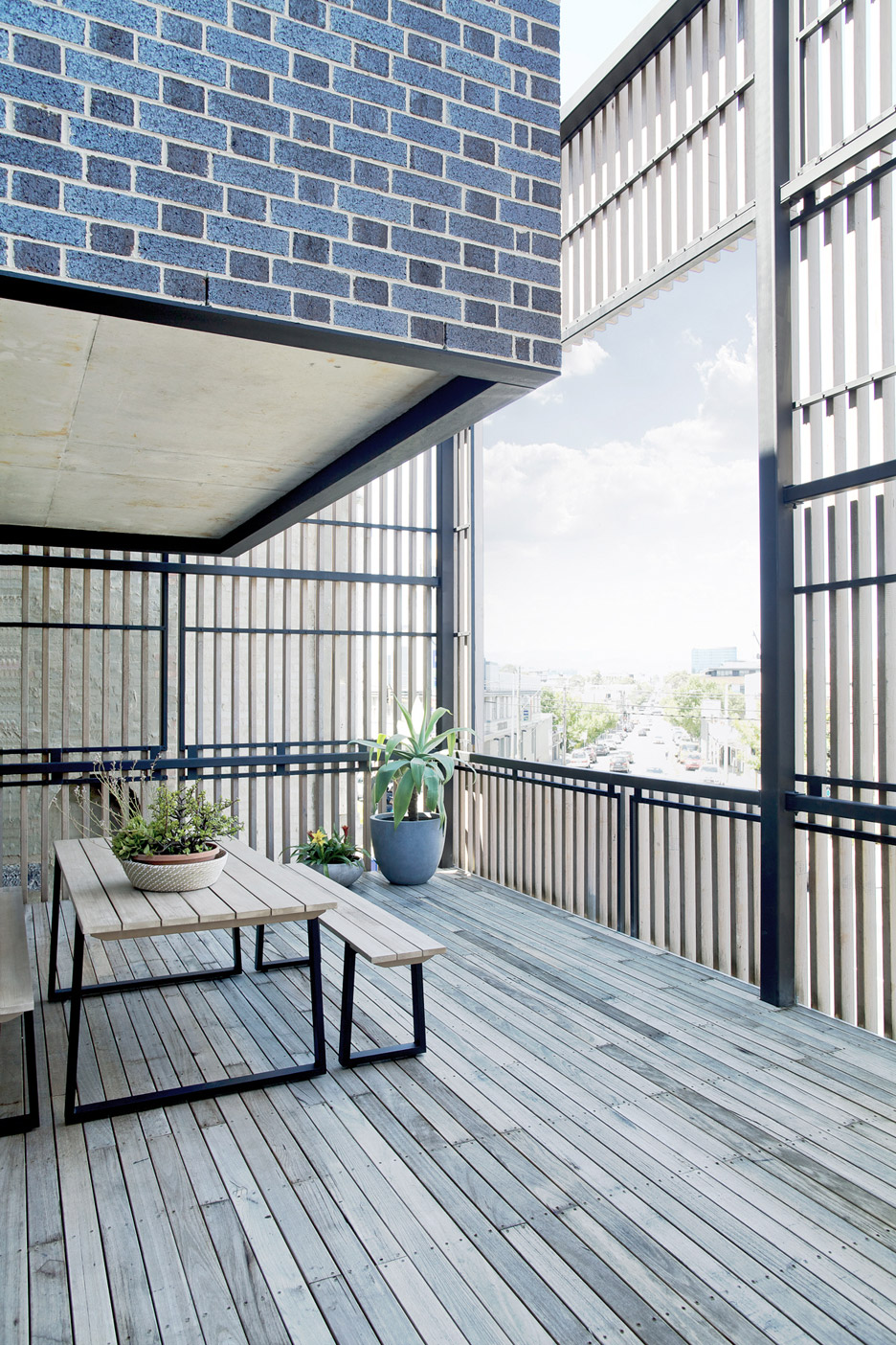
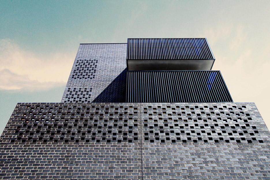
"Given the site's location, the project investigated the opportunities of the humble brick beyond a simple facade material and explored how the brick can be assembled to create detailed patterns on the buildings."
Patterns and perforations in the facade are a result of the studio's experiments with arranging the bricks in different formations. These were combined with small street-facing openings to help maintain privacy for residents while allowing natural light inside.
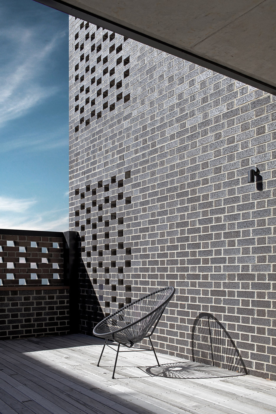
"This ode to the brick couples as a contemporary reminder of an important element in Haworth's early industrial history while showcasing how the material continues to be successfully detailed for contemporary architecture in Melbourne," added the architects.
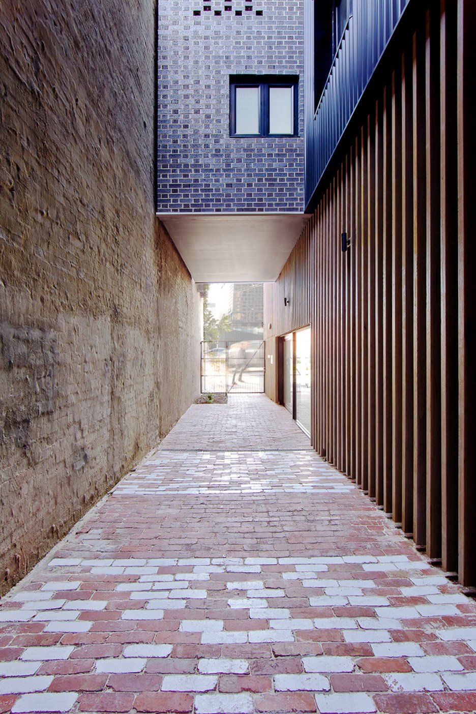
Bricks from the original Victorian building were saved where possible and used to edge the paths and courtyard on the ground floor.
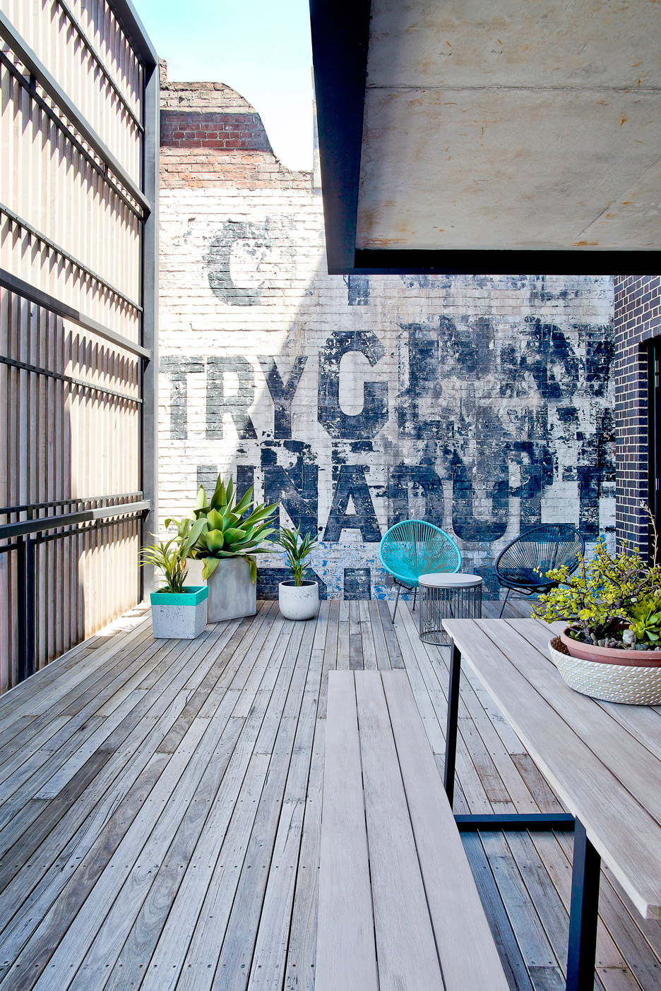
The architects also attempted to preserve a 120-year-old advertising sign that was discovered painted on the wall of a neighbouring building during demolition.
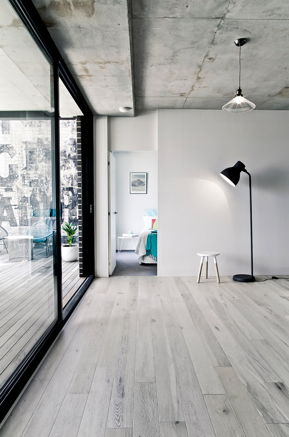
"Efforts were made to alter the design so that the sign could be preserved to not only add a fascinating point of difference to some of the external courtyards but to further contribute to the layering of history and recognition of the site's past," said the studio.
A timber screen at the front also echoes the outline of the old building. This was designed to help reduce the visual impact of the new structure, which contrasts with the smaller pale-painted shops on either side.
The brick and perforated steel facade at the back, where it is surrounded by larger developments, is left unscreened.
"The modest use of black brick and perforated steel allows the building to have a strong sense of sturdiness and solidarity to ensure it will never lose its sense of place," said the team.
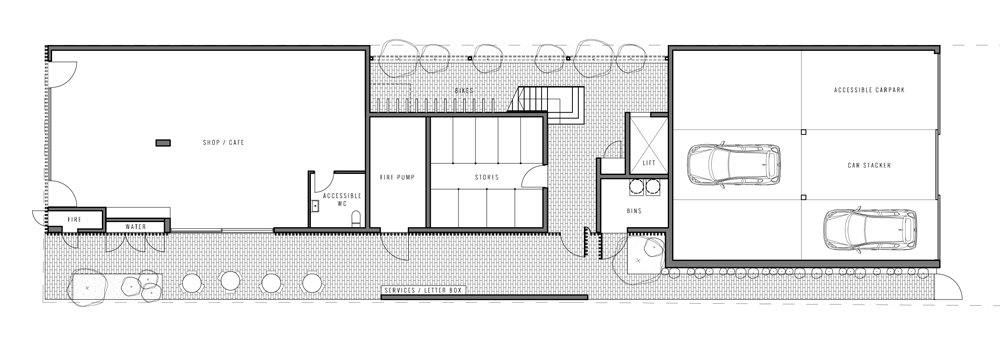
The ground floor contains a shop at the front and a car park at the rear, separated by a courtyard that provide bicycle parking.
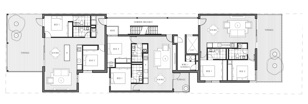
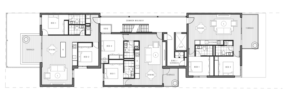
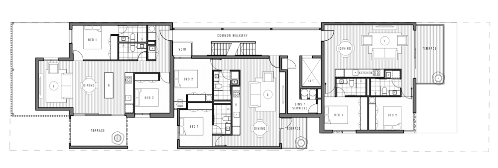
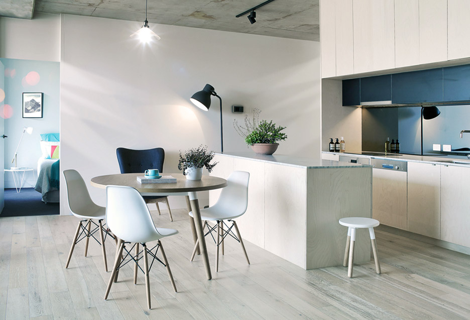
Each of the three residential levels contains three two-bedrom apartments with private terraces of varying sizes. The terraces are wrapped in black steel screens.
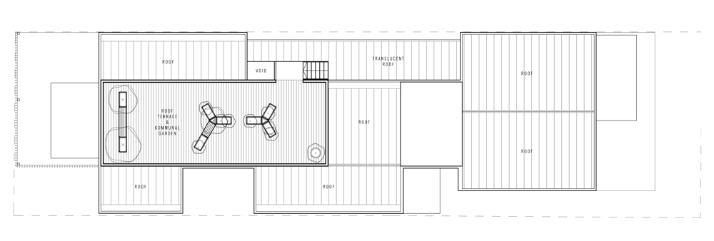
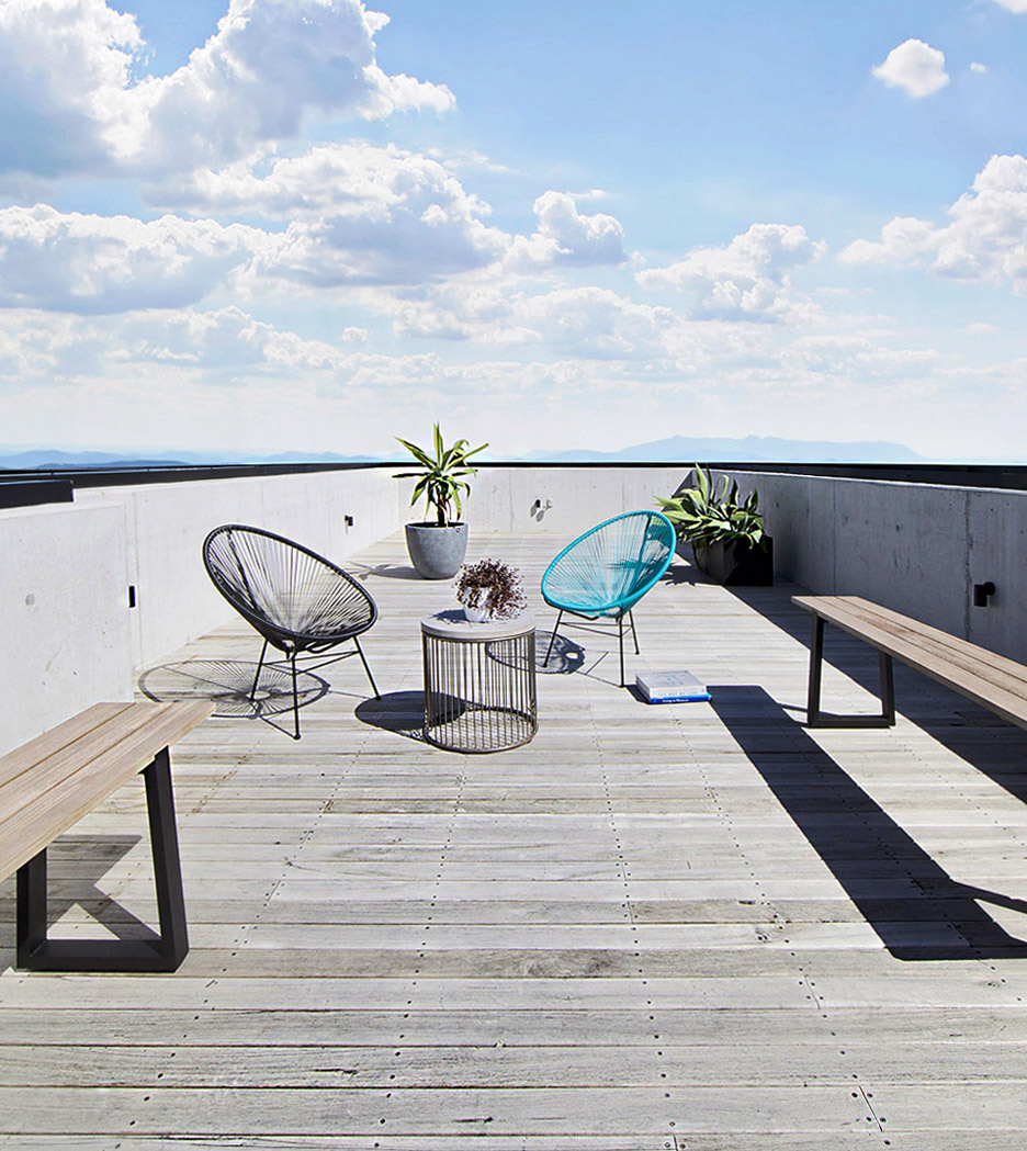
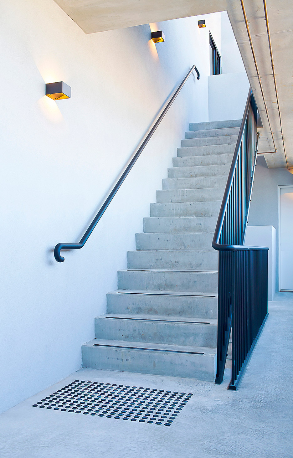
A shared garden and terrace for residents occupies part of the roof, which also features a transparent section above the staircase and hallways that connect the apartments on one side of the building.
Photography is by Paul Carland.
