Jonathan Tuckey designs two contrasting London shops for Malin+Goetz
Jonathan Tuckey Design has completed two London shops for skincare brand Malin+Goetz – one filled with plywood boxes and the other featuring a reflective ceiling (+ slideshow).
British designer Jonathan Tuckey was asked to create the first two UK branches of the American brand, which was launched by entrepreneurs Matthew Malin and Andrew Goetz back in 2004.
Similar to brands like Aesop and Camper, Malin+Goetz is keen to make every shop unique to its setting. To ensure this was the case, Tuckey assigned different project architects to each store.
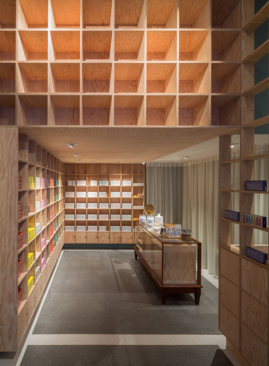
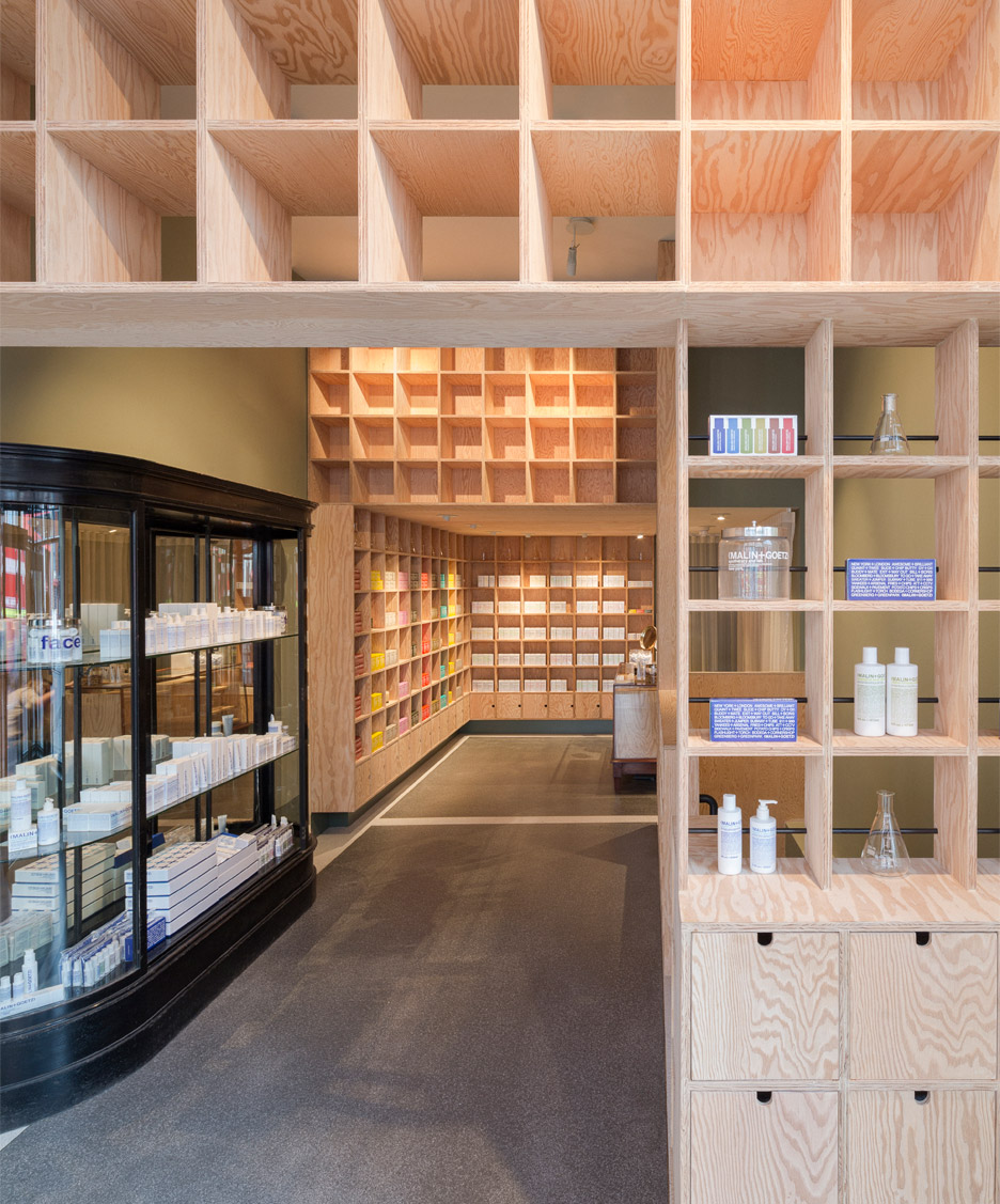
The first of the two shops takes over a Victorian-era premises on Upper Street in Islington. To suit this, the design team paired vintage furniture with a simple, square-grid shelving system to create an apothecary-inspired interior.
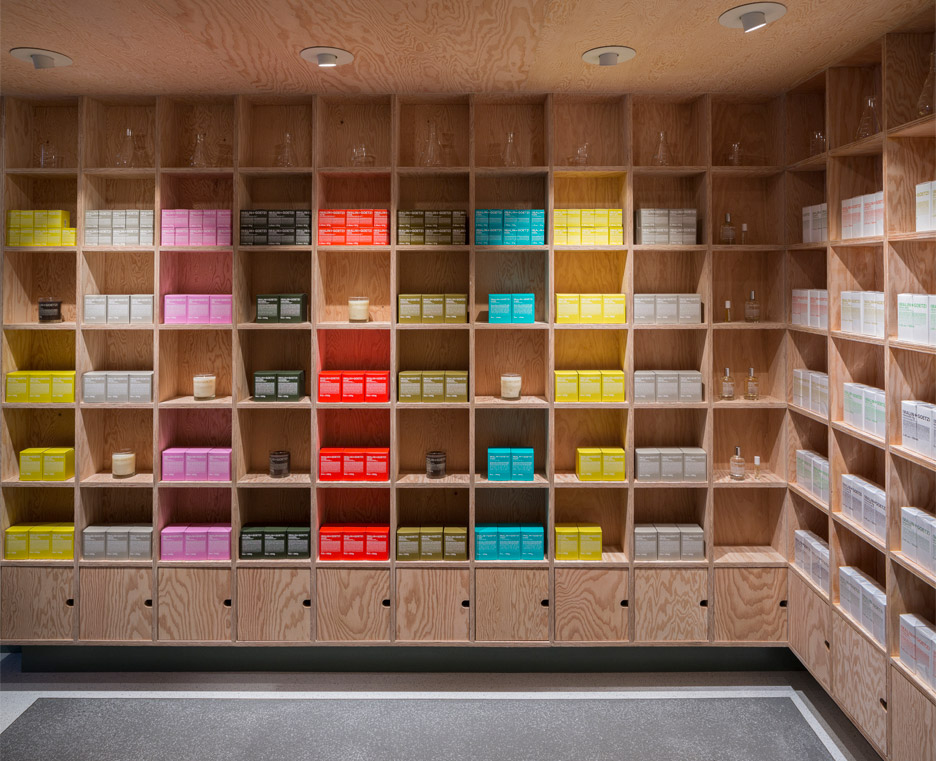
Constructed from plywood, this shelving system extends across the walls of the shop and creates partitions between different areas. It also integrates drawers.
The prominence of this feature is amplified by the height of the area at the front of the store. There was previously a suspended ceiling here, but Tuckey's team removed this to create a more lofty space.
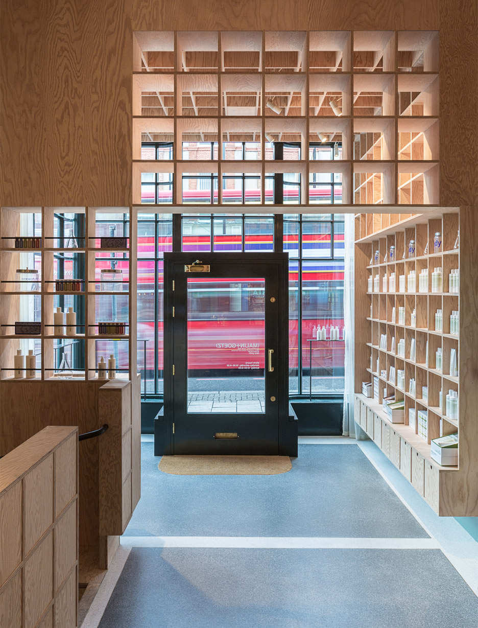
This is reflected in the new shopfront – a traditional curved wall with gridded glazing and raised frames. At night, translucent curtains can be drawn behind this facade.
Two vintage pieces of furniture were sourced for the interior. The first is a grand display cabinet, while the second is a glass counter, which now contains plywood boxes. They sit on a terrazzo floor.
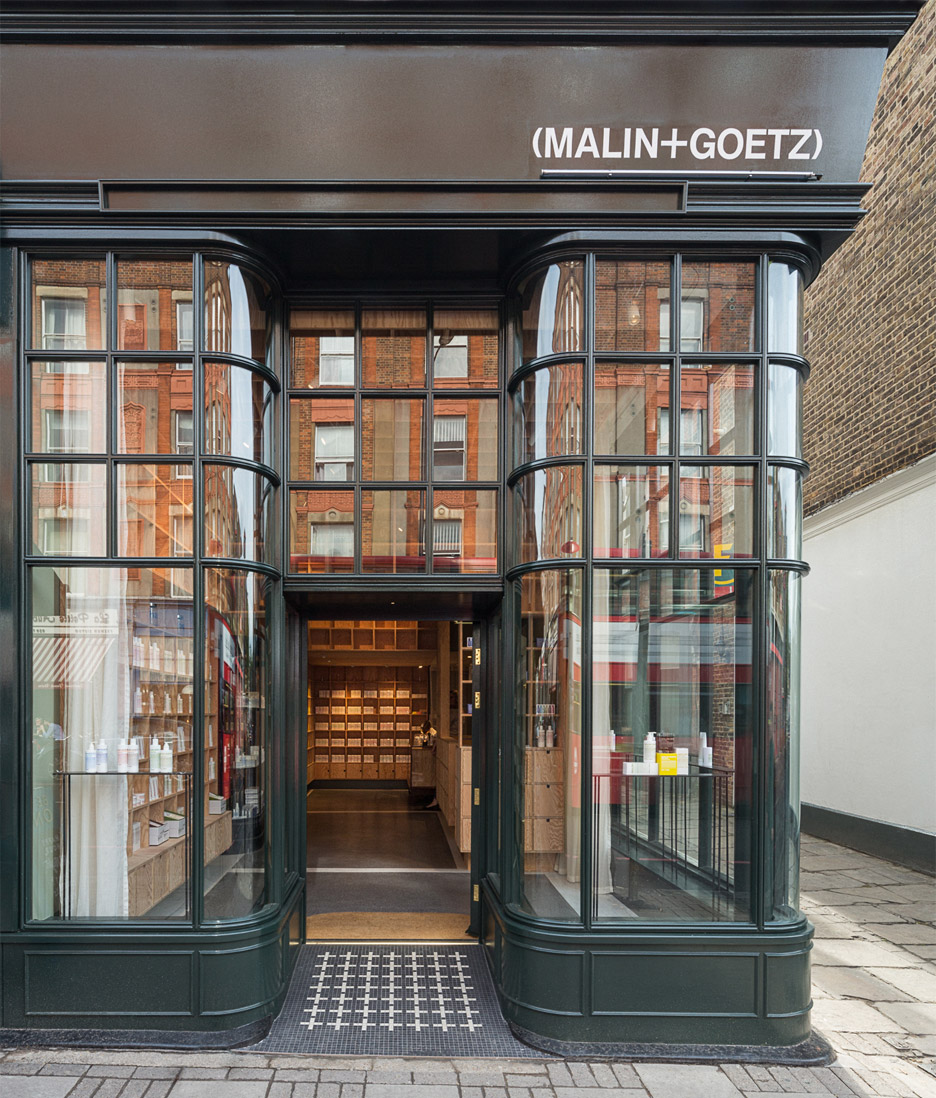
"At Upper Street, we focused on an apothecary feel that works well in keeping with neighbourhood ambience that Malin+Goetz wanted in this residential part of London," explained Tuckey.
"The shop has a warmth that we enjoy and a feeling of something new yet something found too. We like this type of ambiguity when reworking buildings."
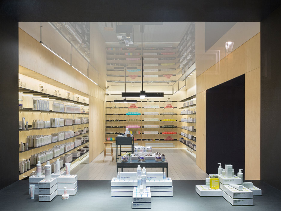
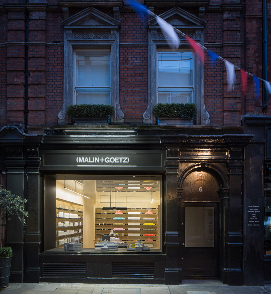
The second shop is located on Monmouth Street in Covent Garden – the same street where Dezeen previously opened a pop-up Christmas design store, The Temporium.
This branch of Malin+Goetz has a much more contemporary aesthetic than the Islington store. Its most prominent feature is a large boxy window, designed to look like a vitrine.
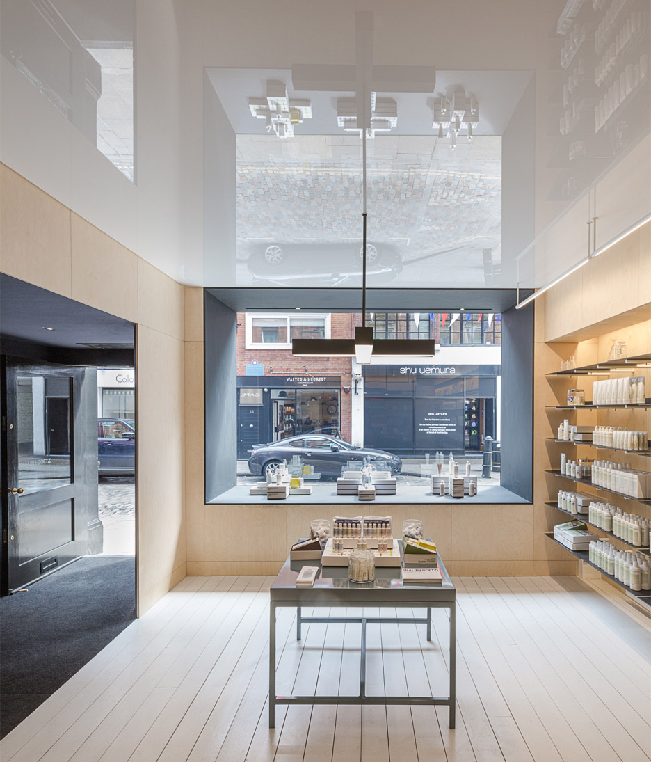
The shop is entered through a dark area described by Tuckey as a felt-lined tunnel. Beyond it, the simple space features illuminated wood-panel walls, whitewashed floorboards and a reflective ceiling.
The colourful products are displayed on dark shelves, supported by cylindrical rods.

"At Monmouth Street, we thought that something more theatrical was appropriate, as Covent Garden is very much a destination for so many high-end retail brands," said Tuckey.
"We are excited by the way in which our interior is experiential like an art installation," he added. "It also plays on the idea of something cinematic or a stage, which is an intriguing part of retail design today."
Tuckey founded his studio in 2000, and now has offices in London and Switzerland. Past projects include a black house extension, a renovated mews house and an archive for London's Southbank Centre.
Photography is by Dirk Lindner.