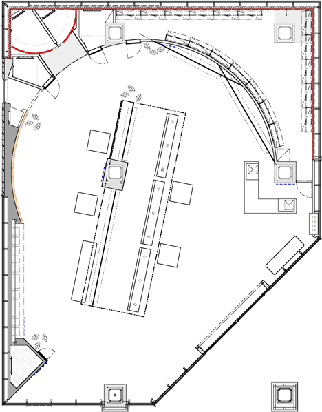
Le Ciel Bleu by Noriyuki Otsuka
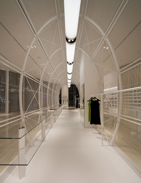
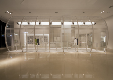
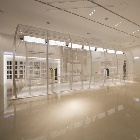
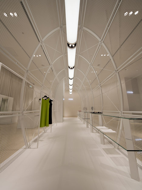
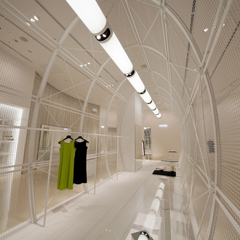
Slideshow: a select number of garments at this fashion store in Osaka are presented inside a white cage-like tunnel.
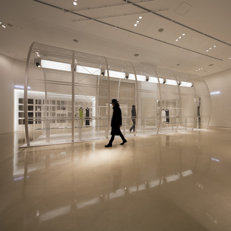
The Ciel Bleu store was designed by Japanese interior designer Noriyuki Otsuka and also features a metallic gold floor and five-metre-high ceilings.
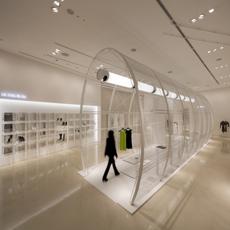
The oval tunnel is positioned slightly off-centre inside the shop and is surrounded by very little other furniture.
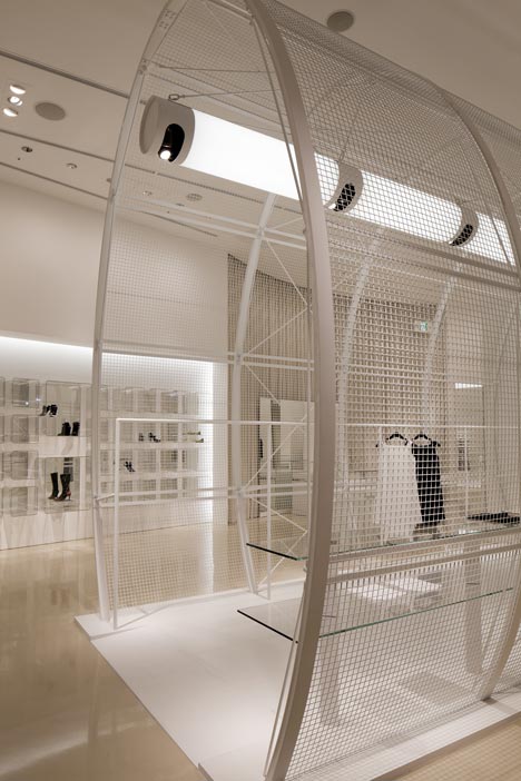
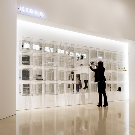
Four rows of acrylic boxes are mounted onto an illuminated rear wall to create shelves for displaying shoes.
You can see a selection of projects featuring tunnels in our recent special feature.
Photography is by Hiroyuki Hirai.
The following text is from Noriyuki Otsuka:
A white space in brilliant colors
This shop was designed for a retail complex called LUCUA, which was built as part of the redevelopment of the Umeda area in Osaka.
It is a luxurious architectural space of about 278m2 with a ceiling 5m high. When approaching the design I simultaneously embraced the two opposing notions of the overall concept as well as the detailed design of the space.
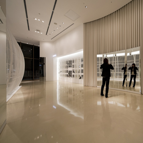
I was conscious that if I based my design on the functional requirements of the space such as the number of products that could be housed, I would end up with an interior resembling a fashion retail megastore.
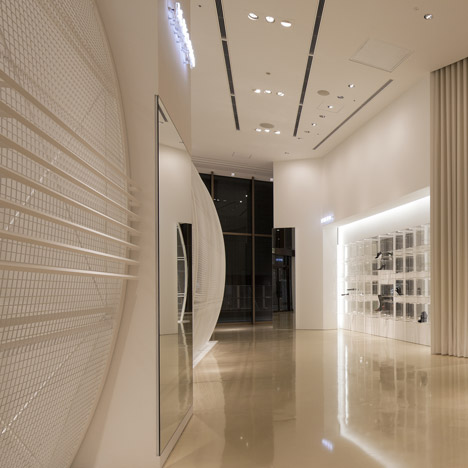
The design that I proposed was an interior space which incorporated another architectural space within it.
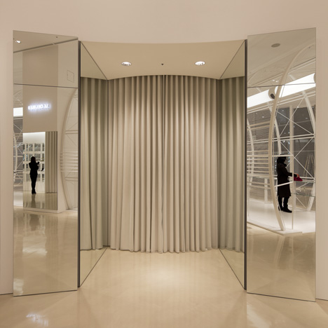
This interior space was a cylinder made with a structurally self-supporting mesh. Because of the size of the feature I wanted to avoid integrating it too much with the surrounding space, so deliberately aligned it off center from the axis of the building.
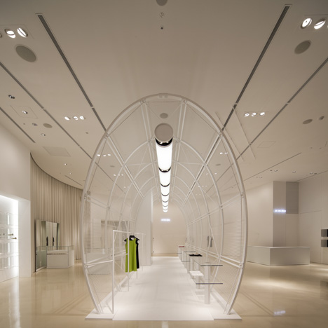
This layout gives the space a sense of gravity. I also included custom-made hanging light fittings in my plan for the cylinder in order to make the interior space the central focus of the design.
The composer Toru Takemitsu expressed music with colors. In the same way, I wanted to express a white space using brilliant colors. That is to say, I wanted to use the density of the design to fill the space in the same way as music notes fill a space. This density is not expressed through an elaborate or gimmicky design; rather it is expressed as a fine balance of musical notes.
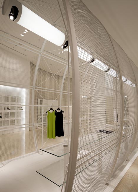
This sense of balance diffuses throughout the space in the same way that a drop of watercolor paint causes the surface of water in a jar to ripple outwards.
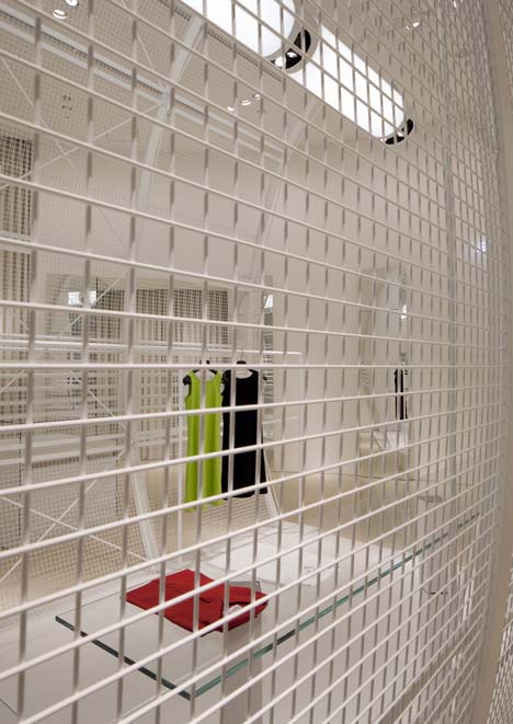
The white space is infused with color but maintains a sense of balance, and the specially-made gold metallic flooring highlights the form of every object in the space. It is in this that the originality and elegance of the shop is expressed.
The client had a very good understanding of design, and it was largely thanks to this that t was possible to design a space to such a high degree of perfection.
