Paco Roncero's workshop by Carmen Baselga Taller de Proyectos
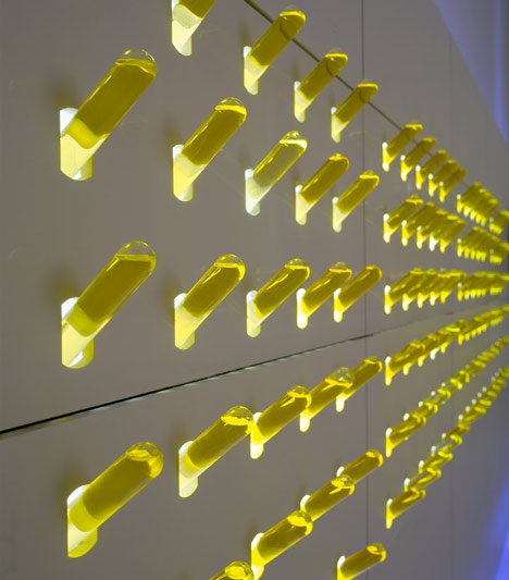
Test tubes of olive oil line one wall of this high-tech workshop designed for Michelin-starred chef Paco Roncero by Spanish studio Carmen Baselga Taller de Proyectos.
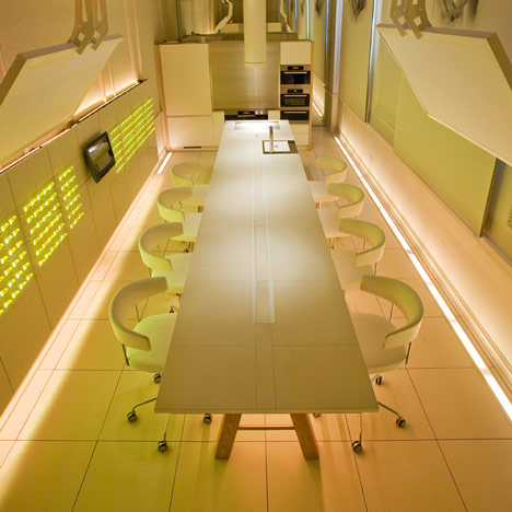
Located in the nineteenth century Casino de Madrid building, which also houses his Terraza del Casino restaurant, the workshop provides a space for olive-oil expert Roncero to experiment with new ideas.
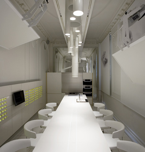
The room, which is higher than it is wide, had significant damage to its floors and mouldings. Carmen Baselga's studio renovated the space in collaboration with designers S3-Tau and created a clean white interior with room to seat nine people.
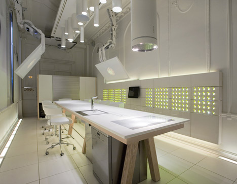
Along one wall is the 'oleotec', which holds 216 types of olive oil in glass test tubes. The oils are identified by the numbers and the letters engraved alongside them, while a touch screen provides information about each one.
The ceramic table has heated areas to keep plates warm or cool as required, while vibrating areas help to prepare certain dishes. A cooking hob and tap are integrated into the table, and guests can even take notes directly onto the surface.
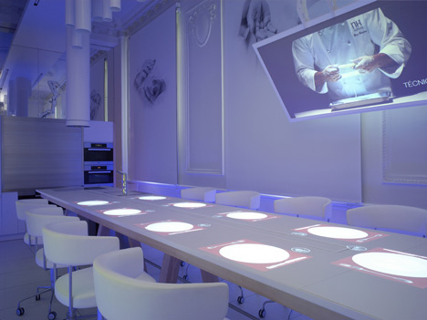
Diffusers are installed inside hanging tubes to vaporise water and maintain the correct humidity. Some diffusers also hold unusual custom-made scents, including mushroom and humid grass.
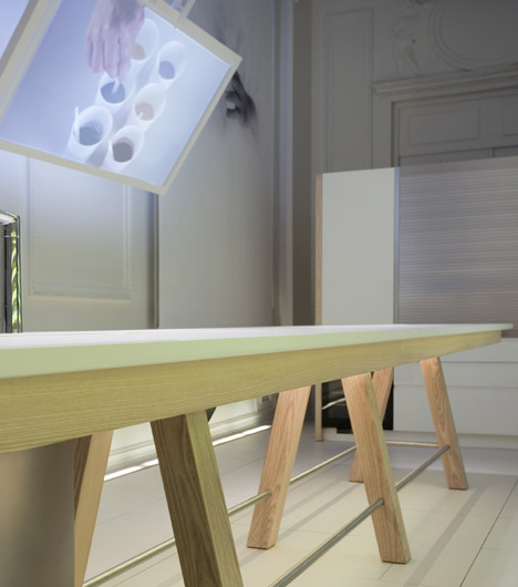
Appliances including a dishwasher and fridge are hidden inside ash-panelled units along the walls.
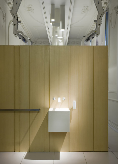
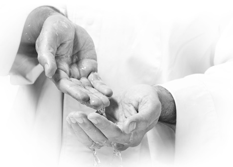
A translucent screen, printed with an image of Roncero's hands, lets light enter the room without glare.
Photographs are by Gerald Kiernan.
See more stories about restaurants »
Here's some more information from the designers:
Projecting Paco Roncero's dream:
An innovative project of multisensory gastronomy
Project: Paco Roncero workshop in The Casino of Madrid
Designed by: Carmen Baselga Taller de Proyectos in collaboration with S3-Tau (departament of Innovación from Tau firm).
Paco Roncero: Chef with three “Repsol Sun”, two Michelín Stars and a Nacional award of Gastronomy 2006. Olive oil specialist.
The project takes place in a space where the most advanced technologies, the new materials and ecosustainable systems for the I+D+I will be put together with the risqué gastronomic proposals of a perfect technique from the chef.
The place
The space is Paco Roncero’s gastronomic research workshop of Paco Roncero, where the chef develops his new creations. It is a place to experiment in the double meaning of the word, that is, testing, trying; but also to experiment with the meaning of feeling and perceiving. And with this aim the surroundings and the different work spaces have been designed.
This place will allow an exploration of the relationships between gastronomy and the surrounding: human perception from the influence of, for example, certain colors, shapes and flavors; or from environmental comfort variables such as temperature, humidity, sound and light, manipulated in the search of well-being, or looking to generate different types of sensations that result in emotions, trying to build, with all this, a synesthetic experience where taste is the backbone.
The place is located on the same floor as the libraries in the old “Casino de Madrid”, in C/Alcalá number 15. It is not accessible to the general public, because it is a private work area. To the different sessions, lunches or experimental dinners that are going to be programmed with certain cadence, one can only go with direct invitation from the chef, due to the fact that they will be forming part of the research project.
The room has very peculiar proportions; it is very long and it is higher than it is wide, with a big entrance door at each end; one of them is linked to an office to support the running of the workshop, that has also been designed inside the project. There is a running theme of the materials and base colours throughout. The other door links to the noble areas of the Casino and this is where the guests will enter and leave.
At the beginning we found a space dating back to 1910, but very damaged with old, however not antique, floors that had replaced the original ones made of wood, some of which could be found with an old fitted carpet in some areas. Some of the decorative molding was broken and in general both ceilings and walls appeared to be covered with stippled-finish paint which ran over the surface of the room indiscriminately above the mouldings and decorative reliefs. Cables, gutters or switches of different models and periods were superimposed depending on the needs of the offices that had been there. The air conditioning installation, as it was on the surface was very invasive; it had a lot of presence and had ruined part of the ceiling and the walls.
The aim was to create a big white box that kept the character of its time, whereupon the first work was the rehabilitation. Inside this box, in a superimposed way allowing the difference between the past and present to be seen, the space was projected, designing the different elements that modernized it and defined it with a contemporary and changeable character thanks to technology (projections, different types of lighting, sound, scents, etc...).
The access
Like with every liturgical ritual, first of all you need to go through water. The first thing you find when you arrive, just behind the door, is a washbasin welcoming you. This washbasin is the model Kubo from Boing, made of flexible polyurethane, and the tap is the Ondus model from Grohe. Two clothes racks, made of stainless steel and designed by Carmen Baselga_Taller de proyectos, flank the sides of the main entrance.
El pavimento
The floor is particularly special as it incorporates the heating system for this room with the Waytec System with heated sheets and automatic temperature control. This is the Colortech 60x60 natural white model from Tau, which continues in line with the rest of the ceramic materials used in the project. This shows the different applications and uses of the product Keraon from Tau, chosen in this case in natural white colour.
The table
Conceived as a type of large worktop to test new dishes, there is also room to seat nine guests including the chef. The surface is made of keraon (Tau ceramic) and the structure of the table legs is made of ash. Under this naive appearance, multiple uses are hidden, thanks to the technology that lives inside it and thanks to the goodness of the ceramic surface that allows the most sophisticated effects to combine with something as basic as, for example, taking notes or sketching directly on the table.
The water and fire areas are integrated into the table to be able to cook, however there are also capacitative sensors to control the sound or the temperature of the table. It has nine individual heated areas whose function is keep the plate warm, another hotter area and a cooling area near the kitchen area, as well as zones of agitation and vibration between the guests that will help to prepare certain dishes during the meal. The tap is K7 Digital model from Grohe, that has a wireless control. It is an innovation that is shown in this space as a novelty.
The chairs
The chairs were designed based on special needs, taking into account that the height would not be the habitual for an eating chair, because they have to be used with the table/worktop that is 97cm high. On the one hand we were searching for comfort; they have to be comfortable for a meal and its after-lunch/after-dinner conversation. On the other hand, an essential requirement was that they had to be of adjustable height and swivel with wheels to allow full mobility. From all of this, a hybrid chair was invented, between what would be an office seat, a kitchen chair and an armchair. As a chair/armchair, the model Tauro from Andreu World offered us all the guarantees of comfort, and starting from here appropriate modifications were made to reach the planned aims.
The oleotec
This has a capacity for 216 types of olive oil that the chef will be selecting as an expert in olive oil. It was created using the mural system Dry System, in Keraon in natural white color, combining bright and matt surfaces, where the numbers and the letters are engraved to be able to identify each oil. The touch screen located in the center gives the information about every product in this oil panel. When the oleotec was designed, a convection cooling system was created, leaving a free space in the upper and the lower part, which is the same principle that “Trombe wall” used in passive solar projects. In this way, the oils do not heat up, inside it keeps them all at the same temperature. For this reason, we also chose a cold light to light them from behind. In addition to seeing the real color of each oil, it creates a very singular atmosphere as the light is emitted through the oil test tubes.
The electrical appliances and the furniture that integrate them
All the electrical appliances are new models from Miele. We have a cutting-edge induction hob in white, some ovens, a large capacity fridge, “vinoteca” and a dishwasher. These electrical appliances are integrated into the furniture units that surround the room on each side, and at the same time they are not in your direct view when you enter the space. These furniture units are paneled with ash, integrating different inspection hatches to gain access to both electrical and plumbing installations. That means it is very easy to make changes to these installations, if needs be.
The ceiling: the hanging tray, the mobiles
Another aim was to integrate the technology (which is a lot) and leave some bridges that allow the installations to be enlarged and modified very easily without damaging the space every time. That is why we designed the hanging tray from the ceiling, an accessible floor, while leaving a space in the inside part. The worktop’s legs are communicated directly with this free cavity, which is accessible from the lower part. The tubes that emerge from the central hanging tray had been conceived to house different types of lighting, projectors, cameras, scent spreadings, extraction systems in the kitchen area, etc.
It is a space that is best measured in cubic meters than in square. 235 m3 are completely used, due to the fact that it is possible to work both lengthwise and widthwise, as it is as wide as it is high. In the upper part, on both sides of the central tray, two mechanical arms move back projection moving screens that are used to create different atmospheres and/or to support the images that can be projected onto the table. They can adopt different positions, either close to or far from the guests.
Above the access area, there is also a digital blackboard, that, when it goes down, is placed in front of the furniture unit nearest to the chef’s chair, which allows for punctual theoretical talks.
The sound
Surround-sound speakers in the ceiling and under the table have been installed.
The scents
This has been done through diffusers installed inside the tubes located in the hanging tray. These diffusers are also going to provide the space with the necessary humidity degree, just vaporizing water, without scents. Several scents have been expressly created for this space, as for example the sea smell, or a mushroom and humid grass that will be useful for supporting certain moments.
The curtains and the hands
Three motorized rolls of 220 cm wide x 438 cm high cover the three large windows of the room. Two layers, one of them completely opaque to make the space darker, and another made of translucent screen, which has the printed image of the chef’s hands and it is the one that will be used during the working daytime hours as it it lets the light enter in a sifted way.
The huge pictures of Paco Roncero’s hands manipulating and molding are a clear allegory to the kitchen as transformation, and it was considered from the basic transformation, the most natural that exists, which is water passing through its three states: solid, liquid and gaseous.
Domótica
The installation of a domotic system shows the programmation of different scenes during lunches or dinners, combining lights, sound, projections from the ceiling projectors and the movement of them, projections on the table, different effects, the use of a camera, etc.