Designs of the Year 2013 shortlist announced
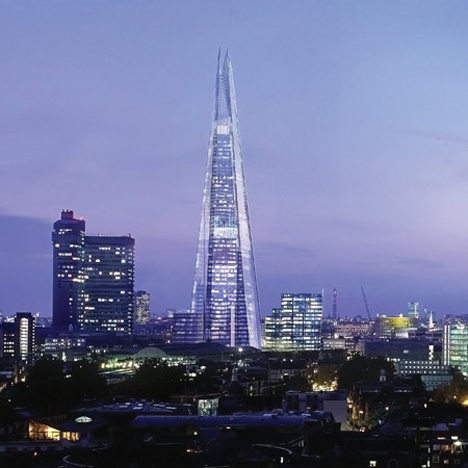
News: the Design Museum in London has announced the projects nominated for the Designs of the Year 2013, including the Olympic Cauldron by Thomas Heatherwick, The Shard by Renzo Piano (above) and the Little Printer by BERG.
Over 90 designs have been nominated in the categories of architecture, product, furniture, fashion, graphic, digital, and transport design.
All the shortlisted projects will be on show in an exhibition at the museum from 20 March to 7 July 2013 and winners from each category and one overall winner will be announced in April.
Last year's shortlist included a wind-powered device for detonating landmines, a machine that uses desert sand to print glass and a cinema under a motorway, with BarberOsgerby's Olympic torch crowned the overall winner.
See our earlier stories on previous winners:
2012 - Olympic torch by BarberOsgerby
2011 - Plumen Lightbulb 001 by Samuel Wilkinson
2010 - Folding Plug by Min-Kyu Choi
2009 - Barack Obama Poster by Shepard Fairey
2008 - One Laptop per Child by Yves Béhar of Fuseproject
See all our stories about the Design Museum »
Here's the full press release from the Design Museum:
Architecture
La Tour Bois-Le-Pretre, Paris - Designed by Druot, Lacaton and Vassal
The striking transformation of a run-down tower in northern Paris created an alternative approach to the physical and social redevelopment of decaying post-war housing.
Clapham Library, London - Designed by Studio Egret West
The £6.5m, 19,000 sq ft public library is located in the heart of Clapham, holding more than 20,000 books, it also provides a new performance space for local community groups, 136 private apartments and 44 affordable homes.
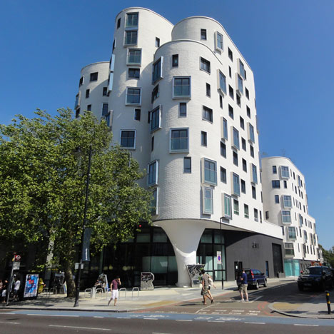
Above: Clapham Library by Studio Egret West
MOCA (Museum of Contemporary Art), Cleveland - Designed by Farshid Moussavi Architects
The 34,000 sq ft structure, which is 44 percent larger than MOCA’s former rented space, is both environmentally and fiscal sustainable.
Metropolitan Arts Centre, Belfast - Designed by Hackett Hall McKnight
The Metropolitan Arts Centre is wedged between two existing buildings on a hemmed-in corner plot that sits beside the city cathedral. The glazed tower sits atop the volcanic stone facade of this performing arts centre to create a beacon above the surrounding rooftops.
A Room For London - Designed by David Kohn Architects in collaboration with artist Fiona Banner
Perched above Queen Elizabeth Hall at London’s Southbank Centre, the boat-shaped one bedroom installation offers guests a place of refuge and reflection amidst the flow of traffic surrounding its iconic location.
Kukje Art Center, Seoul - Designed by SO-IL
This single-storey building is draped in a stainless steel mesh blanket that fits precisely over its structure and merges with the district's historic urban fabric of low-rise courtyard houses and dense network of small alleyways.
Ikea Disobedients - Designed by Andrés Jaque Arquitectos
IKEA Disobedients, an architectural performance by Madrid-based Andrés Jaque Arquitectos, was premiered at moma PS1, part of the 9+1 Ways of Being Political exhibition and reveals how recent architectural practices use performance to engage audiences with architecture in a non-traditional way.
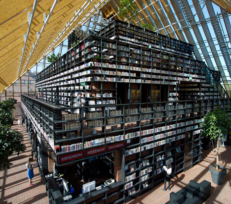
Above: Book Mountain by MVRDV
Book Mountain, Spijkenisse - Designed by MVRDV
This mountain of bookshelves is contained by a glass-enclosed structure and a pyramid roof with a total surface area of 9,300 sq m. Corridors and platforms bordering the form are accessed by a network of stairs to allow visitors to browse the tiers of shelves. A continuous 480m route culminates at the peak's reading room and cafe with panoramic views through the transparent roof.
The Shard, London - Designed by Renzo Piano
The Shard is the tallest building in Western Europe, transforming the London skyline, the multi-use 310m vertical structure consists of offices, world-renowned restaurants, the 5-star Shangri-La hotel, exclusive residential apartments and the capital's highest viewing gallery.
Thalia Theatre, Lisbon - Designed by Gonçalo Byrne Arquitectos & Barbas Lopes Arquitectos
Built in the 1840s, the Thalia Theatre has been in ruins almost ever since. The project reconverts it into a multipurpose space for conferences, exhibitions and events. In order to retain the old walls, the exterior is covered in concrete, while the interior remains in its original condition.
Astley Castle, Warwickshire - Designed by Witherford Watson Mann
A sensitive renewal of this dilapidated castle in rural Warwickshire, the ancient shell forms a container for a dynamic series of interior contemporary spaces. The rebirth of Astley in this elegantly assured, thoughtful project presents a strong new idea for the future interactions with the old and new.
Museum Of Innocence, Istanbul - Designed by Orhan Pamuk with Ihsan Bilgin, Cem Yucel and Gregor Sunder Plassmann
The Museum of Innocence is a book by Orhan Pamuk, telling the story of the novel’s protagonist, Kemal in 1950s and 1960s Istanbul. Pamuk established an actual Museum of Innocence, based on the museum described in the book, exhibiting everyday life and culture in Istanbul during the period in which the novel is set.
Home For All - Designed by Akihisa Hirata, Sou Fujimoto, Kumiko Inui and Toyo Ito
Presented at the Venice 2012 Architecture Biennale, Home for All is the proposal to offer housing solutions for all the people who lost their homes in the Japan earthquake, 2011.
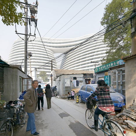
Above: Galaxy Soho by Zaha Hadid
T-Site, Tokyo - Designed by Klein Dytham
The T-Site project is a campus-like complex for Tsutaya, a giant in Japan’s book, music, and movie retail market. Located in Daikanyama, an upmarket but relaxed Tokyo shopping district, it stands alongside a series of buildings designed by Pritzker Prize-winning architect Fumihiko Maki. The project’s ambition is to define a new vision for the future of retailing.
Galaxy Soho, Beijing - Designed by Zaha Hadid
Five continuous, flowing volumes coalesce to create an internal world of continuous open spaces within the Galaxy Soho building – a new office, retail and entertainment complex devoid of corners to create an immersive, enveloping experience in the heart of Beijing.
Superkilen, Nørrebro - Designed by BIG, TOPOTEK1 and Superflex
Superkilen is a kilometre-long park situated through an area just north of Copenhagen's city centre, considered one of the most ethnically diverse and socially challenged neighbourhoods in the Danish capital. The large-scale project comes as a result of a competition initiated by the City of Copenhagen and the Realdania Foundation as a means of creating an urban space with a strong identity on a local and global scale.
Four Freedoms Park, New York – Designed by Louis Kahn
In the late 1960s, during a period of national urban renewal, New York City Mayor John Lindsay proposed to reinvent Roosevelt Island (then called Welfare Island) into a vibrant, residential area. Louis Kahn, was announced as the architect of the project in 1973. Louis Kahn finished his work but died unexpectedly as the City of New York approached bankruptcy. On March 29, 2010, 38 years after its announcement, construction of Franklin D. Roosevelt Four Freedoms Park began.
Rain Room - Designed by Random International
Random International’s largest and most ambitious installation yet, Rain Room is a 100 sq m field of falling water for visitors to walk through, experiencing how it might feel to control the rain. On entering visitors hear the sound of water and feel moisture in the air before discovering the thousands of falling droplets responding to their presence and movement to keep the visitor dry.
Superstitious Fund Project - Designed by Shing Tat Chung
The Superstitious Fund was created by Shing Tat Chung in February 2012 as a response to research behind superstitions and there effects on the world around us, creating a correlation between superstitions from around the world with financial gain or loss.
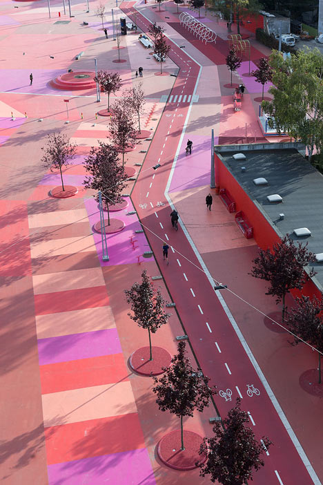
Above: Superkilen by BIG, TOPOTEK1 and Superflex
Raspberry Pi Computer - Designed by Eben Upton
The idea behind this tiny and cheap computer for kids came in 2006, when Eben Upton and his colleagues at the University of Cambridge’s Computer Laboratory became concerned about the numbers of A Level students applying to read Computer Science in each academic year. Affordable and powerful enough to provide excellent multimedia, the design is desirable to children who might not initially be interested in a purely programming-oriented device.
English Hedgerow Plate - Designed by Andrew Tanner and Unanico for Royal Winton
British ceramic designer Andrew Tanner has developed 'English Hedgerow', a chintz wall plate for Royal Winton that is the world's first to interface with augmented reality to create an animated world. An application developed by Jason Jameson and James Hall of Unanico group lets users of ios devices watch as birds and field mice scurry among the brambles, flies buzz, and butterflies flutter through the flowers.
Digital Postcard And Player - Designed by Uniform
Digital Postcards give digital tracks a low cost physical form, with each postcard represents a unique track. The cards are docked in a Postcard Player and users can control the playback of the tracks by pressing buttons printed on the postcards.
Windows Phone 8 - Designed by Microsoft
Windows Phone 8 is the second generation of phones from Microsoft and integrates mobile use with excellent Microsoft office functionality.
Gov.uk Website – Designed by Government Digital Service
The new Gov.uk website aims to combine all the UK Government’s websites into a single site. The project could save the public £50 million a year by building a platform to make web publishing simpler for government and delivering more services online.
Zombies, Run! App – Designed by Six to Start
The Zombies, Run! Fitness app is an interactive running game. The game guides you through zombie-apocalypse-themed missions with a variety of audio narrations. The application is capable of recording the distance, time, pace, and amount of calories burned per running mission via GPS.
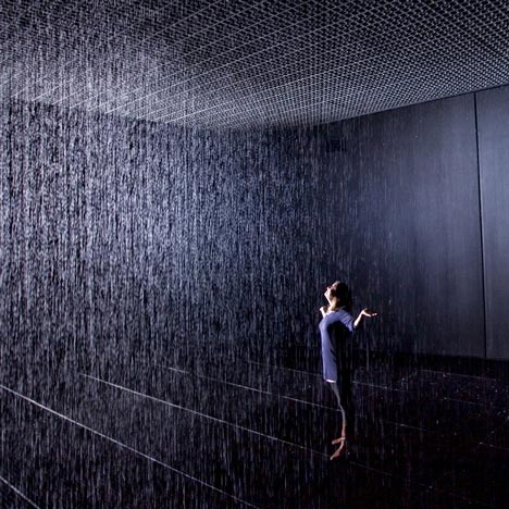
Above: Rain Room by Random International
Free Universal Construction Kit - Designed by Free Art and Technology Lab
The Free Universal Construction Kit is an online matrix of nearly 80 adapter bricks that can be 3D printed and allows any piece to join to any other, enabling the creation of previously impossible designs, and ultimately, more creative opportunities.
Wind Map - Designed by Martin Wattenberg and Fernanda Bertini Viegas
The Wind Map shows the delicate tracery of wind flowing over the US using different shades to signify different speeds and directions.
Candles In The Wind - Designed by Moritz Waldemeyer for Ingo Maurer
Candles in the Wind is a revolutionary new lighting concept, using modern LED technology to recreate the experience of light from a candle flame. The minimal design is a bare circuit board featuring the latest in micro-processor technology paired with 256 high quality leds to evoke the natural flow and flicker of a candle.
Chirp - Designed by Patrick Bergel
Chirp is a new way to share your stuff using sound. Chirp uses sound to using information from one iphone to another enabling you to share photos, webpages, and contacts all from your phones built-in speaker.
Dashilar App – Designed by Nippon Design Centre Inc.
Dashilar is a smart phone app that creates a new and detailed way to look at the Beijing district of Dashilar.
City Tracking pt2 – Designed by Stamen
As part of a grant from Knight News Foundation, Stamen released original map designs of the world in three original styles: Toner, Watercolor and Terrain.
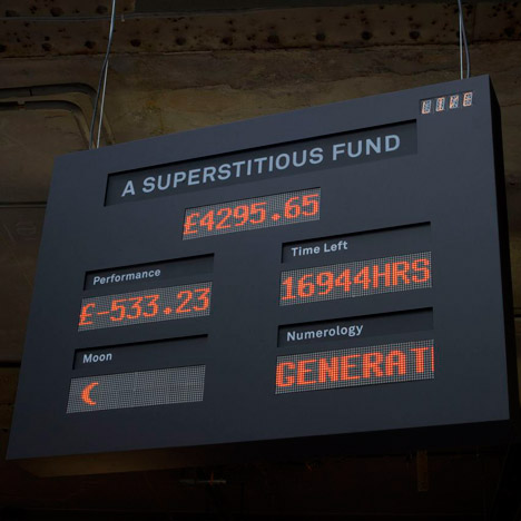
Above: Superstitious Fund Project by Shing Tat Chung
Light Field Camera - Designed by Lytro
The Lytro Light Field Camera is the first consumer camera that records the entire light field, instead of a flat 2D image. By capturing the entire light field, it allows the user to refocus the pictures after they take them.
Fashion
Anna Karenina Costumes - Designed by Jacqueline Durran
Two million dollars’ worth of Chanel diamonds and vintage Balenciaga-inspired dresses are just a few of the finishing touches costume designer Jacqueline Durran dreamt up for Keira Knightley’s fur-wrapped character in Joe Wright’s 2012 film adaptation of the 1877 Tolstoy novel.
A/W12 Womenswear - Designed by Giles Deacon
Made up of a number of gowns, each with their own intricate mood, Deacon combines ideas of death with the exuberance and decadence of life. Flowing skirts and tight restricted arms meet layers of what looks like torn ribbons of silk, built up into floor length dresses.
Louis Vuitton Collection - Designed by Yayoi Kusama
Bold and playful, the collection features the artist's signature bold spots - which cover every item, from bags to dresses. The range is the house's most significant artist collaboration since it teamed up with Stephen Sprouse in 2001 to create his now-iconic graffiti bags.
Diana Vreeland: The Eye Has To Travel - Directed by Lisa Immordino
Called 'the Empress of fashion’, Diana Vreeland’s (1903-1989) impact on fashion and style in her time was legendary. With 350 illustrations, including many famous photographs by Richard Avedon, Irving Penn and other major fashion photographers, this film shows fashion as it was being invented.
I Want Muscle - Directed by Elisha Smith-Leverock
Witty and glamorous, I Want Muscle is a personal 2 minute portrait of female body-builder Kizzy Vaines. Focusing on the attitudes of others to the idea of female body building and the compulsion to push the body to extremes.
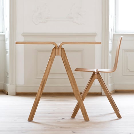
Above: A-Collection by Ronan and Erwan Bourellec for Hay
AW12 Collection - Designed by Craig Green
Playing with ideas of utility and function, the large wooden structures in this collection have connotations of religious pilgrimage. Inspired by luggage carriers, the huge structures dwarf the models and create abstract, almost menacing silhouettes. Each colour outfit has an exact replica outfit in black, which walks behind it as a ‘shadow’ on the catwalk.
Commes De Garcons RTW A/W12 - Designed by Rei Kawakubo
Kawakubo plays with the idea of 2D shapes, in this collection. Large and flat, the pieces integrate elegant and simplistic curves in bright reds and pinks.
Christian Dior RTW S/S13 - Designed by Raf Simons
For Simons’ first collection for Dior, he explored the ideas of sex and freedom combining minimalism with sensuality and silhouette exploration.
Prada S/S12 RTW Collection - Designed by Miuccia Prada
Influenced by the Chevrolet and 1950s style, this collection saw a return to the bourgeois taste first set out in the nineties.
Proenza Schouler A/W12 Collection - Designed by Lazaro Hernandez and Jack McCollough
This collection opened up to a rougher and more dangerous look with a structured toughness. Integrating modes of protection, Lazaro Hernandez and Jack mccollough experimented with padding and quilting and took inspiration from different forms of fighting such as samurai, fencing, kendo and martial arts.
Furniture
The Sea Chair - Designed by Studio Swine & Kieren Jones
Since the discovery of the Pacific Garbage Patch in 1997, which is predicted to measure twice the size of Texas, five more have been found across the worlf’s oceans. The ‘Sea Chair’ is made entirely from plastic recovered from our oceans. In collaboration with Kieren Jones, Studio Swine has created devices to collect and develop marine debris into a series of stools.
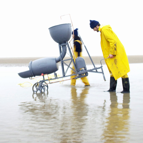
Above: The Sea Chair by Studio Swine & Kieren Jones
Liquid Glacial Table - Designed by Zaha Hadid
The Liquid Glacial design embeds surface complexity and refraction within a powerful fluid dynamic. The elementary geometry of the flat table top appears transformed from static to fluid by the subtle waves and ripples evident below the surface, while the table’s legs seem to pour from the horizontal in a vortex of frozen water.
A-Collection - Designed by Ronan and Erwan Bourellec for Hay
Fabricated from oak and beech, the motivation for the series was an old wooden university trestle chair by architect Berndt Pedersen.
Gravity Stool - Designed by Jolan Van Der Wiel
Jolan Van Der Wiel developed a 'magnet machine', whereby he positions magnetic fields above and below a container of polarized material containing metal shavings. In order to form and determine the shapes of his furniture pieces, the hanging units are pulled down and then released, in which the substance follows, drawn upwards by magnetic force, letting gravity determine the shape of the stool.
Well Proven Chair - Designed by James Shaw and Marjan van Aubel
The Well Proven Chair is the result of research into the development of wood chips. The investigation began with the discovery that products and furniture made from wood generate between 50-80% waste in the form of sawdust, chippings and shavings. By combining these waste products with bio-resin, it turns to a porridge-like mixture and expands into a solid. With the addition of water or increased temperatures it can expand up to 700%. This material is then used to create the seat shell combined with a simple but beautiful leg structure of turned ash.
Tié Paper Chair - Designed by Pinwu
The Tié Chair is the design studio’s second paper chair and was inspired by Yuhang Aper Umbrellas - the shell is made from irregularly shaped rice paper sheets, and the shape echoes the classic Chinese horseshoe-back armchair.
100 Chairs - Designed by Marni
Marni designers have reworked the patterns and colour palettes of traditional Colombian chairs woven from PVC threads to create a desirable, one-off range, which has been produced by Colombian ex-prisoners.
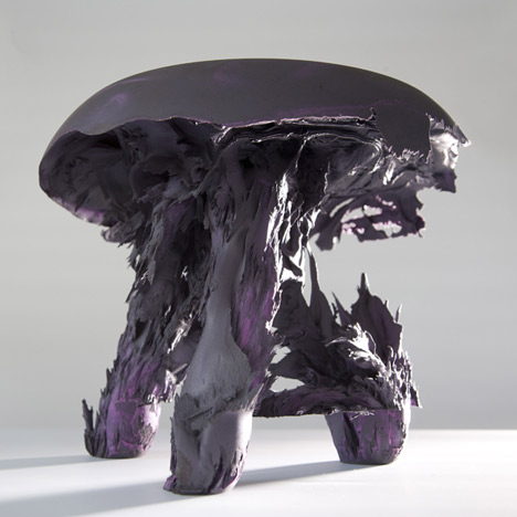
Above: Gravity Stool by Jolan Van Der Wiel
Medici Chair - Designed by Konstantin Grcic for Mattiazzi
Three types of wood, thermo treated ash; walnut and douglas, are joined at irregular angles, resulting in a comfortably reclined seat.
Re-Imagined Chairs - Designed by Studiomama (Nina Tolstrup and Jack Mama)
Re-imagined Chairs by London-based Studiomama is a project born out of questioning resourcefulness and attitudes towards waste. It builds on the interests in expediency and re-using the existing, and speaks of the ability to see the potential in the unwanted, by encouraging users to re-look at unwanted furniture.
Engineering Temporality - Designed by Studio Markunpoika
Using small circular tubular steel to semi-cover over existing objects including cabinets and chairs, Tuomas Markunpoika burnt away the sculptural piece, leaving the charred steel structure behind. Inspired by the designer’s Grandmother’s Alzheimers, Engineering Temporality evokes the ideas of vanishing memory.
Corniches – Designed by Ronan and Erwan Bouroullec for Vitra
The idea for Corniches arose from the need for small storage spaces to keep small items. Corniches are neither regular shelves nor simple horizontal surfaces, but rather individual, isolated protrusions in the environments that we create. Corniches are a new way to use the wall in living spaces.
Future Primitives – Designed by Muller Van Severen
This collection of shelving units, in various heights and configurations, include deckchair shaped seating inserted into their frames, as well as standing and hanging lamps and separate chairs and loungers.
Graphics
Zumtobel Annual Report - Designed by Brighten the Corners and Anish Kapoor
Design studio Brighten the Corners collaborate with artist Anish Kapoor to create this two-volume publication: one book containing the facts and figures for the year, the other a printed version of a 1998 video piece by the artist. Brighten the Corners uses Kapoor's video projection, Wounds and Absent Objects, as the starting point for the commission which, unusually, meant designing a text-only volume with graphic elements that link to the Kapoor work and a lavish colour publication, which sees a rainbow of hues bursting from the centre of the spreads and features ten neon colours.
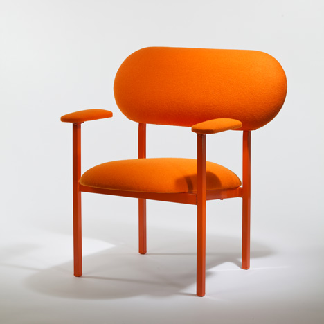
Above: Re-Imagined Chairs by Studiomama
Bauhaus: Art As Life Exhibition - Designed by A Practice For Everyday Life
Situated in the Barbican Art Gallery, Bauhaus: Art as Life was the largest UK exhibition, to date, focusing on the iconic art school. Graphically, the design is informed by an awareness of the Bauhaus’ own principles of colour, structure and typography – painted walls and bold panels draw together objects, themes and ideas, and the typeface used throughout is a contemporary revival of the letterpress typeface used within the Bauhaus itself.
Strelka Identity - Designed by OK:RM
The Strelka Institute for media, architecture and design is a non-profit organisation aimed at generating discussion, ideas and projects in the creative and cultural industries.
Occupied Times Of London - Designed by Tzortzis Rallis and Lazaros Kakoulidis
The Occupied Times of London is designed by Tzortzis Rallis and Lazaros Kakoulidis who used Barnbrook's VirusFonts typeface for the large intro caps to their features and then PF Din Mono, designed by Panos Vassiliou as the main body copy face.
The Gentlewoman #6 - Designed by Veronica Ditting
Legend of stage and screen Angela Lansbury was the cover star for Issue 6. The issue gathered some of the most remarkable and captivating women in the world today.
Austria Solar Annual Report - Designed by Serviceplan
Austria Solar teamed up with design group Serviceplan to create a beautiful and uniquely apt presentation of their annual report – printed with special ink that only materialises when exposed to the sun.
Rijksmuseum Identity - Designed by Irma Boom
Irma Boom has designed a new logo for the Rijksmuseum in Amsterdam, replacing the previous logo by Studio Dumbar, which had been in place for 32 years.
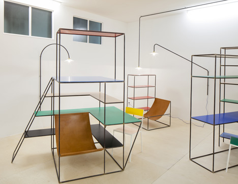
Above: Future Primitives by Muller Van Severen
Adam Thirwell: Kapow! - Designed by Studio Frith
Exploding with unfolding pages and multiple directional text, Kapow! is set in the thick of the Arab Spring, it is guided by the high-speed monologue of an unnamed narrator. Kapow! asks readers to open and unfold pages, to follow text leaking in and out of paragraphs, while progressively becoming part of and lost within the narrator’s thoughts.
Organic - Designed by Kapitza
At the cutting edge of contemporary pattern design, Organic provides a fantastic source of inspiration for creative’s working in the fields of illustration, graphic design, animation, fashion, textiles, interiors and digital design. Organic is Kapitza’s second book project featuring 200 dazzling, previously unpublished artworks.
Doc Lisboa ’12 - Designed by Pedro Nora
Designed by Pedro Nora, this is the bright and colourful identity for the Doc Lisboa documentary film festival.
Ralph Ellison Collection – Designed by Cordon Webb
Graphic identity to the latest series of Ralph Ellison books.
Venice Architecture Biennale Identity – Designed by John Morgan
Spoken in a Venetian dialect, the stencil text is contained in a white plaster panel and roughly framed in black. The signs were made to blend in with the fabric of existing Venetian signage.
Dekho: Conversations On Design In India – Designed by CoDesign
DEKHO is an anthology of inspirational conversations with designers in India, probing their stories in to the development of design in India and highlighting approaches that are unique to designing for India.

Above: Olympic Cauldron by Heatherwick Studio
Made In Los Angeles: Work By Colby Poster Printing Co. – Designed by Anthony Burrill
Graphic artist Anthony Burrill raided the Colby archive to create a vibrant set of prints, revisiting the very best of their past work.
Australian Cigarette Packaging – Commissioned by Australian Government Department for Health and Ageing
The olive green packaging that, now required by law in Australia, is the graphic identity for all cigarette packets regardless of brand. Based on consumer studies, the anti-design features a hard-hitting anti-smoking image, with plain text and unappealing colours.
Product
Olympic Cauldron - Designed by Heatherwick Studio
At just 8.5m high and weighing 16 tonnes, it is far smaller and lighter than previous Olympic Cauldrons. Heatherwick Studio incorporated 204 individual copper ‘petals’, each carried at the opening ceremony by each participating country to create an iconic image not only for the Olympics but also for London.
Bang & Olufsen ‘Beolit 12’ - Designed by Cecile Manz
Beolit 12 is a handy, portable music system that plays music wirelessly from your iPod, iPhone, iPad or Mac, or wired from any other smart phone or PC.
Liquiglide Ketchup Bottle - Designed by Dave Smith/Varanasi Research Group MIT
LiquiGlide is a ‘super-slippery’, non-toxic, edible but tasteless substance that can be applied to the inside of a bottle, preventing the condiments from sticking to the neck and the bottom where they can't be reached.
Colour Porcelain - Designed by Scholten & Baijings/1616 Arita Japan
The Colour Porcelain collection is decorated with three different levels of intensity, selecting traditional colours from the company's archives on the pale grey background of natural porcelain.
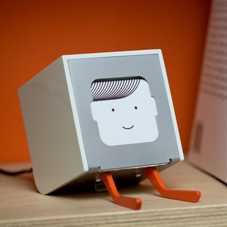
Above: Little Printer by Berg
E-Source - Designed by Hal Watts
E-source provides a sustainable cable recycling system for small scale recyclers in developing countries. It consists of an innovative bicycle powered cable granulator and an approach to separating copper and plastic using water. Un-burnt copper can be sold for up to 20% more than burnt, providing a better income for workers and much healthier working conditions. The designs will be made available to local workshops who would produce the machines and then sell to recyclers.
Little Printer - Designed by Berg
Little Printer lives in your home, bringing you news, puzzles and gossip from your friends. Use your smart phone to set up subscriptions and Little Printer will gather them together to create a timely and beautiful miniature newspaper.
Switch Collection - Designed by Inga Sempe for Legrand
French designer Inga Sempé has teamed with electrical equipment specialists Legrand to produce a collection of switches, sockets and dimmers, the series reinterprets functionality to imply additional user interactivity.
Papa Foxtrot Toys - Designed by PostlerFerguson
Papa Foxtrot is the new toy brand from London-based design studio PostlerFerguson. The studio’s Wooden Giants series comprises of models of the Emma Maersk, Arctic Princess and TI Asia, three of the largest cargo ships in the world.
Child Vision Glasses - Designed by The Centre for Vision in the Developing World
Self-adjustable glasses that allow the wearer to tweak the lenses until they focus clearly. These glasses are based on a fluid-filled lens technology that is similar to that used in the Adspecs. While the Adspecs were designed for use by adults, the Child Vision glasses have been developed specifically for use by young adults aged from 12-18.
W127 Lamp - Designed by Dirk Winkel
Berlin-based product designer Dirk Winkel created this slim black desk lamp to show that plastic can be as solid and tactile as metal or wood.
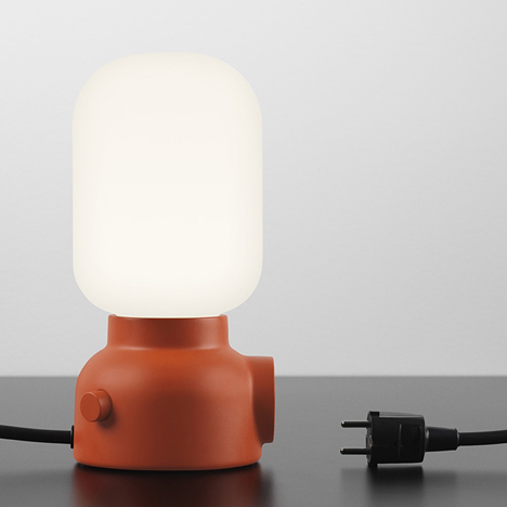
Above: Plug Lamp by Form Us With Love
Plug Lamp - Designed by Form Us With Love
Addressing today's digitally connected society and our constant need to recharge our computers, smartphones, tablets, this lamp features the addition of an electrical socket in its base.
Replicator 2 - Designed by MakerBot
This fourth generation 3D printing machine from MarkerBot has a massive 410 cubic inch build volume and is the easiest, fastest, and most affordable tool for making professional quality models at home.
Magic Arms - Designed by duPont Hospital for Children
The duPont Hospital for Children has been treating children suffering with musculoskeletal disabilities. As part of their research and development, duPont’s Department of Orthopedics developed WREX–the Wilmington Robotic Exoskeleton. It gives kids with muscle weakness much better movement and the ability to lift objects but was too heavy to use on a younger or smaller child. They figured out a wearable plastic jacket could be 3D printed to offer the same aid as WREX but in a mobile form that a child weighing only 25 pounds could wear.
Kiosk 2.0 - Designed by Unfold Studio
Inspired by the carts used by Berlin's currywürst vendors, Kiosk 2.0 works as a mobile 3D printing station that brings design out of the studio and onto the streets.
Oigen Kitchenware - Designed by Jasper Morrison/Japan Creative
The Japan earthquake and tsunami in March 2011 brought to light the fact that true wealth in life does not lie in material affluence. Throughout history, the Japanese design aesthetic has been acknowledged for its simplicity. Japan Creative have produced a series of minimalist cast-iron products conceived together with Jasper Morrison.
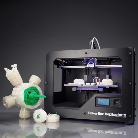
Above: Replicator 2 by MakerBot
Tekio - Designed by Anthony Dickens
Teiko is a prototype modular lighting system inspired by traditional Japanese ‘Chōchin’ paper lanterns. Tekio, the Japanese word for ‘adaptation’, can adapt to any interior and its ability to transform spaces is only limited by your imagination to change its shape and style.
Little Sun - Designed by Olafur Eliasson
Developed over the last two years, Little Sun is a work of art that brings solar-powered light to off-grid areas of the world.
colalife - Designed by Simon Berry
ColaLife works in developing countries to bring Coca-Cola, its bottlers and others together to open up Coca-Cola’s distribution channels to carry ‘social products’ such as oral rehydration salts and zinc supplements to save children’s lives. ColaLife is an independent non-profit organisation run and staffed by volunteers.
Federic Malle Travel Sprays – Designed by Pierre Hardy
Limited edition travel sprays designed by Pierre Hardy, these metallic tubes were designed to ‘embody femininity’ with their expressive colours.
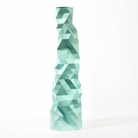
Above: Faceture Vases by Phil Cuttance
Faceture Vases – Designed by Phil Cuttance
The Faceture series consists of handmade faceted vessels, light-shades and table. Each object is produced individually by casting a water-based resin into a simple handmade mould. The mould is then manually manipulated to create each object's form before casting, making every piece utterly unique.
Surface Tension Lamp – Designed by Front
Created by Swedish designers Front, the lamp blows a bubble to from a temporary transparent shade round an LED light. The lamp will create 3 million bubbles over the course of its 50,000 hour life.
Flyknit Trainers - Designed by Nike
Exceptionally lightweight, the Nike Flyknit Trainer features Nike’s Flyknit technology for structure, support and a precision fit that creates the feeling of a second skin. The one-piece knitted form features areas of stretch, breathability and support exactly where the runner needs it.
Transport
Morph Folding Wheel - Designed by Vitamins Design/Maddak Inc.
The wheelchair re-invented. For the first time the wheels on a wheelchair are able to fold flat and fit in storage compartments of airplanes and small cars. When folded, this wheel takes up only 12 litres of space, compared with 22 litres when it is circular and in use. The wheel has been developed with support from the Royal College of Art, the Wingate Foundation and the James Dyson Foundation.
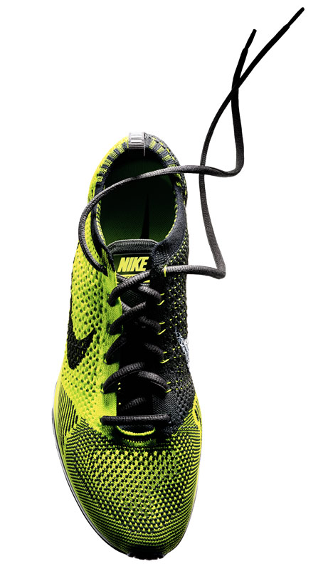
Above: Flyknit Trainers by Nike
Air Access Seat - Designed by Priestmangoode
Facilitating an easier transition between gate to aircraft, Air Access is composed of two components: a detachable wheelchair in which passengers are assisted into at their departure gate, which transports them onto and off the airliner; and a fixed-frame aisle seat which is already on board in which the wheelchair seamlessly slides sideways into the infrastructure and locked in place as a regular airline seat.
i3 Concept Car - Designed by BMW
The BMW i3 Concept with eDrive is a sustainable vehicle designed for urban areas. Powered by innovative eDrive technology, the coupe not only generates zero emissions but also provides a calm, virtually silent driving experience for up to 100 miles before requiring charging. And through its optional fast charging, the battery can be replenished to 80% charge in less than 30 minutes.
Mando Footloose Chainless Bicycle - Designed by Mark Sanders
Like other bicycles the Footloose combines manual and electric power. However, unlike other similar machines, it totally eliminates the chain and transforms the cyclist's efforts directly into electricity to drive the wheels. This energy is then stored in a lithium-ion battery inside the bike frame, before it is converted back into kinetic energy by an electric motor which drives the rear wheel.
N-One - Designed by Honda
Featuring a naturally aspirated 1.3L DOHC engine, this hatchback delivers a fuel economy of 64 mpg.
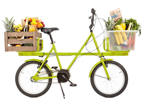
Above: Donky Bicycle by Ben Wilson
Donky Bicycle - Designed by Ben Wilson
The steel beam running through this compact bicycle by British industrial designer Ben Wilson means it can carry heavy loads on its front and rear platforms.
Exhibition Road - Designed by Dixon Jones/ The Royal Borough of Kensington and Chelsea
Exhibition Road is a £28m development project to improve the infrastructure of, access to and facilities within the Exhibition Road area. Led by the Royal Borough of Kensington and Chelsea, in partnership with the City of Westminster and the Mayor of London, it was completed ahead of the London 2012 Olympic Games.
Olympics Wayfaring – Designed by TfL/JEDCO/LOCOG
The Olympic Wayfaring created an identity that was carried out through all of London 2012, appearing on everything from street banners, to the Tube, to the Torch Relay to the Olympic venues themselves.