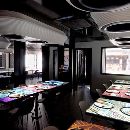
Inamo restaurant by Blacksheep
London-based interior architecture and design office Blacksheep have designed the interior for Inamo, a restaurant in London, UK, with interactive projections on the tables.
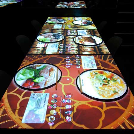
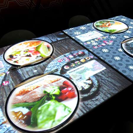
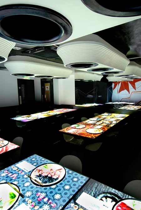
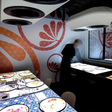
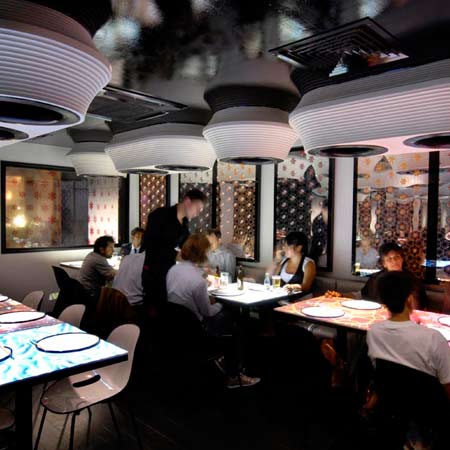
A projector and computer are suspended above each table; customers can use a touch panel to order food, access the kitchen webcam, play games, change the pattern projected onto the corian table top and source local information.
The following text is from Blacksheep:
--
Projecting the Future - Inamo shines a light on a new west end dining experience!
Inamo, a whole new concept in west end dining, opens this month in the heart of London's Soho, with menus projected onto tabletops, allowing diners to order food and beverages interactively, to change the ambiance of their individual table, to play games and even to order up local information and services, such as booking a cab!
The 310 sq m (gross), 62-cover Wardour Street restaurant and downstairs bar is the brainchild of entrepreneurs Danny Potter and Noel Hunwick and will offer customers high-quality Asian fusion cuisine, under the guidance of leading Head Chef Anthony Sousa Tam, who comes to Inamo from superstar restaurants Atami, Chino Latinos, Nobu, Hakkasan and Ubon.
The interior of Inamo has been designed by Blacksheep, hot from their latest west end success with the Whisky Mist at Zeta bar and nightclub at London's Hilton Hotel - and from the announcement of their third winning project in a row at the London Bar & Club Awards with the Knightsbridge bar Vendôme.
Blacksheep also contributed to all the restaurant's graphic applications, adapting the existing identity with new iconography for signage, menus and marketing materials as well as all environmental graphics, from graphic wallpaper to graphic tablecloths, shopfront etched patterns and illuminated screens, with all pattern work inspired by and adapted from traditional Asian print designs.
For the designers, it was an ambitious project and a tricky concept to get right. Great attention had to be paid especially to ensure that lighting levels and proportions were spot on for the restaurant to work at all hours of the day and night. The restaurant design also had to have an overall strong sense of identity as a space, neither overwhelming nor being overwhelmed by the technology at its heart. 'We created a concept based around the keywords: warmth, vibrancy, charm and theatre', explained Blacksheep Director Tim Mutton. 'It was important to balance out the restaurant's technological aspects by creating a sensuous, social space with a strong personality.'
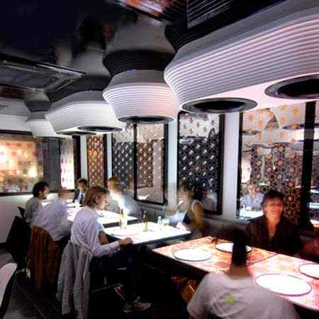
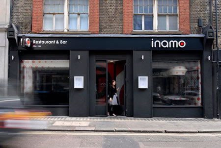
Customers approach the restaurant via a brand new jet black timber facade, in keeping with the existing architecture. To protect interior light levels, the glazed restaurant windows have a graphic vinyl applied featuring solid and translucent star patterns (designed by Blacksheep), creating a strong graphic statement as well as protecting interior light levels. The vinyl graphic nonetheless allows tantalising glimpses of the interior and of the Blacksheep-designed 'cocoons' which house the projectors, computers and frames and which sit above each table.
External signage includes a projecting sign, a high-grade acrylic 'Restaurant & Bar' sign and halo-lit boxed steel lettering for the 'Inamo' identity. The shopfront bases have an aluminium trim and there are four external aluminium downlighters with a red filter to match the red and silver of the graphic vinyl on the glazing.
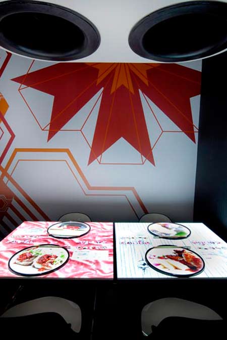
The central entrance to Inamo is via glazed doors with a high-impact, red, black and white graphic applied to the back wall of the small entrance lobby area (which had to be kept for structural reasons, as the restaurant was once two separate buildings with a subsequently-infilled alleyway at its centre!). The main structural works to the interior (formerly an Italian restaurant which existed for 25 years) centred on the ground floor space, opening it up as much as possible by removing columns and a structural wall and also creating a new extension to the rear to house an extra twenty covers.
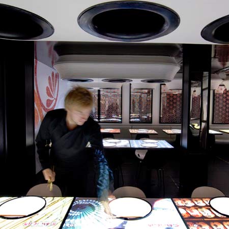
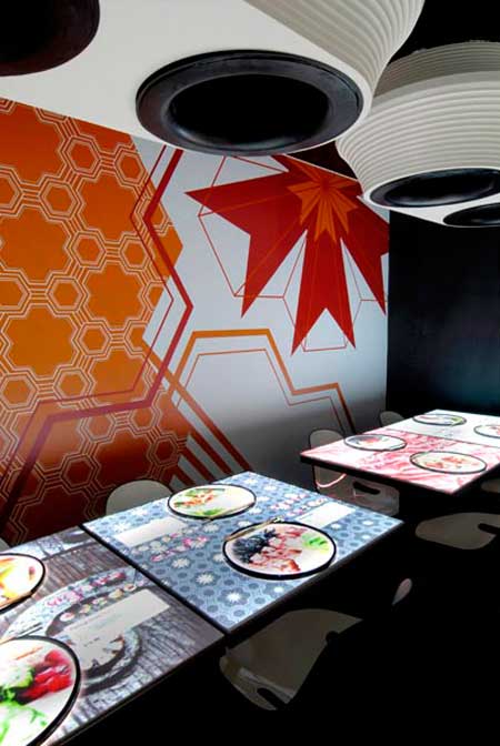
Once inside the restaurant, the stair to the downstairs bar is immediately to the left, finished in matt black, with timber-effect vinyl flooring here and throughout (by Armstrong). Graphic wallpaper above the stair mirrors the window graphic. Customers are immediately met at the greeter station (in black timber), directly in front of a high-impact six-seater table. The restaurant has been treated partly in monochrome to allow the tabletop illuminations to stand out and partly with further graphics (inspired by the colour choices of kaleidoscopes and origami for an Asian feel) to mirror the strong graphic sense created by the tabletops.
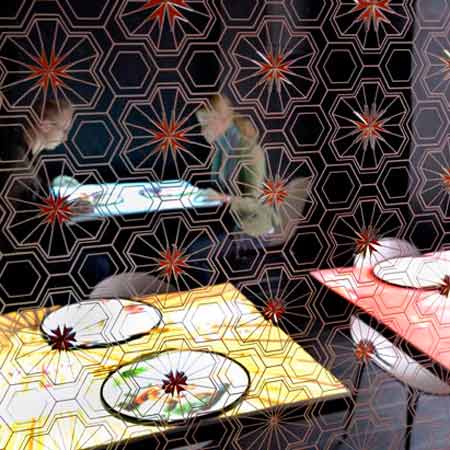
Walls are therefore in a white vinyl wallpaper with mirrored graphic panels, which work effectively like lightboxes with an etched pattern and a cut pattern, with light allowing the cut pattern to shine through. Seats are either a silver vinyl banquette with feature red stitching or else 2-tone flip chairs with black backs and white frontage (from Protocol). The tables themselves have a black base and a white Corian top.
The 'cocoon' projectors are set at the same height throughout within the suspended high gloss black ceiling and come in three sizes to light 2-cover, 4-cover or 6-cover tables. When customers sit down there are white spots for plates and an individual 'e-cloth' for each table. Customers use a touch panel to order food and drink or change their table top to one of the seven other patterns available. 'Serving staff are available at any time to help customers to navigate their menus or answer any other queries, but the menus have been exceptionally clearly designed and should be both intuitive and fool-proof for users!' Project Designer Benjamin Webb commented.
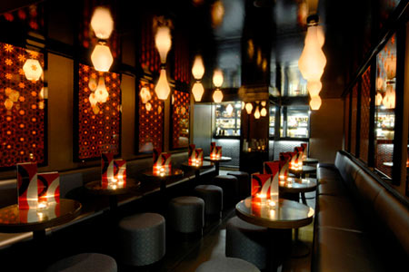
The downstairs bar features the same design language as the restaurant, but uses a warmer and darker colour scheme (as it doesn't have to work alongside any technological elements) to create a sense of intimacy. Graphic screens replicate those on the ground floor, but use bronze mirrors, with a glowing red backing to promote a sense of space within the bar. Pendant light fittings again echo the cocoons above and have been specially-designed using the same organic language.
'It's important to adapt to a new way of thinking when working so closely with technology' Benjamin Webb concluded. 'With Inamo, we took a cohesive approach towards adapting the technology to sit within the interior, fine-tuning ambience levels and building strong relationships between graphic and interior elements. Above all, we had to ensure that the vivid projections were met by the interior elements of the scheme, creating an equally strong and unified impression.'
The clients commented: 'Before starting the build of this project we had pitches from four different interior designers with our brief and keywords: warm, vibrant, charm, theatre. Blacksheep stood out because of their ability to take our brief on board while simultaneously inputting their own creative flair and talents into the project. They have since created a holistic design that ties into and around our concept, adding value throughout.