Thiais Bus Centre by ECDM architects
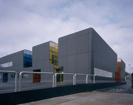
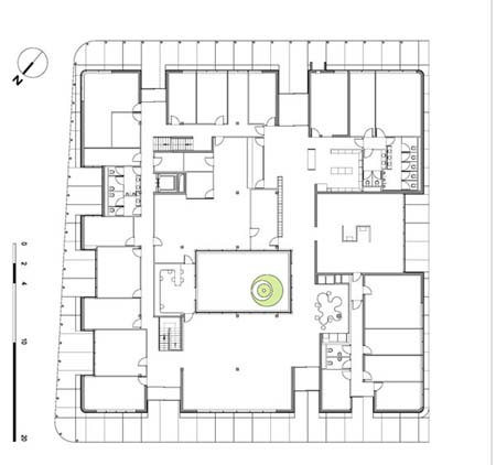
Here are some photographs and plans of the Thiais Bus Centre near Paris, designed by architects Emmanuel Combarel and Dominique Marrec of ECDM.
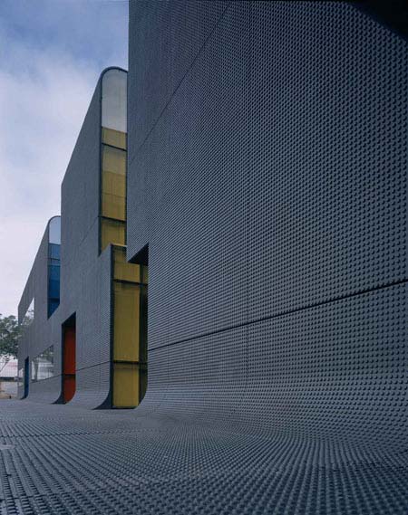
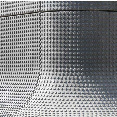
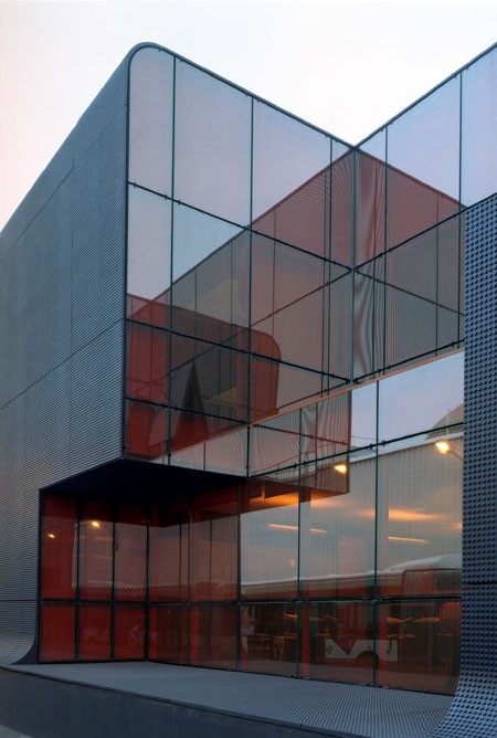
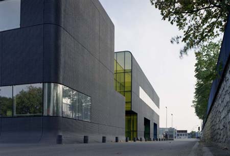
The walls, roof and ground surrounding the administrative centre are covered with Ductal, a high performance concrete with a raised texture, which "looks like the world-famous pattern on a piece of Lego."
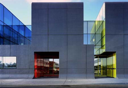
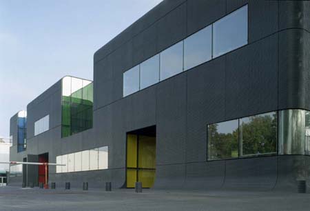
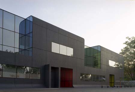
The primary colours surrouding the building's appertures are intended to reflect the bright graphics of surrounding warehouses and industrial buildings.
The following information is from architects ECDM:
--
"As one of the world’s largest urban transport companies and technology pioneer, it is only natural that RATP’s buildings should reflect the company’s image," states Rémi Feredj, Real Estate Manager for RATP. "The Thiais building certainly meets this requirement. It helps to improve the site’s urban landscape. It is the pride of the hundreds of people who will be working there and represents a sign of belonging and a symbol of what we are all about."
Based near
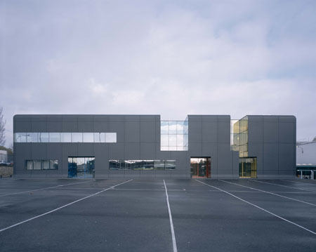
The area surrounding the new periurban-style building is cluttered with major brand warehouses and industrial buildings, wide streets and junctions. ECDM’s challenge was to reconcile functionality with integration, and design a relay-type building which blends into the scenery while at the same time forming a modern and attractive focal point. The architects plumped for spatial continuity. Shaped like an elevated plateau, the building looks as though it is rising out of the road or growing out of and fusing with a landscape of unbroken minerality.
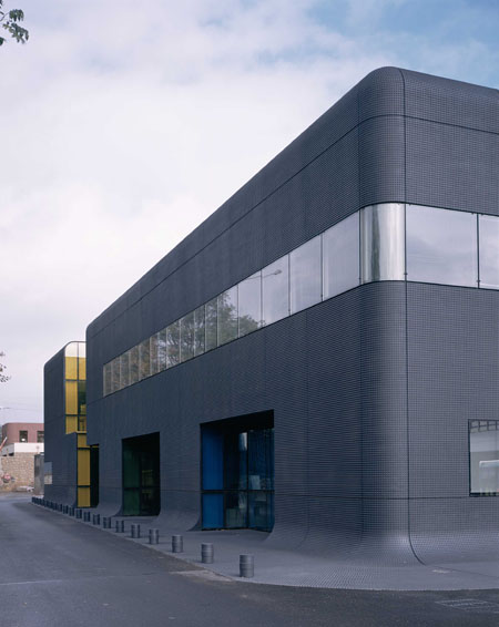
This effect is achieved by covering the entire building and a large tarmac strip surrounding it in Ductal, which has a strong mineral homogeneity. This elegant concrete 'skin' runs along the edge of the building before rising up so that the building (including the roof) and road merge into a sigle coherent structure – bestowing the new
ECDM (Paris)
The desiners of the new Thiais RATP bus Center building are Emmanuel Combarel and Dominique Marrec, founders of ECDM (Paris), set up in 1993. Both are ardent supporters of contextual architecture, taking structure, restrictions linked to function and the socio-cultural concerns of the surroundings into account. ECDM's style combines light, cohesion, and aesthetics. Effective simplicity is also a priority. "One dominant characteristic can be found in the firm’s work, as expressed by Marrec and Combarel themselves. It is the desire to offer simple architecture with rigorous logic and without preconceptions, nostalgia or stylistic concerns."
Designing the
Balance and unity
When working in the actual context, Emmanuel Combarel and Dominique Marrec never have a pre-conceived idea of what the finished building will actually look like. After a lengthy observation and survey phase which generally involves consulting future users, the architects designed an administrative unit which is both ambivalent and suggestive, organically emphasizing continuum rather than rupture.
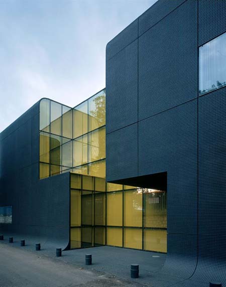
"Our aim was to focus on the site’s mineral nature and design a building that merged with and grew out of the road," said Dominique Marrec. Built next to the old
This skin looks like the world-famous pattern on a piece of Lego, except that it is enlarged and reproduced ad infinitum. It is consistently gray in color and covers the ground around the building together with its walls and roof. Made from tinted Ductal, it is attached as cladding to the building itself and laid flat around the base. In addition, this pattern of regularly repeated studs meets the specification requirements for an anti-slip surface. It is a perfect blend of effect and function. The ease with which Ductal can be molded further enhances the esthetic effect. The top edges of the building are beautifully rounded without the slightest hint of aggression. There is no facadism and no front or back to this building, whose entire structure exemplifies unity from its design through to its style.
A distinctive building
The openings in this monolithic block look like they were cut out of the building after it was built with a giant

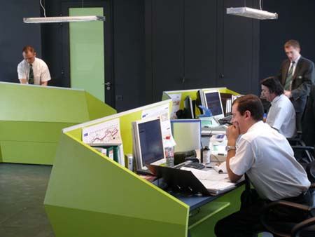
The different color schemes used to distinguish the various indoor areas together with the spacious offices, generous lighting and attractive indoor patio area, bathed in a pool of light, all bear witness to this elegance which makes the building pleasing to the eye and a comfortable place to work in.

Even the reflective structural glazing conveys a sense of elegance, with its tinted or partially frosted glass creating multiple reflections and mirror-like effects.

Independently of its administrative functions, the new

This remarkable building is sure to elicit two responses. Firstly it catches the eye, its high architectural quality and bombastic appearance naturally arousing curiosity. Secondly, it generates discussion. Yet this new building is far from an example of radical autonomy .
This building is neither provocative nor out of touch with reality. Nor does it bow down to "poor quality" urbanity- a common characteristic of the neighbouring buildings. ECDM’s building is both divergent and convergent. It forms part of the local area, while at the same time adding something to it.
Despite the fact that Thiais’ unusual new
Above all else, Emmanuel Combarel and Dominique Marrec have designed the building specifically for purpose as the well thought-out interior design testifies. The
--
Posted by Rose Etherington