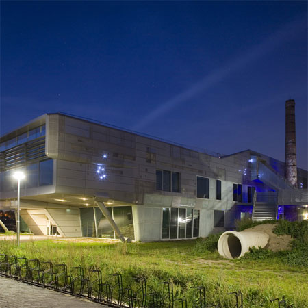
Forum 't Zand in Utrecht by architects VenhoevenCS is one of two projects to be awarded the 2007 Rietveldprijs for architecture.
The school building shares this year's prize with A.A. Hijmans van den Berghgebouw by Erick van Egeraat Associated Architects (see the following story). The prizes will be awarded on 27th January 2008.
Here's a description from VenhoevenCS:
--
Multifunctional school building ‘t Zand
Urban planning
’t Zand is positioned in an archaeological park that contains remains of Roman history and is surrounded by orchards, old greenhouses and romantic reminders of a recent horticulture past. We have chosen to develop a compact building in order to save the valuable underground and the surrounding nature. Several spaces have multiple use and the playing areas are situated on the roof.
Exterior
The exterior of the building has a strong connection to the imaginary world of children based on movies, Internet and games. Because of the shape, materials and technical detailing of the façade, the building appears to be more of a spaceship than a school. Like many other space ships it has animal characteristics. With its white belly and a dark grey back it resembles an orca.
Interior
’t Zand is a village in the shape of a rocket. It is a colourful world, not only an educational building but also a playground, a place to meet and to learn how to interact. Central in the building is a big indoor square, which in the future can be transformed into a green botanical garden.
It is a bright, covered space where children can play in bad weather. It is also the meeting room for the leisure centre and a foyer for the auditorium. The auditorium is suspended in this open space and offers a great view into the sports hall.
Facades
The facade is mainly constructed of perforated aluminium panels. The patterns of the perforation evoke the image of a spaceship which after a long journey has had the necessary repairs. The integrated LED-lighting enhances this image. Installations and drainage are hidden behind the aluminium veil or form an obvious part of the façade. From top to toe the aluminium panels have a seamless transition to screened safety glass. Many window frames have been hidden in the façade but in certain positions a window forms an eye that pops out or lies back in the façade. They’re false clues about the interior. The façade does not reveal everything but narrates an exhilarating story.
All photographs by Luuk Kramer
--
Posted by Rose Etherington

