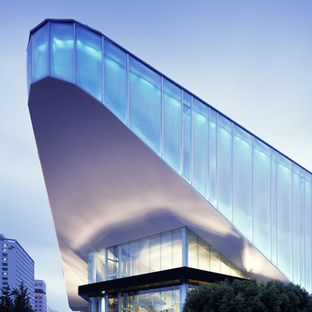
Xi Gallery by Mass Studies
The second of our three recent buildings by Korean architects Mass Studies is the Xi Gallery in Pusan.
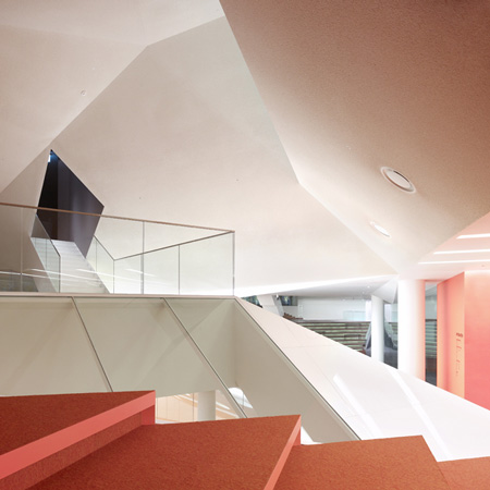
The exhibition centre, built by apartments brand Xi to showcase its show flats, also provides public cultural spaces.
See Mass Studies' Ann Demeulemeester Shop in Seoul in our previous story. All photos are copyright Yong-Kwan Kim and used with permission.
Here's the info from the architects:
--
Xi Gallery
Located in Yeonsan-dong, Pusan, this building was constructed for the purpose of promoting “Xi,” a brand of apartments.
In addition to the standard type of an apartment unit exhibition space (a common practice in Korea to publicize and market prospect constructions), a even larger share of the floor area is allocated as a variable cultural space for the locals, which as a result creates a brand-new building typology: a Housing Cultural Center.
As economic forces and cultural activities seem to form complex interrelationships causing our private and public spheres to merge and invade each other, this building comes as a product of these current phenomena.
The focus of our investigation is to create a fluid space that can respond to the “continuously new” situations arising from the dynamic flux of economy and culture, and in the organization of the movement system to correspond to such a space.
This new movement organization is necessary to maintain the existing individuality of the spaces, but at the same time be able to expand/unify them in diverse manners to suit future possible needs. Through this, we may be able to discover a new type of spatial efficiency to actively respond to the present and near-future cultural variances, and subsequently open the possibilities for a progressive culture.
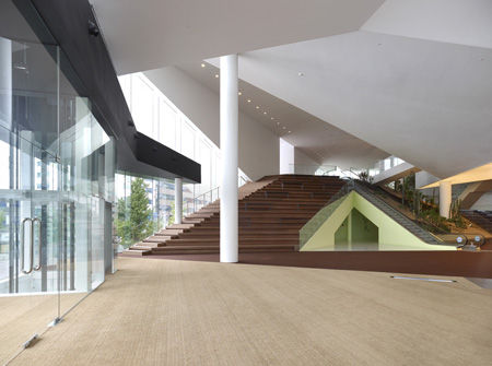
This four story, 9,491 m2 building is organized as follows [NB the pictures aren't with the right bits of text]
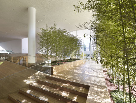 :
:First Floor: This floor serves as pedestrian and vehicular access. In the most prominent street corner, a spacious outdoor staircase flows up to the second floor as a pedestrian entrance, while the rest of the first floor as marked as a parking lot and a small lobby to connect to the upper floors.
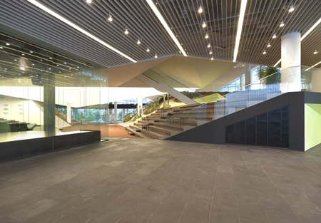
Fourth Floor: The uppermost floor is dedicated for apartment unit exhibitions. This 3,396m2 space has a maximum ceiling height of 7m, allowing up to 7 different unit types to be showcased at once.
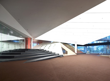
The truss structure permits a wide 35m column span, creating a universal, neutral space for varying situations. At the centers of its 4 edges are different access facilities such as elevators, stairs and escalators, as well as a stepped rest space.

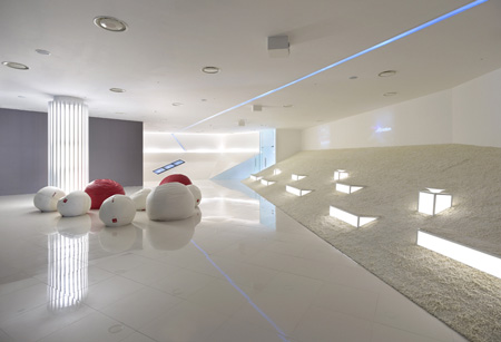
Second and Third Floor: A variety of public cultural programs are located on these floors. They efficiently connect the first and fourth floor, while the organization creates a different spatial condition as opposed to those functionally focused ones.
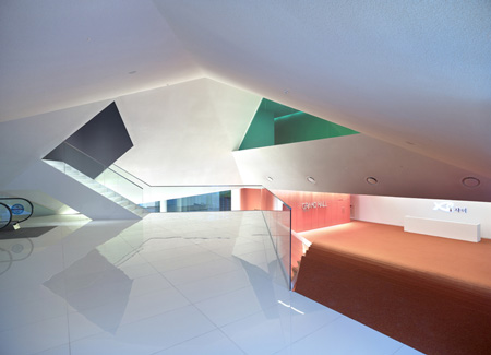
The fundamental logic is as follows: All the programs that act as a closed-off block (lecture hall, yoga room, offices, future housing exhibits, etc.) are dispersed within this 2 floor height space as each individual volumes.
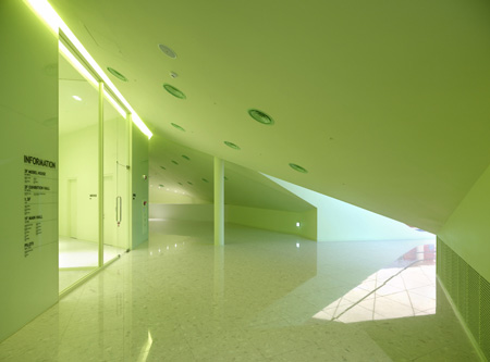
Simultaneously, all the remaining spaces are adjoined to flow in a continuous manner, and accommodates the rest of the open programs (special exhibition hall, open lecture room, hall, lounge, etc.), by adjusting the locations of the closed masses.
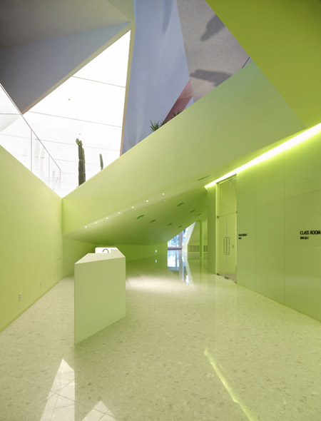
These two typologies placed within this 2 floor height space are therefore all interconnected, and is a composition of small private spaces within a large open field.
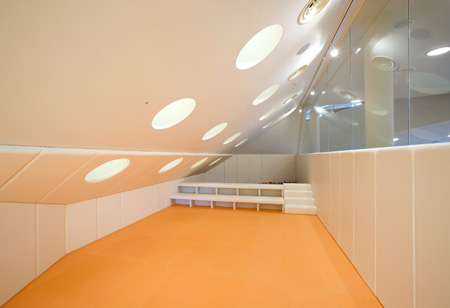
For the visual/physical fluidity of the open space, the open/closed spaces are divided by sloped, folding surfaces. The slopes expand the line of sight as well as acting as means for vertical movement (such as a staircase), or even landscaping.
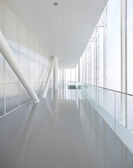
As a result, these 2 floors act as one large dynamic and topographical surface, while fulfilling the programmatic requirements. Furthermore, these topographical spaces can be effectively reorganized in unlimited ways. Movements in this space escapes from the standard orthogonal norm to be organized like a non-linear, 3-dimensional net, and encourages and supports dynamic spatial use.
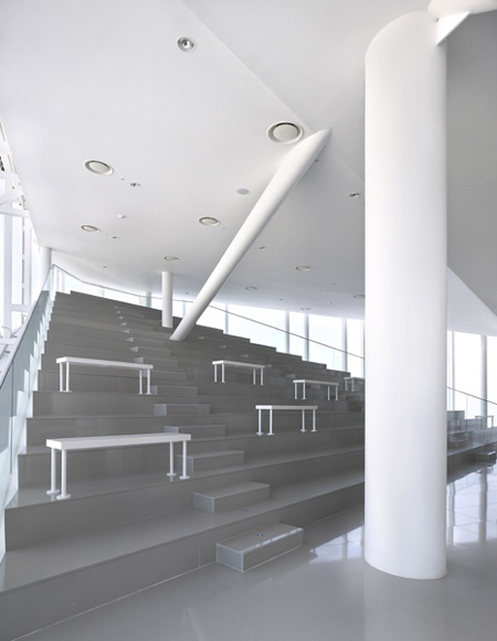
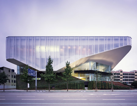
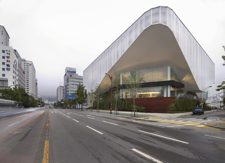
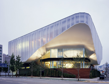
As a result of such spatial and circulatory manipulation, the building mass can be organized into two parts: The ‘Cubist Mountains’, the under mass, from the first floor parking space to the programs connected on the second floor; and the ‘Cubist Cloud,’ the over mass, of the 4th floor exhibition space and the programs attached to its 3rd floor.
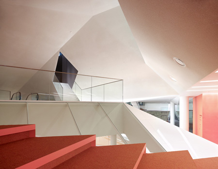
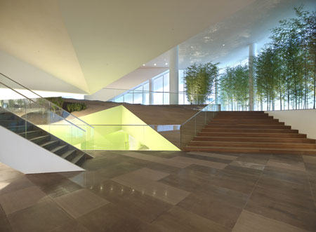
These two masses minimize their contact, and the third in-between space is created to form the large, open, abstract, topographical space. These two elements cast a strong contrast, and the spatial depth, direction and views change in response to one’s movements in between them, opening up new programmatic possibilities.
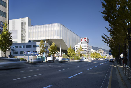
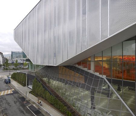
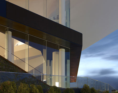
The lower Cubist Mountains form two hills and a valley in between, and are finished with familiar textures and landscaping elements in its interior and exterior, to be experienced as a physical topography.
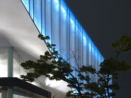
The upper Cubist Cloud is finished with white ceilings and transparent/translucent ETFE (Ethylene Tetrafluoroethylene) air cushion skin to minimize materiality and physical presence. Moreover, the ETFE skin is lit when dark, further inducing the upper mass as a light, floating volume.
Project Data
architect: cho,minsuk + park,kisu
design team: mass studies
location: 1123-1 Yonsan-dong, Yonjae-gu, Pusan, Korea
site area: 10074.80 m2
gross floor area: 3613.94 m2
total floor area: 9400.79 m2
building-to-land ratio: 35.87%
floor area ratio: 93.31%
building scope: 3f, pilloti
structure: sc
finishing: plant box, ETFE, Polycarbonate
design period: 2006.11~2007.03
construction period: 2007.03~2007.08