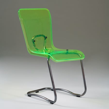
Kiasma chair by Vesa Honkonen
Stockholm Design Week: architect Vesa Honkonen launched the Kiasma chair for Swedish manufacturer Källemo at the Stockholm Furniture Fair last week.
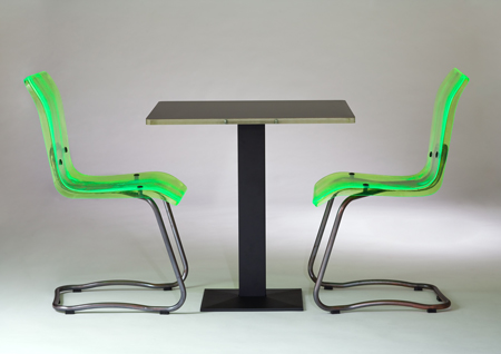
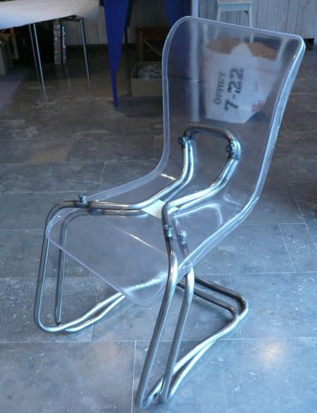
The assymetrical chairs were designed for for the Museum of Contemporary Art Kiasma in Helsinki, Finland.
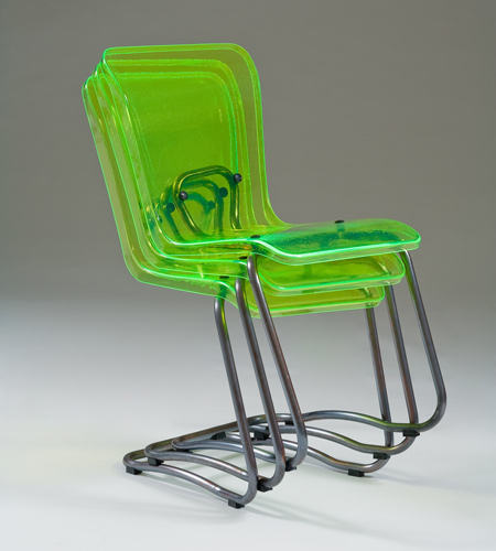
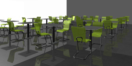
They will be installed in the museum café, and will replace those designed by Steven Holl ten years ago. Honkonen assisted Holl with the design for the original chairs.
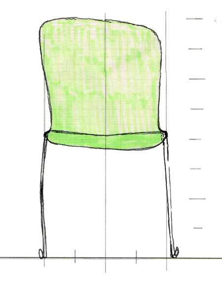
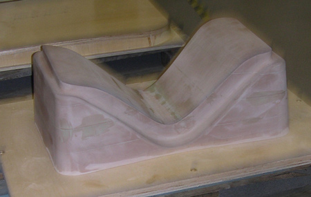
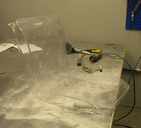
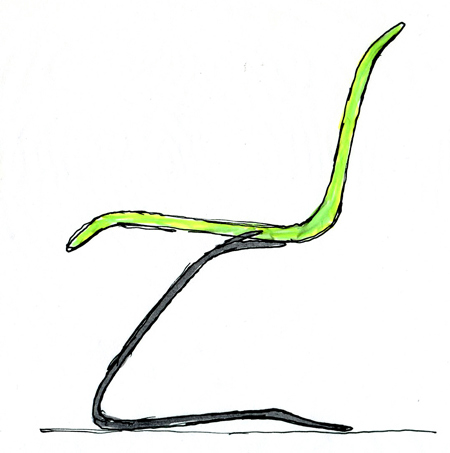
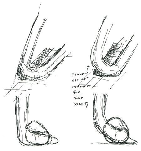
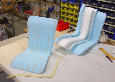
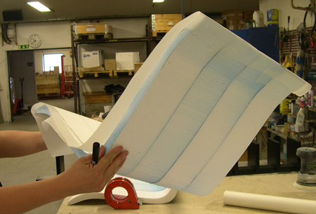
Honkonen has provided us with the original sketches, drawings and photos of development prototypes for the Kiasma chair.
See our earlier story on Honkonen's Heinola Reading Lights. The following text is from Honkonen:
--
KIASMA CHAIR
In 2008, Kiasma Café’s original chairs designed by Steven Holl, become 10 years old. This chair has a strong character and it has been an important part of Kiasma’s image. However, ten years is a long time for café chairs.
I had personally assisted Steven in making these chairs come true. It was a long process with some artists, boat makers and casting experts helping us. Average lifespan for a café chair is about 5 – 6 years, so in 2007 it was time to create something new.
I got permission to design the chairs and develop them together with Swedish furniture manufacturer Källemo. Steven Holl gave me one piece of advice, “Light passing through the chairs is important”.
I started to make sketches as cartoons, since I did not want to force the form to become visible too soon. I wanted to first find the essence, the soul of this chair. With these cartoons, where the emptiness is talking with a person, the chair found its form.
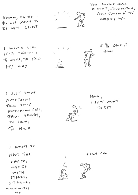
It became clear that the chair itself is the light and the leg that represents the earth, holds it.
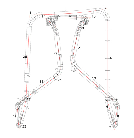
The form wanted to have movement as well. Asymmetry started to take over. It was interesting to follow this path. Few times during this process, I was forced to change the form I had found.
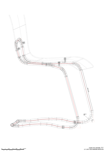
These discussions with emptiness guided me always to a new form, which also followed the origin of the chair. The leg became one continuous line moving through space, holding the light in its hands.
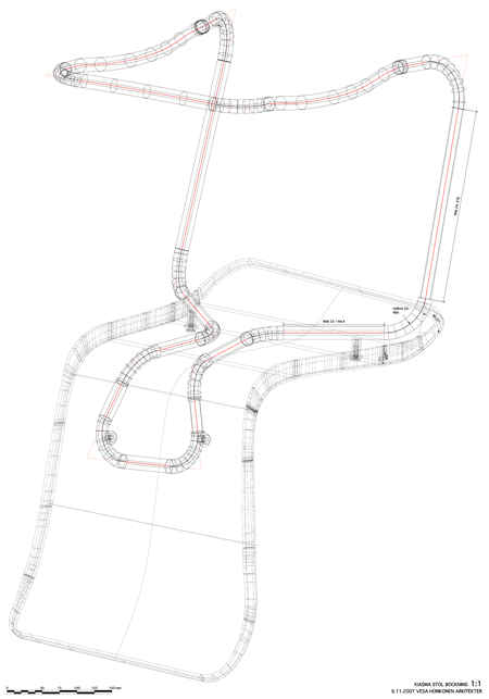
During this process I became more and more convinced that in design, in giving form, the form itself is not so important. It is what is behind the form, the origin telling the story. It is about movement, space in between.
