KK Outlet by Fashion Architecture Taste
Another one from Fashion Architecture Taste: the architects have completed the KK Outlet, a combined office, gallery and shop in London for communications agency KesselsKramer.
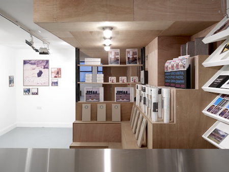
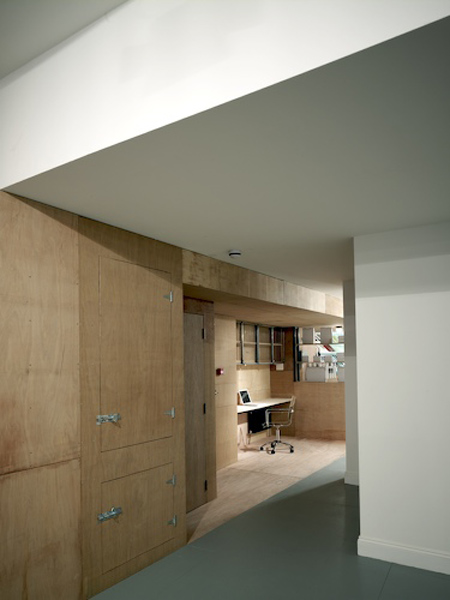
The space is divided in half by a plywood wall. On one side of the wall is a plain white painted space. When sections of the wall are reconfigured, brightly coloured and patterned rooms are revealed on the other side.
The information below is from FAT:
--
KK Outlet is a multifunctional office combining workspace, gallery area and shop for the Amsterdam based communications agency KesselsKramer in London’s Hoxton Square.
The deep rectangular plan is sliced by a full-length plywood wall, leaving half of the room as found - a simple white painted space.
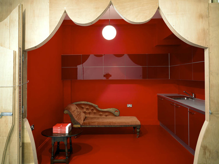
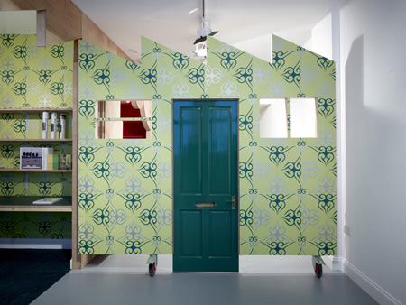
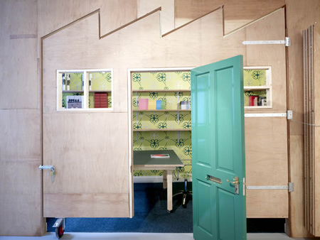
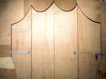
The ply wall opens up in a number of unexpected and dramatic ways: elevations of a factory swings out on industrial castors, a cut-out curtains folds back.
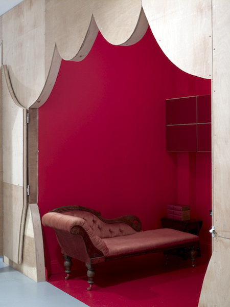
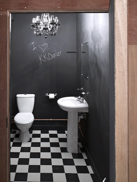
Inside this wall, in contrast to the plain ply exterior are richly decorated spaces: heavily patterned wallpapers, totally red rooms, and other unexpected spaces.
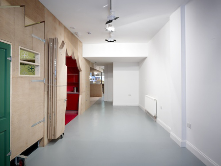
These fragments make a sequence of juxtapositions that allow the Outlet to operate in many different configurations and with all kinds of alternative atmospheres.

The project continues FAT and KesselsKramers experiments in office design, which began back in Amsterdam with the Church.
