Bela Cintra 1235 by Triptyque
French-Brazilian architects Triptyque have sent through images of Bela Cintra 1235, a private apartment in São Paulo.
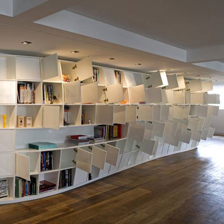
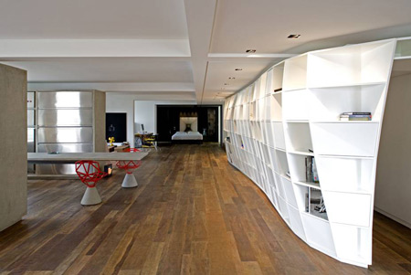
Completed in 2006, the apartment features a monumental curving bookcase that wraps around the building's circulation.
The apartment was designed for Houssein Jarouche, owner of the design boutique Micasa in São Paulo. Triptyque also designed the Micasa showroom.
See our earlier story about the Loducca building in São Paulo by Triptyqye.
Here's info from Triptyque:
--
BELA CINTRA_1235
PROGRAM APARTMENT
LOCATION BRAZIL / SÃO PAULO (JARDINS)
AREA 300 m²
DATE SEPTEMBER_2006
Dominique Gonzales Foester defined the tropical identity as “something organic, intense, sensorial, vegetal, pulsating, immature, out of control”.
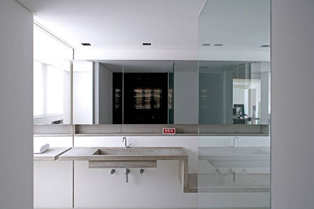
These concepts guided the project for this apartment. This project embodies the idea of global design – it’s a completely artistic project. A contemporaneous and singular architectural plan is established from the layout to the faucets.
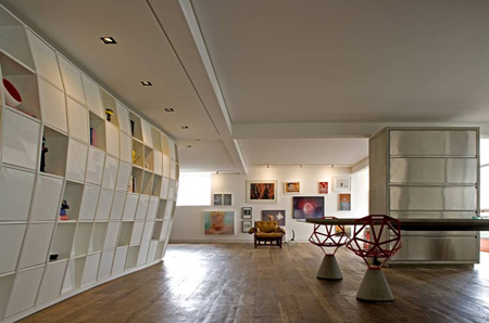
The 300 square feet apartment was planned as a great gallery with aligned rooms without an established function. The goal was to stimulate unexpected occupations and give a certain gratuité to the spaces. The main concept was to work the space as whole unit, divided in smaller rooms.
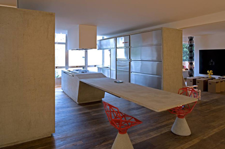
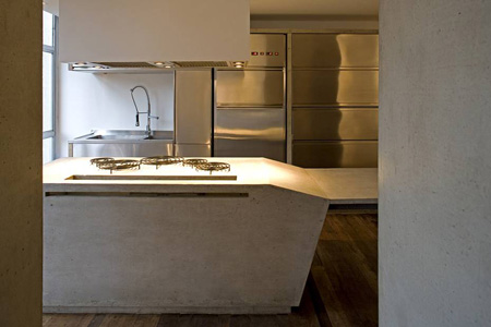
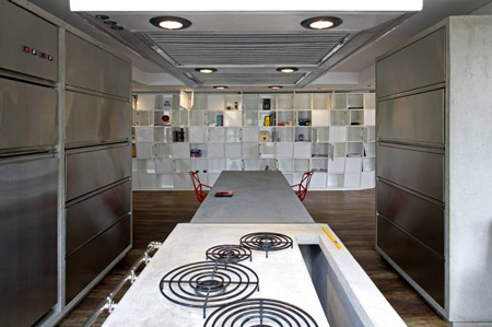
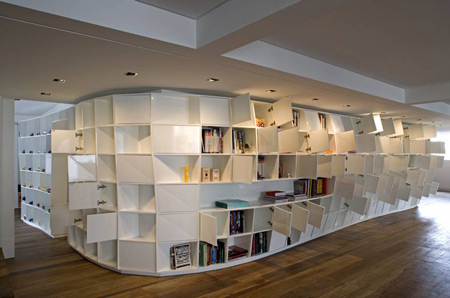
Inside, strong elements are confronted, resulting in a poetic conversation. The use of wooden floors – per example – is very expressive: the treated demolition wood and its irregular pieces juxtaposes with the white lacquered bookcase. The artificial makes visual contrast with the rough. In the same way, the kitchen’s concrete speaks to the stainless steel from the drawers and doors.
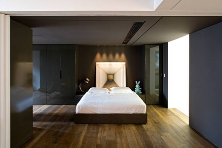
Therefore, the apartment offers a great variety of points of view, sequences, accidents and movements. The result is extraordinary and surprising – the visual relation created with the loose volumes and the organic omnipresence of the Treme-Treme leads to a unique architectural experience.
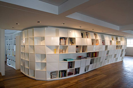
“The first step was to clear the space and observe the potentials. The second step was to establish a new hierarchy that privileges the continuity of spaces. The third, to search and create a language of our own”, say the Triptyques.

The greatest challenge to the architects was to make sure that this continuity was obtained without interfering in the richness of internal spaces. The apartment structure was opened to its maximum in order to clear the plan, where a dialog between the bookcase, the kitchen and the galleries is set.
A monumental structure (the bookcase) embraces the technical core of the building (elevators and stairs). It presents itself in every room and defines the whole project: through the bookcase is made the entrance to the apartment, like walking into a cave, through the dark towards the light.
The kitchen is a great concrete stone – from where fire arises – that stands in the center of the project. It is the element of encountering and articulation and is placed in the central position, speaking directly to the great structure (the bookcase).
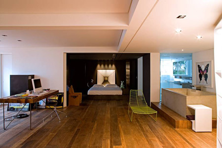
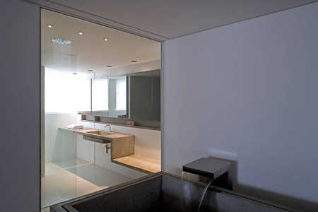
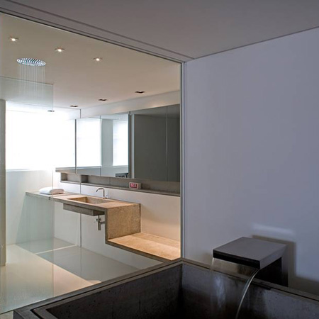
The gallery is marked by integrated essential elements, such as closets, bathtub, bed, kitchen, etc. – all of them treated in a minimalist way – rough concrete, demolition wooden floors, stainless steel, white walls, etc. – giving the furniture and art pieces space to be moved around.
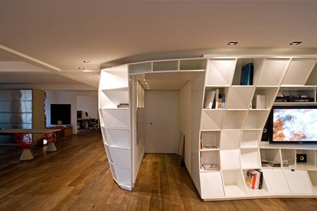
The furniture – pieces of international design collections – was chosen with the client’s participation. The choice was leaded by the configuration of spaces, considering as priority the rooms’ versatility and the possibility of eventual layout changes.
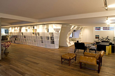
White is the main color used. In the gallery, the white is accompanied by the natural colors of the other materials – concrete, wood and stainless steel – and in the bedroom it is side by side with dark-grey elements, giving it a strong and intimate feel.
