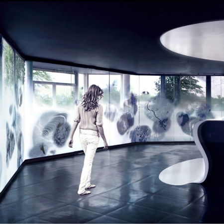
Designer Daniela Bianka has completed a renovation of the reception area and exhibition space at the French National Space Agency (CNES) in Paris.
The project includes a Corian reception desk (below) stretching from floor to ceiling and artworks on glass representing the themes of the Space Agency's research.
Here's some more information from Bianka:
--
CNES - CENTRE NATIONAL D’ETUDES SPATIALES
Renovation of the Entrance and Exhibition Area 2007-2008 - Studio Daniela Bianka
The Space Agency contacted me and asked me to take part in the architectural competition for the renovation of their space-launch headquarters on the outskirts of Paris. After having been selected for the project, we met many times with both the communications department of the Space Agency and with scientists working there in order to discuss a whole new identity for the entrance, reception and exhibition areas of the building. The Space Agency gave me quite a free hand to create this new identity.
The goal of the project was to integrate the complex technical research conducted at the Space Agency as well as its vision of the future, combining science and imagination, into the physical space at the entrance of the building.
I envisioned a conceptual “space of passage,” which explores the relationship between Man and the Universe, bringing together the ideas of space and time, of movement and direction, and of depth and density. Space and time are the raw materials of the area, which serves as a functional reception for the public as well as an exhibition hall.
The visitor is welcomed into this architectural space, created with elements of light, glass, supple structures, perforated metal, transparency, rhythms, partitions, and transitions, a space where one might experience a feeling of weightlessness and lightness. I envisioned the expression of the design as the relation between matter and light rather than as fixed and definitive forms.
Visually, the reception area is open to the exterior, while the inner façade consists of a series of rotating glass elements, into which are integrated graphic compositions based on images from earth observation satellites and space probes. These compositions are abstract in the macro-vision, detailed and figurative in the micro-vision. Light and views of the cityscapes beyond the building interact with the glass elements, superimposing images of realities local, global and universal.
The resulting “Spatial Composition” of images and light is constantly evolving with the ever-changing interplay of nature and form, of internal and external light. It evokes space, science, technology and the world around us; it creates a landscape within a landscape, a space within space.
The glass panels of the façade are continued into two gallery spaces on either side of the reception area. The gallery on the left is composed of a series of monochrome images illustrating the work of the Space Agency, touching on themes such as propulsion, force, time, weightlessness, autonomy, modularity, innovation, technology, adventure, trajectory, the finite and the infinite, history, technical drafts, research and development and space launchers.
The gallery on the right is a display area designed to evoke the image of floating between earth and the atmosphere. It is conceived as a landscape of models of the future, where technical models and futuristic machines are suspended at different heights along fibre optic cables and encased in transparent tubes, creating an interplay of technology, reflections, light and imagination.
The background shows an abstraction of the landscape in Kourou, Guiana, the location of Guiana Space Centre, from where the European space missions are launched: the Ariane launch system, for example.
The reception “desk” comprises a single moulded Corian® form, extending from floor to ceiling, in part transparent, in part opaque. I wanted to create a place for interaction, between the Space Agency and visitors, between material and immaterial, between the present, here, and space. It is made from a translucent and luminous material that catches light and colour, creating a functional and comfortable working area that reflects the pursuits of the Space Agency.
Part of the hallway within the French National Space Agency is dedicated to communication, comfort and exchange, with an open reading space. This area, named as “The Labyrinth” is designed as a flexible space that allows for the display of temporary exhibitions and presentations.
Beyond the creation of a new identity for the interior, based on the theme of space research and the work of the Space Agency, the internal communal area is dedicated to reflections on the history of representations of the cosmos and art related to outer space. The primary material of this creation is therefore art itself.
The 14 metre-long installation that makes up the hallway is an interaction of images, light and architecture, reflections and angles. This “Fresco Space” comprises different strata, made out of layered and fragmented metal. The base elements of the fresco are pixels, the smallest single components of digital images, cut out of metal sheets using innovative laser technology. The “setting in space” of reflective surfaces underlines and accentuates the micro and macro dimensions, density and depth, the obscure and the visible, material and vacuum.
This “Hallway Space” or intermediary space is not only an architectural and visual element within the Space Agency, it also inspires exploration of the relation between the Man and the Universe, the discourse between matter, the immaterial and reflection.

