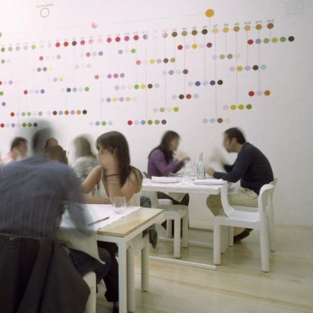
Italian architect Francesco Moncada has designed the interior of a pizza restaurant in Syracuse, Italy, using materials normally associated with construction sites.
A fibreglass wall divides the restaurant in two, accommodating take-away and eat-in customers.
The wall is used to store and display ingredients as well as customer's coats and bags.
The graphics, by Point Supreme, represent possible combinations of pizza ingredients.
Photographs by Alberto Moncada.
Here's some more information from Moncada:
--
The restaurant is lodged in the ground floor of a 70's building, in the business district of the city, beside the Archimedes' tomb in Syracuse (Italy).
The budget was really low so the client accepted to use very cheap materials, normally used in construction sites, and cover the surfaces of the bathroom with waterproof painting. Ceiling and warehouse-wall are covered by fiberglass, usually used in garage’s canopy, and bar is made just assembling metal painted boxes, that allow to hold the steel shelf. The pavement and kitchen-wall were covered by plywood, used in shipyards, and supported by a metal structure.
The space is divided in half by a fiberglass wall. On one side is the fast-food area, where people can drink a beer while waiting for take-away orders to eat at home. On the other side is the slow-food area where you can sit to take your time eating pizzas and drinking wine.
The fiberglass wall, totally opened from any side and transparent, is used as an informal display for wine, ingredients and tools used by the restaurant, and as a wardrobe for the client’s coats and bags. In the upside the grid-band hide the speakers for the music and the air conditioning.
The design emphasizes the social aspects of meeting for dining. Usually tables and chairs allow customers to sit in closed groups, while interaction between groups is not facilitated. So we decided to minimize the volume occupied by 1 single module/table (a cube 70x70x70 cm) and the distance between modules, so people have to share the same table.
The main room is illuminated by circular and linear standard neon used in garages. The main windows are totally opened, allowing customers to use the terrace as an extension of the restaurantin the summer.
The graphics (by Point Supreme, Athens ) complement the simplicity of the space; they express and celebrate the variety and richness of taste in the food served. All the ingredients used are mapped and symbolized by colors and codes. Their combinations result in the different pizzas. A very precise and scientific looking matrix, with these ingredients, covers the wall in the seating area. The pizzas are exhibited and arranged according to the season of the year. It offers an abstract overview of all the possibilities of choice.
On the wall next to the entrance appears a real size zebra. The zebra is simply the other side of the scientific information; It is colorless, simple in its appearance and it refuses to suggest an explanation. It is simply standing there beautiful, mysterious, surreal and inspiring thoughts and discussions between the customers waiting for a table or some take-away food.
Architect: Francesco Moncada
Collaborators: Marco Pizzo, Carmelo Zappulla
Graphics: Point Supreme , Konstantinos Pantazis and Marianna Rentzou
Photos: Alberto Moncada
Area: 90 m2
Budget: 90.000 euros
Date: March 2008
Client: Vincenzo Perez
Location: Syracuse, Italy

