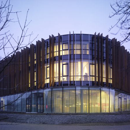
Dutch architect Erick van Egeraat has completed the new City Hall at Grave in the Netherlands.
Here's the lowdown from the Erick van Egeraat Associated Architects:
--
Erick van Egeraat designs for unity and diversity
Rotterdam, 25 August 2008 - The new building for the City Hall in Grave, designed by Erick van Egeraat, was officially opened this summer. The municipality shares the building with housing corporation Maasland and the regional historic archive of the Province of North Brabant, BHIC.
Seen from a distance, the building presents itself as a singular ensemble. Up close, however, specific identities of the users become
apparent. The three parties present themselves to the public in the main entrance hall, an open environment on the ground floor, thereby
stimulating interaction among the tenants and between tenants and visitors.
The building is part of a masterplan developed by EEA for Grave in 1998. The masterplan distinguishes between two zones; the historic centre of Grave and the green space surrounding the old fortress. The new city hall is situated on the border between these two zones, on the exact location of the former fortification. The city hall's design refers to both, the historic centre and the surrounding landscape.
According to Erick van Egeraat, this urban transition influenced his design significantly: "I wanted the building to blend into its
environment unobtrusively, while making it very accessible to the public. We mainly used natural materials, such as wood, natural stone and a grass roof. The design is sturdy and subtle at the same time. In this manner, the city hall opens itself towards the entrance of the town
and invites the public to enter."
The surroundings were not only an inspiration for the building's materials, but also influenced its shape. The fluent form of the complex refers to the former city walls, the interior structure of the building integrates the town's characteristic alleyways as a theme into its
layout: "At the front, the building establishes itself as a city wall, with the office of housing corporation Maasland marking the highest and
most prominent point; the back side, where the building encloses a public square, has a smaller-scale appearance."
"Typical for this design is the unity and diversity," says Erick van Egeraat. "The complex unites three very different tenants under one
roof, it has an open character and it blends into its historic surroundings."

