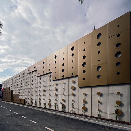
Slovenian architects OFIS Arhitekti have completed the facade of a shopping mall in Ljubljana, Slovenia.
Due to budget constraints, the architects were commissioned to decorate three walls of the building using only enough material to cover one wall.
Their solution, called Dot Envelope, uses bronze-painted steel panels on parts of the facade, with discs cut from the panels arranged over the rest of the concrete surface. Plants will be grown over chains linking the disks.
The shopping centre is situated in a listed industrial area that includes an old butchery and water tower.
Photography by Tomaz Gregoric.
The following is from OFIS:
--
3 for cost of 1_Dot envelope _ low cost shopping 2006-08
Commission 2006 /
construction start 2008 /
completed 2008
Navigation: Mesarska cesta, Ljubljana
The existing site is listed as industrial historical area with buildings of an old butchery complex, which included the water-tower and old butcher hall.
Demand of National heritage was to rebuild the tower as it was in original and to integrate the main façade portal of old hall in front of the planned new shopping mall.
The client permission and expected plan was prefabricated concrete hall of 46x42x7 meters. Interior and all internal finishing is done as “Mercator standard” – the standard which is prescribed by shopping company’s chain for all their standard malls.
Construction Company budget was extremely limited; the part of their contract with Mercator was a reference project – simple mall, built in village in northern part of Slovenia. (This mall had only front façade with final façade finishing; the rest 3 facades were basic concrete). Exactly the same budget had to be respected in this project and the same amount was listed in our contract.
The new shopping mall has customer approach and parking facilities on 3 sides of the building. Therefore it was important to cover 3 sides with final decorative finishing with the budget of 1 side only. After detailed calculation the budget for covering all elevations was at 60.000 EUR.
The pattern was based on different stepped elevations in order to soften basic cube shell. We took and calculated the surface that would be needed for one side. The surface was divided into three elevated surfaces. The surface which could fit into the budget for the facade was use of basic metal sheets which were painted in bronze structured color.
After cost evaluation only 20% of the concrete shell could be covered with the metal sheets. So the sheets were perforated with holes in different sizes. Furthermore the cut metal circles from the sheets were used and arranged on the rest of the façade surface.
The use of the holes and circle ornamental patterns were justified with the commercial merchant’s company “Mercator pika* (*pika in slovene - dot)” (campaign for faithful customers).
For the rest of the budget which remained; the metal chain rope was created around the metal dots. In time the surface will be covered with green climbing plants. Sustainable Issues: Climbing plants (evergreen) are placed around the building which will slowly cover the elevations and will become eco-green.
Design team: rok oman, spela videcnik,
andrej gregoric,
Javier Carrera,
Anna Breda
Luis Ferreira,
Ana Kosi, katja aljaz
Interior design:
Mercator Optima
Main client:
Mercator d.d.
Structural engineering:
Projecta d.o.o.
Mechanical engineering:
ISP d.o.o.
Electrical engineering:
Eurolux d.o.o.
Traffic engineering:
Tegainvest d.o.o.
Construction company:
Gradis Skupina G d.d.
Basic data: brutto surface including services 2.000 m2
Shop surface: 1.200 m2
Old tower: 200 m2
More Dezeen stories about Ofis Arhitekti:
Lace Apartments by Ofis Arhitekti
Jaroslavska Square by Ofis Arhitekti
Tetris Apartments by Ofis Arhitekti

