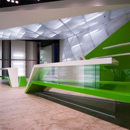
Estonian interior architect Ville Lausmäe of VLS Interior Architecture has completed the interior of clothing store 2.MOOD in Tallinn, Estonia.
According to Lausmäe the 110 square metre store consists of "a geometrical construction that tries to diffuse the contours of the original room."
The following text is from VLS:
--
Clothes shop 2.MOOD interior by VLS interior architecture
“2.MOOD” (in translation „2.fashion“) clothes store, selling several different brands is located on the ground floor, in the white building of a recently built and acclaimed set of apartment buildings and business blocks in Rottermann area, Tallinn, Estonia. It is located in the City business district, close to the Old Town.
The store takes quite small space about 110sq/m, and the selection of merchandise consists of several different brands - therefore there isn’t any monosemantic corporation design included and the interior architect Ville Lausmäe in charge of the commission had full freedom to alter the space in his way of liking, without taking in account any of the brands sold there.
It was even preferred that the shop doesn’t have the “look” of any of the brands sold there – so they would be equally represented. For that reason the commissioner didn’t reveal the brands to be sold there, up until the shop opening. In a way the interior design tries to experiment a bit – it revolves around the question what kind of framing to create for completely different items on display there and how they are going to look inside it.
The idea was for the interior to exist and have a certain effect, mood, imposed upon the visitor, even without the items sold there, inside it. If you would stop displaying these items, and would want to start displaying something else, maybe not even clothes, the place would carry the same “mood”.
The interior would be probably sufficient for anything, because it exists in itself, it doesn’t try to represent anything, except the effect an interior itself has, or the “mood” it creates, to the visitor.
The interior tries to exist solely and is directed inwards – it doesn’t communicate with other constructions around it, it tries to encompass a visitor to its world. The glossy wall and ceiling forms made of bright white illuminated plastic and green panelling grows from the ground and tries to distort the original square room with straight walls to something that is harder to comprehend, thus creating interest, thus making people stop, thus attracting customers. The centrepiece of the design, and space in use, forms a ceiling, interlocking with the back wall in a geometrical construction that has a tries to diffuse the contours of the original room.
The interiors aim is to form an independent sculpture that serves not merely the purpose of a clothes displaying room but the stuff what comes inside afterwards alters the room and changes its original meaning, but only so much, that the place would always carry a certain “mood”. That gives it multiplicity in function – first giving the visitor uncommon spatial impression, and secondly being a display for the stuff sold there.

