Luisaviaroma store by Claudio Nardi Architects
Italian architect Claudio Nardi has renovated the interior of fashion boutique Luisaviaroma in Florence, Italy.
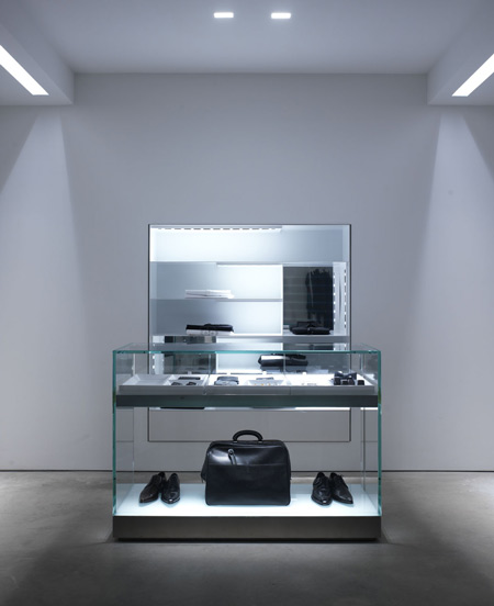
Fitted out using concrete, steel, Corian and thick, tempered glass, the three-storey shop will be used for events, exhibitions and fashion shows as well as its primary function as a retail space for clothing.
Nardi originally designed the store in 1984.
Here are some more details from the architect:
--
Claudio Nardi Architects
LUISAVIAROMA 2008
Claudio Nardi has reinvented Luisaviaroma, the store which since his original design of 1984 has been the site of a series of significant and influential projects for the fashion world, identifiable through his use of technology and versatile creativity.
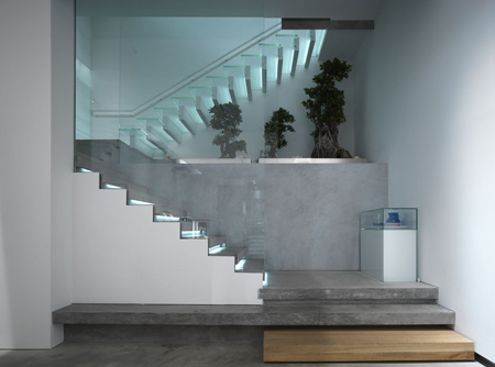
no boing architecture
In a radical restructuring of the three story fashion store, new spaces and volumes have been created and defined by a new concrete monumentality divided by glass and light. Claudio Nardi has given form to a new concept to incorporate the high art and contemporary forms of communication that make up the “no boring philosophy" of Luisaviaroma. A revolutionary space has been designed to enable the transformation from a retail clothing environment into a venue for special events, exhibitions and fashion shows.
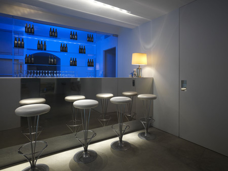
A meeting place, a neutral container, absent of trends; in this fascinating new environment the store now interfaces with the web in real time with the on-line/in store presence of luisaviaroma, one of the most recognised websites in global high fashion. The architectural transposition of this innovative idea of a mutation of shopping trends, created by Claudio Nardi with the collaboration of Annalisa Tronci, travels in the realm of high technology, proposing the concept of multifunctional and mutatable spaces that have a very strong scenography through a new language of materials and constructional innovation.
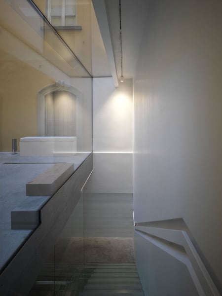
the character of crystal
The store is articulated on three floors: the ground floor is dedicated to women designs, the first floor to men and the basement for young fashion. Luisaviaroma has been conceptualised as a minimalist, high tech multi use space with a new light and form created through the extensive use of massive glass load bearing features.
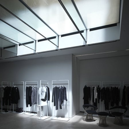
Symbolic of the research developed by Claudio Nardi in this field is the large glass terrace 13 metres by 4.5 metres that covers the main room of the round floor and is simultaneously an outdoor entertaining space for the cafe upstairs. The innovative structure is supported by eight laminated glass beams 5 cm thick, 50cm tall and 4.5 metres long which carry a tempered glass floor. The floor panels contain a UV laminated film and a screened anti-slip pattern on the exterior.
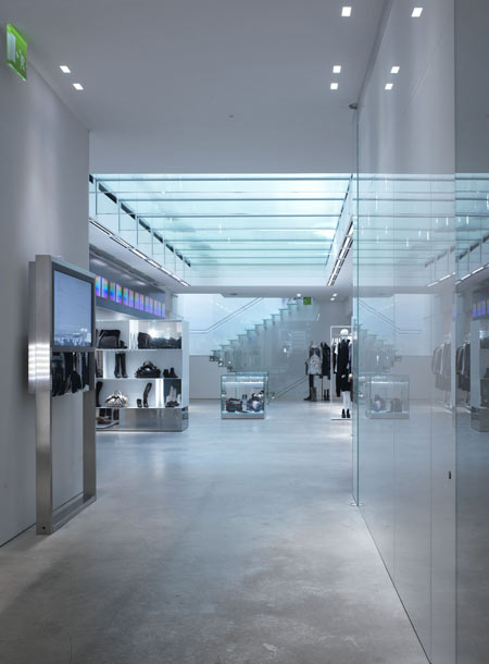
The access to the various levels is a play of light and mass with the two staircases, one at the front of the store and one at the back, screened by thick glass walls. The steps are cast in concrete and back lit creating a floating environment while the elevator in the centre of the space transports one in a private world while transcending the space.
a multipurpose and mutatable space
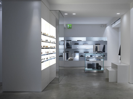
Also changed is the relationship with the street where the traditional concept of the store window has been replaced with two large arched glazed openings which define the store entrance. One side is the entrance with a background of the cashier area and the staircase, the other a pivoting glass wall that opens creating a new perspective of the store and opening up the building directly onto the street. The space is defined by an industrial concrete floor and a series of sharp clean wall panels, some in glass, others in enamel paint or corian as was used to clad the central building column which acts also as a continuous display unit connecting the different levels. This definition of simplicity, of a box that has a variety of functions changeable within minutes is the concept that has been developed. This is made possibile by extensive use of folding and sliding doors and freestanding display units in simple teflon coated square steel tubing that allow the reconfiguration of the store space within minutes. The permanent elements of the store design also have a multipurpose existence from the formed concrete bases that support the shelving units which becomes benches or display units or the windows with their backlit thick glass shelves which become exhibition units.
theatrical connectivity
Animating this ethereal and minimalist space are a miriad of monitors that through a sophisticated concealed cabling system can be situated anywhere throughout the store and connect the real environment with the web site as well as transmitting avant garde art and communication.
Recessed into the white plaster ceilings or hidden behind glass shelving, subtle LED lighting strips with one watt lamps diffuse a cold technical light, which creates a strong theatrical atmosphere which mutates with the changes of use of the environment.
women’s retail space
The retail space dedicated to women designs is characterised by the presence of the thick plate glass ceiling with its’ heavy glass beams. The clothing racks, built in fine square metal tubing and lacquered wood, are designed as freestanding units which can be removed from the space in a few minutes. The communications network via monitors within the space allows both connectivity to the web site and the synchronisation of video art displays. The staircase at the back of the room connects to both the basement, retail youth fashion and to the courtyard upstairs.
the courtyard
The second floor courtyard built in tempered plate glass supported by heavy glass beams, represents the principal innovation in the new Luisaviaroma. Accessibile from the elevator and the menswear space, the surrounding spaces offer private shopping rooms and a cafe/bar for patrons and special events.
materials
The store concept is one of a multi use space characterised by the use of white and indestructible materials such as concrete, steel, corion and thick tempered glass. The fitting rooms are hidden behind a series of doors, sometimes mirrored, sometimes in white glass, which contribute to the fragmentation of the space in a variety of planes. The sophisticated LED lighting system recessed into the false ceilings creates an ethereal cold atmosphere which has a strong theatrical presence.
staircase
The access to the various levels is a play of light and mass with the two staircases, one at the front of the store and one at the back, screened by thick glass walls, the cast concrete steps are back lit creating a floating environment.
“A project of grand simplistic formality, yet at the same time radical in the choice of its content: the diaphonous light of thick glass and the massive solidity of concrete. Central to everything, an almost obessive research into a natural weightlessness, of ambients that are both emotive and emotional, of materials sensitive and mutated by light.
"A space apparently nude yet subtlely sophisticated, a baroque scenography stripped of decoration, pulsatine, constantly interacting with the light of the seasons and human sensations. The hard clear light of morning and the LED lighting system which diffused throughout the store gives a sense of a perennial dawn.
"A non static space which mutates, an articulated composition, almost becoming an outdoor world, simultaneously natural and artificial, in the sense of artifice, the concept of invention and mirage.”
CLAUDIO NARDI
He produces architectural projects, for government offices and private clients, in Italy and, above all, abroad. Among his most recent projects are the new headquarters of the Port Authority at Marina di Carrara (2007), the Vertex tower and Office Building in Amman (2007), the new Museum of Contemporary art at Fabrika Schindlera in Krakow (2007) (which won a first prize), dealing with the theme of transformation, the relationship between innovation and history, between form and function, between “product” (in the broadest sense) and communication.
Among his many projects in the fashion world appear names like Dolce e Gabbana, Ferrè, Valentino, Extè, Malo, Tod’s etc.
Every time, his work involves in-depth study, not only in his own sphere of specialization; every project, even an interior, is to a large extent developed through the use of light, sensitive materials and particular combinations of surfaces, volumes, solids and open space.
The roots of a language that is constantly enriched with new expressions can be found In Mediterranean culture and Italian rationalism, but constant experimentation and the experience of new materials and technologies, new and ancient sites, have enabled Nardi to develop innovative themes and functions.
In this view, the themes of large-scale architecture, of residential or commercial space, of art exhibition, all have equal importance and create an interior continuum of active, harmonious transferal of knowledge. Among other activities: he teaches at the Department of Architecture in Florence and gives lectures in various spheres. He has won many prizes and awards in architectural exhibitions and competitions.