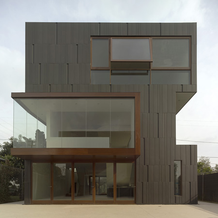
Los Angeles office Studio 0.10 Architects have completed a home incorporating an artists' studio and exhibition space in west Los Angeles, California.
The residence comprises two buildings with a courtyard between. A two-storey building faces the street and contains a garage, apartment and art studio.
The circulation and exhibition spaces for the owners' artwork and collections wrap around the three-storey main house.
Both volumes are clad in zinc; glazing is framed with Ipê wood.
Images are copyright Fotoworks; Benny Chen and Studio 0.10 Architects.
The following text is from Studio 0.10 Architects:
--
A single-family residence designed for a couple and set in a postwar subdivision, a few blocks away from the ‘hip’ strip of Sawtelle Blvd. in Los Angeles. Considered a last bastion of the “traditional values” of home ownership, the neighborhood’s properties of mostly single level cottage typology have been predominately occupied by their original owners since their creation.
However, with the aging of many of the original owners and with still reasonable real estate pricing, a new generation of home seekers is buying in. Armed with favorable zoning regulations, many of the recent buyers have sought new opportunities for an architectural reconsideration of their property. Though still early in the neighborhood’s transformation, there is an emergence of a new aesthetic and potentially new synergy for a design enclave in the patchwork urbanism that is Los Angeles.
The neighborhood is largely composed of 50 feet by 150 feet infill and corner R2 zoned lots with a height limitation of 35 feet capable of legally accommodating three-story duplex developments. The uniqueness of the project site is that a second-generation family owned nursery with a low redevelopment potential borders it on two sides and offers extended outwardly views from within the lot once above the ground floor. The green visual field of unobstructed views of the neighborhood and the bordering urban fabric presented by the nursery also impose a surreal urban and visual presence back onto the lot.
The owners’ lifestyle revolves around the creating, exhibiting and sale of art and photography. As such, the project took on a complex and aggressive set of programs aimed at integrating domestic, entertainment and work activities. In addition, there were two unique requirements: one, the project needed to include an autonomous but fully integrated apartment for the wife’s elderly mother; two, after a decade of loft living devoid of access to exterior living spaces, the owners requested that the project be planned to maximize usable outdoor spaces for entertaining. Specific to the work programs, there was the need for an art studio for the husband, home offices and a dedicated exhibition space as an extension of the wife’s gallery business.
These programmatic parameters informed two primary strategies to organize the project. First, due to the restrictive lot dimension, consideration had to be given to break up the massing as a whole into parts to generate more outdoor space(s). This was done by shifting and stacking the program blocks to maximize the buildable height in order to minimize the footprint of the buildings to produce the required outdoor spaces. This strategy yielded the traditional front and back yard in addition to a large courtyard as a focal outdoor space. Second, in order to maximize display surfaces, the exhibition space was stretched as a three-dimensional trajectory of movement throughout the entire volume of the main house. This was accomplished by conceptualizing the exhibition and art viewing activities as a ribbon of display surfaces also doubling as the main circulation of the house.
The resultant project consists of two independent structures sandwiching a courtyard space. The street front garage/studio unit is two stories with a 4-car garage (doubling as an art production space), an integrated apartment on the ground floor with an art studio on the 2nd floor. The R2 zoning designation was beneficial in allowing the apartment to operate autonomously from the rest of the programs on the property and as such it has its own kitchen, bedroom and bathroom. The main house, situated in the back of the property, is a three-story structure containing the living, dining and kitchen programs on the ground floor, home office and a guest room on the second and the master suite on the third floor.
Once the site planning and massing agenda were established, consideration was given to mapping current and potential future contextual impacts onto the project as cues for formal manipulations and articulations. As such, the key strategy was to manipulate the circulation / exhibition ribbon element and use it strategically to articulate the massing of the project. The result is the wrapping of the circulation / exhibition ribbon on the periphery of the main house volume and using it as a privacy buffering “armature.” The final design accentuates the movement of the users transitioning between programs while also projecting the exhibition activities and artwork onto the exterior.
The two structures are clothed in a custom-patterned zinc rain screen to personify the monolithic quality of the volumes while the imprints of the circulation/exhibition ribbon are identified through the use of structural glazing framed with Ipe wood. The Zinc cladding is conceptualized and detailed as a skin - a simple wrapper. Its combination of differing size panels and a special depressed unit interacts delicately with the sunlight - offering smooth and pattern shadowed variations of the skin as the day passes. To protect the artwork, high performance glass was used to virtually eliminate the penetration of harmful UV light.

