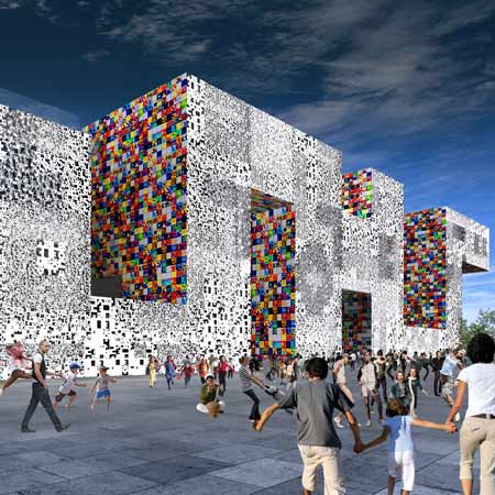
Shanghai Expo 2010: Architects Mass Studies have unveiled their design for the Korean pavilion at Expo 2010 in Shanghai, China.
The shape of the pavilion will be derived from letters forms of the Korean alphabet, Han-geul.
Its surface will be covered in white panels with a relief of letters in four different sizes and around 40,000 aluminium panels decorated in bright colours by Korean artist Ik-Joong Kang.
The ground floor will house a 3D abstract map.
Mountains form seating for visitors and a five metre wide artificial stream cools the area, where visitors will wait to enter the exhibition.
This area will be shaded by the main structure of the pavilion, containing the exhibition space, suspended seven metres above.
The pavilion will include a large exhibition space, VIP lounge, press room, conference room, restaurant, administrative facilities and a roof garden.
Model photos by Kyehnyong Kwak.
Here's some more information from Mass Studies:
--
Context
The World Expo 2010, held in Shanghai, China, is expected to be the largest world expo to date. The theme of the exposition will be “Better City, Better Life,” and the event is to take place from May 1 until October 31, 2010, with more than 230 participating countries (48 of them having their own pavilions) to accommodate the 70 million expected visitors.
Site
The Korea Pavilion is situated in Zone A, directly neighboring the Japan Pavilion and the Saudi Arabia Pavilion, and in close proximity to the China Pavilion. The site is around 6000m2, and it is one of the largest lots within the Expo compound. Located on the perimeter of the zone, the site takes advantage of the views out towards the Huangpu River and the Shanghai skyline in the distance.
Concept
With land culture (China) and sea culture (Japan) surrounding the peninsula, Korea has been permeable to imported cultures and global influences, whose progressive mix defines contemporary Korean society. Using ‘convergence’ as the main theme, the Korea Pavilion is an amalgamation of ‘sign’ (symbol) and ‘space’: signs become spaces, and simultaneously, spaces become signs.
Sign as Space
Han-geul, the Korean alphabet, is the prime element of ‘signs’ within the pavilion. The overall volume, lifted 7.2m above ground level, is created by converging these Han-geul letters, allowing signs to create the exhibition space, and so that the visitors can experience their geometry through horizontal, vertical and diagonal movements. The primary geometries that compose the Han-geul letters are universal to other cultures, thus acting as a sort of ‘open’ set of signs that is engaging to everyone.
The exterior surfaces of the Korea Pavilion are clad in 2 types of pixels: Han-geul Pixels and Art Pixels. Han-geul Pixels are white panels with a relief of letters in four different sizes whose combination forms the majority of the exterior, mainly the peripheral surfaces. Most of the non-peripheral surfaces are composed of Art Pixels, which are 45cm x 45cm aluminum panels created by a Korean artist, Ik-Joong Kang, who is renowned for creating massive art walls out of small hand-painted tiles, either self-produced or by gathering from around the world (thus being another type of convergence). About 40,000 of these panels will texture the façade, contributing a bright palette of colors, hope, and unity throughout the Korea Pavilion.
The surfaces will project different atmospheres during the day and night, with light and shadows creating different textures. Sequential lighting is installed behind the Hangeul Pixels to highlight the individual letters on the exterior façade at night, further animating the pavilion as a sign (like a text message) on a larger scale.
Space as Sign
By understanding a map to be a type of a sign that depicts space, we’ve translated the ground level piloti space as a sign, by making an abstract 1/300 scale 3D map of a characteristic Korean city as its surface. The rest of the building, containing the exhibition space, is suspended 7m above to create a 40m x 77m free, open space generated by the map.
The map becomes a semi-exterior landscape that expresses the converging of mountains, water, and a dense metropolitan area, as exemplified by Seoul, the national capital. This ground floor is shaded by the main volume and additionally cooled by the a replica of a river (modeled after the Han River) flowing from one corner to the other as a 5m wide, 79m long artificial stream, while the notable mountains become stages/seating/spaces for the visitors to enjoy shows while queued in line to enter the exhibition space above, to improve the typical inverted condition that most visitors spend more time waiting than experiencing the exhibition itself. There is also a series of LFD monitors, a large LFD screen and two water screen projections to assist the interaction with the visitors.
Program
Upon entering the second level of the pavilion, the floor opens up to a gigantic 3,700m2 exhibition space, that is enclosed in complete darkness, to provide a controlled environment for the exhibition. We take advantage of the space by opening it up as an open flat plane, to be able to handle an extremely heavy load of visitor traffic. The level above contains the VIP Lounge, Press Room, Conference Room, and programs for the staff and administration. On the opposite end of the exhibition space (at the north-western side of the building) is a restaurant with its own self-operating circulation, and an access to a roof garden that overlooks the Huangpu River and Shanghai’s skyline
More Dezeen stories about Expo 2010:
.
Austrian pavilion by Span and Zeytinoglu
Polish pavilion by Wojciech Kakowski, Natalia Paszkowska and Marcin Mostafa
UAE pavilion by Foster + Partners
British pavilion by Thomas Heatherwick

