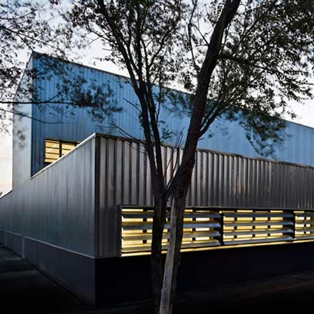
Jordi Badia of Barcelona practice BAAS Architects has completed the CAP Salt 2 health centre in the town of Salt near Girona, Spain.
The exterior of the building is clad in galvanised sheet metal and has few openings to maintain privacy for the patients within.
Natural light and ventilation are admitted through windows onto internal courtyards, which are positioned high up in the consulting rooms but low down in waiting rooms.
Located in an industrial area, the building is constructed from prefabricated parts.
Photographs are by Pedro Pegenaute.
Here's some more information from BAAS Architects:
--
SALT HEALTH CENTRE 2. GIRONA
BAAS. Jordi Badia
Summary
The project guarantees functional and economic calibre, opening up the ground floor to public use and rationalising floorspace by grouping it into clear functional parcels. These functional parcels are separated by interjacent courtyards which, at the same time, subdivide the vast size of the facility into smaller, more human spaces. The first floor and ground floor house the administration and consulting areas respectively.
The division of the building is designed so that it guarantees user privacy. Windows overlooking the courtyards alternate between low-level in the waiting room and high-level in the consulting rooms, ensuring constant natural ventilation and sunlight without any visual or physical intrusion whatsoever. The dimensions and proportions, both interior and exterior, stem from the adoption of prefabricated construction criteria and the use of regular and modular elements. This favours speedy and straightforward construction, helped by dry material assembly cutting back costs. The building stands on a hollow below street level, bestowing it with more privacy without the need for physical separations. Along the same lines, the dark-coloured, large-scale but reduced-headroom entrance porch filters the interior from the exterior and enshrouds the proceedings inside. From outside, the heavy, almost blank yet balanced image of the building harmonises with the industrial surroundings. The use of gleaming galvanised panels on the façade reflects the ever-changing tones of light throughout the day.
The concept
To take prefabricated-industrial architecture to the limits. The project is designed as a stylistic blueprint for the concept. The entire structure, façade enclosure, interior enclosure, false ceilings, etc. are all perceived as a fusion of catalogue products based around strict modulation for dry construction. This could enable the future systematised construction of other similar facilities, saving both time and costs.
The project
Ground-floor development with all public access areas, except for some private areas on the first floor. The ground floor takes the form of a solid piece, practically blind given the inherent privacy requirements of a health centre. To avoid street-level openings and due to the building's use, courtyards harmonise the consultation areas, thus bestowing natural ventilation and sunlight. Besides providing optimum conditions for the health centre, said courtyards act as a filter between the consulting rooms and the waiting rooms. Each piece has an out-of-sync opening so that sunlight streams in yet direct views are rendered impossible. The consulting rooms have high-level strip windows whereas in the waiting rooms they are low-level. On the ground floor, the structure opens outs to the exterior only to light and ventilate the row of consulting rooms at each extreme. These openings are suitably protected by aluminium shutters.
Apart from these openings, on one corner there is a steel outlet which leads to the building entrance. The courtyards, at regular cross sections to floor level, organise a layout of totally homogeneous and repetitive bays only interrupted by a fishbone-style corridor which completes the floor and is positioned so that it disjoins the row of consulting rooms and marks off spaces geared towards certain functions such as the reception area, health education section and service areas.
The upper level is simply a raised extension of one of the ground-floor bays and a layout of central corridor and offices opens out to the exterior just as the ground floor does: with a shutter-protected strip window. From the first floor upwards, the building simply arises in the form of an open-ceilinged façade, concealing the installations but providing ventilation.
The image
Taking into account the surroundings of the facility – markedly industrial - the image of the building is categorically rotund. A gleaming, extremely opaque exterior prism guarantees maximum privacy yet, in contrast, the interior is flooded with natural sunlight pouring in from the inner courtyards.
Materials
The use of prefabricated-industrial elements, depending on where and how, can merge and lead to surprising results worthy of the preconceived basis expected by the manufacturer. The starting point – the structure – is based around a modular and repetitive mid-section of prefabricated pillars and girders on a continuous in situ foundation. The slab walls and roofs are then added by resorting to standard-sized prestressed concrete honeycomb panels. The pillars outline the floor freeing all interior spaces from any structural element. The exception is the metal-structured porch.
Façades
The façades consist of a Z-shaped galvanised sheet finish, supported by metal pans which contain the thermal insulation and are linked to the building structure. At the extremes, the windowed façades opening onto the street are protected from the sun by mechanically-operated galvanised metal shutters. On street level, a resistant concrete plinth separates and closes off the metal façade from the pavement. The trimmers and drip edges use the same type of metal thus conferring uniformity to the entire building. The roof is characterised by its simplicity. The use of filter tiles gives a 0% slope, saving slope layers and at the same time serving as a finish.
NAME: CAP Salt 2
SITE: Salt. Girona.
PROJECT 2004
CONSTRUCTION 2006 -2008
AUTHOR OF THE PROJECT: Jordi Badia http://www.jordibadia.com/
Collaborators: Daniel Guerra, Rafael Berengena, Andreu Orradre
EXTERNAL COLLABORATORS
Structures: Eduard Doce, arquitecto
Measurements: FCA Forteza Carbonell Associats
Installations: Consulting Lluís Duart
CLIENT: GISA. Gestió d’infraestructures S.A. - Departament de Sanitat
More about BAAS Architects on Dezeen:
.
Court of Sant Boi de Llobregat

