Utility exhibition stand by Studio Toogood for Tom Dixon
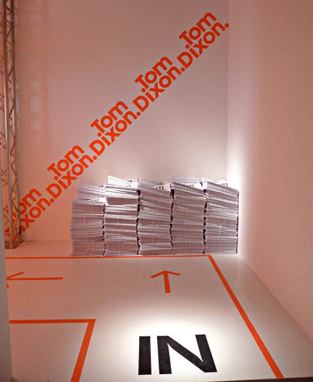
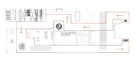
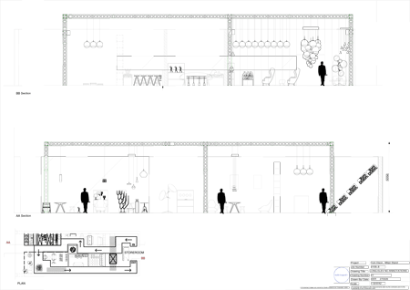
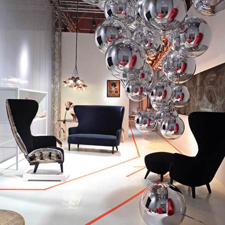
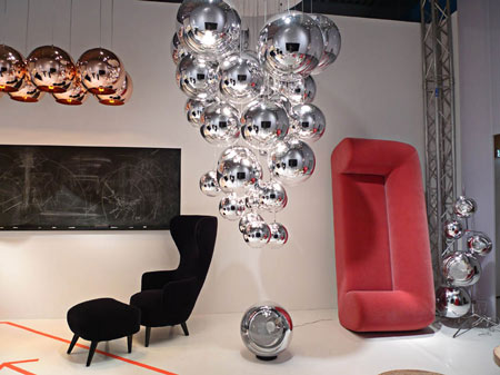
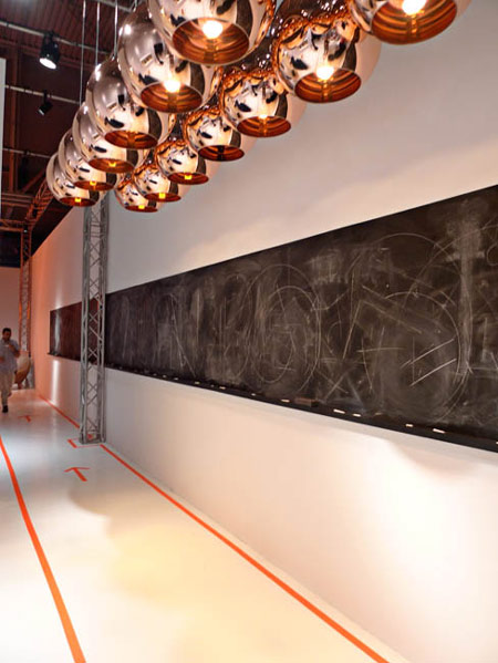
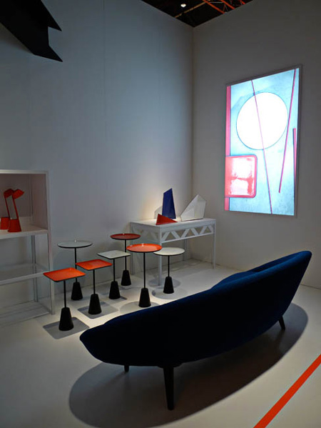
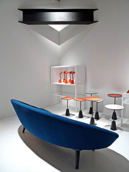
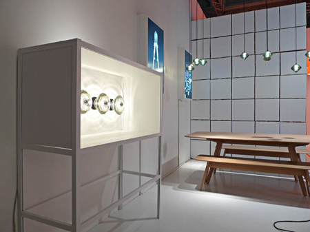
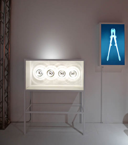
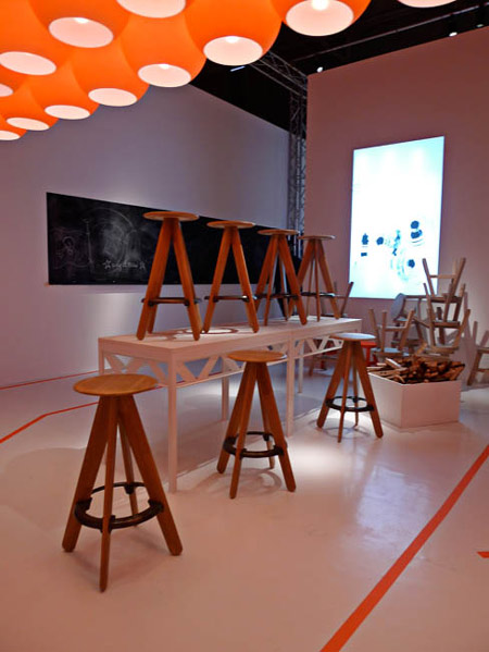
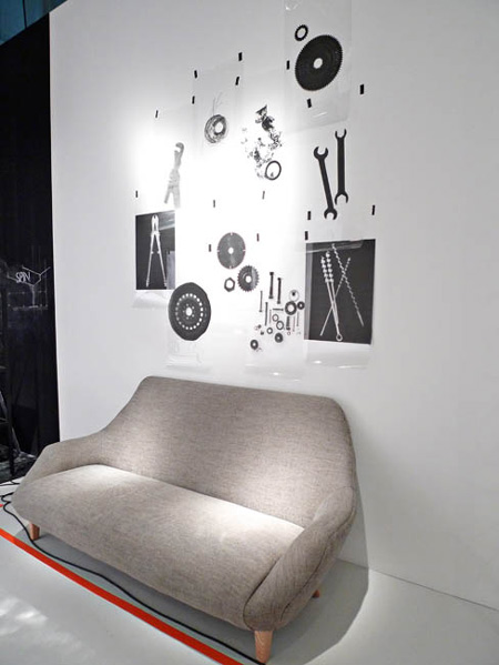
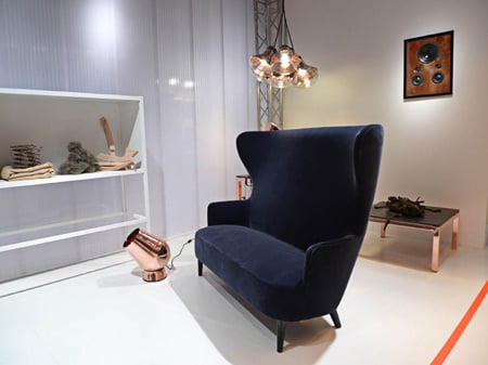
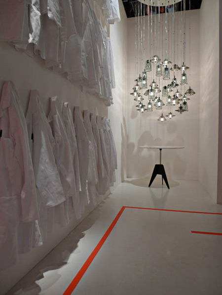
Milan 09: London stylist Faye Toogood designed the exhibition stand for British designer Tom Dixon in Zona Tortona in Milan last month.
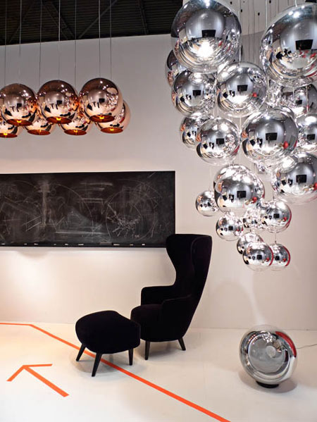
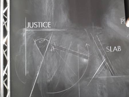
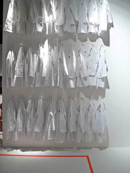
The stand included orange graphics, projections and a chalk board along one wall.
More information about Dixon's Utility collection in our previous story.
Studio Toogood is a new company under the creative direction of stylist Faye Toogood.
The new website and branding were designed Micha Weidmann of Design Science Office, who created Dezeen's identity.
Here's some text from Studio Toogood:
--
Tom Dixon - Milan
The visual merchandising concept and the display units were shown for the first time on the ‘Utility’ exhibition stand at Salone de Mobile in Milan.
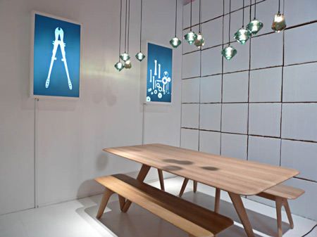
Studio Toogood was responsible for the concept, detailed design and final installation of the stand.
The Studio
Studio Toogood designs, directs and executes interiors and environments from concept through to creation.
Offering styling and set design as well as event, interior and exhibition design for both the interior and fashion industries, the studio’s projects range from the two-dimensional page to the three-dimensional space, and from the real to the conceptual.
Under the creative direction of London-based interior stylist Faye Toogood, the studio has a distinctive approach that disregards convention in favour of something altogether more brave, joyous and impulsive.
The members of the studio are able draw on a wide range of talents and diverse backgrounds – including fine art, history of art, curation, publishing and architecture – to produce refined work that is as much about an understanding of confidence and attention to detail as it is about taste.
Studio Toogood is introducing an interiors service to coincide with the launch of this new creative consultancy.
For the first time Faye Toogood will be offering a personalised service that will cater to both domestic and commercial clients in need of an alternative approach to interior design and environments.
The approach and style promises to be bold and imaginative, drawing on the graphic and sophisticated eye apparent in all of her styling work to date.
The new website and print identity for the studio has be done by Micha Weidmann of Design Science Office.
