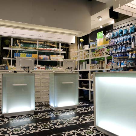
Barcelona-based architects MOBIL M have recently refurbished a pharmacy in Bilbao, Spain, featuring an interior inspired by the forests of the Basque Country.
The tiles on the floor were designed to resemble those found in the historic centre of Bilbao.
Large photographs of foliage and illuminated, glass counters representing running water have been installed to instill an atmosphere of calm.
The brief was to create an entirely new space whilst designing it to be in keeping with the historic surroundings.
Photographs are by César San Millán.
Here is some more text from MOBIL M:
--
The Plaza Nueva drugstore, in Bilbao (Spain), is set in an emblematic square of the historical centre of the city. The square, also called Plaza Nueva, is a protected area due to its historical value. The pharmacy was first open a century ago and had not been altered since then. The new owner acquired the local in 2008 and wanted a complete renewal, even though tradition and respect for the surroundings was to be taken into special account.
The architect wanted the paving to bear a resemblance to an antique floor; that’s why he chose an exclusive design of hydraulic mosaic that looks like the typical tile used in the old centre of Bilbao. In combination with black tiles, they create a kind of zebra crossing between floor and ceiling. A black and white game that brings near the upper and lower part of the shop and contrasts with the green color that builds the visual identity.
The back panel of the furniture represents the humid forests of the Basque Country. A unique and enormous photograph becomes an open window to leafy trees behind every exposed product. But something was missing: you can’t conceive a Basque forest without the comforting murmur of water. That was solved with a glass cascade behind the counters that puts the non-stop rumor of calm and welfare as a soundtrack to the place.
How could all that fit in just 35 square meters? The architect in charge had help: pharmacy automation. An automated storage hidden in the cellar makes it possible to lose not a centimeter of useful space for selling and client attention. The result is, to have so little space to create has been not a handicap but a source of inspiration.
PLAZA NUEVA DRUGSTORE (Bilbao, Spain)
A MOBIL M project
Architect in charge: Pablo Ibarrondo
Graphic designer: Alberto Andino
Furniture: MOBIL M

